Simplifying Omni-channel marketing for small businesses


Angelina
Sales associate

What would you like to buy today?
Electronics


Please select an option to get recommendations


Mobiles


Laptops


Accessories
laptops


Type your message....

Simplifying Omni-channel marketing for small businesses


Angelina
Sales associate

What would you like to buy today?
Electronics


Please select an option to get recommendations

Mobiles

Laptops

Accessories
laptops


Type your message....

Simplifying Omni-channel marketing for small businesses


Angelina
Sales associate

What would you like to buy today?
Electronics


Please select an option to get recommendations

Mobiles

Laptops

Accessories
laptops


Type your message....

Simplifying Omni-channel marketing for small businesses


Angelina
Sales associate

What would you like to buy today?
Electronics


Please select an option to get recommendations

Mobiles

Laptops

Accessories
laptops


Type your message....

Simplifying Omni-channel marketing for small businesses


Angelina
Sales associate

What would you like to buy today?
Electronics


Please select an option to get recommendations

Mobiles

Laptops

Accessories
laptops


Type your message....

Context
Context
Context
Context
OmniEngage is an omnichannel marketing platform designed to help businesses create, manage, and optimize personalized marketing campaigns across various digital channels such as web, mobile, SMS, email, Facebook Messenger, and WhatsApp. The platform aims to increase customer engagement and drive revenue through targeted messaging and intelligent campaign management
OmniEngage is an omnichannel marketing platform designed to help businesses create, manage, and optimize personalized marketing campaigns across various digital channels such as web, mobile, SMS, email, Facebook Messenger, and WhatsApp. The platform aims to increase customer engagement and drive revenue through targeted messaging and intelligent campaign management
OmniEngage is an omnichannel marketing platform designed to help businesses create, manage, and optimize personalized marketing campaigns across various digital channels such as web, mobile, SMS, email, Facebook Messenger, and WhatsApp. The platform aims to increase customer engagement and drive revenue through targeted messaging and intelligent campaign management
OmniEngage is an omnichannel marketing platform designed to help businesses create, manage, and optimize personalized marketing campaigns across various digital channels such as web, mobile, SMS, email, Facebook Messenger, and WhatsApp. The platform aims to increase customer engagement and drive revenue through targeted messaging and intelligent campaign management
My Role
My Role
My Role
My Role
Team
Team
Team
Team
Team
I worked with a senior designer on the project.
I worked with a senior designer on the project.
I worked with a senior designer on the project.
I worked with a senior designer on the project.
I worked with a senior designer on the project.
Timeline
Timeline
Timeline
Timeline
Timeline
3-4 months
3-4 months
3-4 months
3-4 months
Skills Utilized
Skills Utilized
Skills Utilized
Skills Utilized
Skills Utilized
UI design, Prototyping, Visual design, UX research, UX design
UI design, Prototyping, Visual design, UX research, UX design
UI design, Prototyping, Visual design, UX research, UX design
UI design, Prototyping, Visual design, UX research, UX design
Project Objectives
Project Objectives
Project Objectives
Project Objectives
Improve the overall usability of the workflow builder section.
Improve the overall usability of the workflow builder section.
Improve the overall usability of the workflow builder section.
Improve the overall usability of the workflow builder section.
Simplify the workflow building experience for the new users.
Simplify the workflow building experience for the new users.
Simplify the workflow building experience for the new users.
Simplify the workflow building experience for the new users.
Problems
Problems
Problems
Our Quality assurance and marketing teams tested the products after every development cycle. We received feedback about some major issues that the teams were facing.
Our Quality assurance and marketing teams tested the products after every development cycle. We received feedback about some major issues that the teams were facing.
Our Quality assurance and marketing teams tested the products after every development cycle. We received feedback about some major issues that the teams were facing.
Problem 1 : Too many options slowed the workflow creation process
Problem 1 : Too many options slowed the workflow creation process
Problem 1 : Too many options slowed the workflow creation process
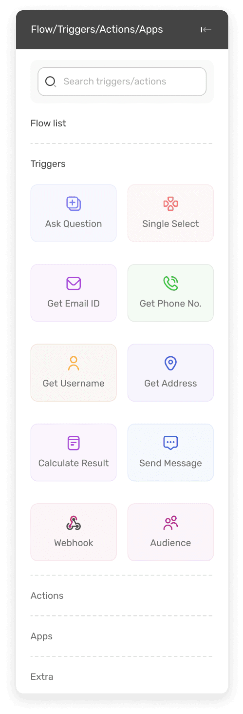
As the product evolved , it was figured out by the product team that major use cases for the product was to send campaigns and build bots. There were 8 action nodes that were needed for making a campaign workflow and 16 nodes (8 action & 8 trigger) for making a bot. But the user is presented with all 16 nodes on the builder canvas.
As the product evolved , it was figured out by the product team that major use cases for the product was to send campaigns and build bots. There were 8 action nodes that were needed for making a campaign workflow and 16 nodes (8 action & 8 trigger) for making a bot. But the user is presented with all 16 nodes on the builder canvas.
As the product evolved , it was figured out by the product team that major use cases for the product was to send campaigns and build bots. There were 8 action nodes that were needed for making a campaign workflow and 16 nodes (8 action & 8 trigger) for making a bot. But the user is presented with all 16 nodes on the builder canvas.
When a user wanted to build a campaign workflow, they had to select from 16 different nodes listed on the left side panel of canvas. This increased the cognitive load on the user and made the workflow creation process slower.
When a user wanted to build a campaign workflow, they had to select from 16 different nodes listed on the left side panel of canvas. This increased the cognitive load on the user and made the workflow creation process slower.
When a user wanted to build a campaign workflow, they had to select from 16 different nodes listed on the left side panel of canvas. This increased the cognitive load on the user and made the workflow creation process slower.
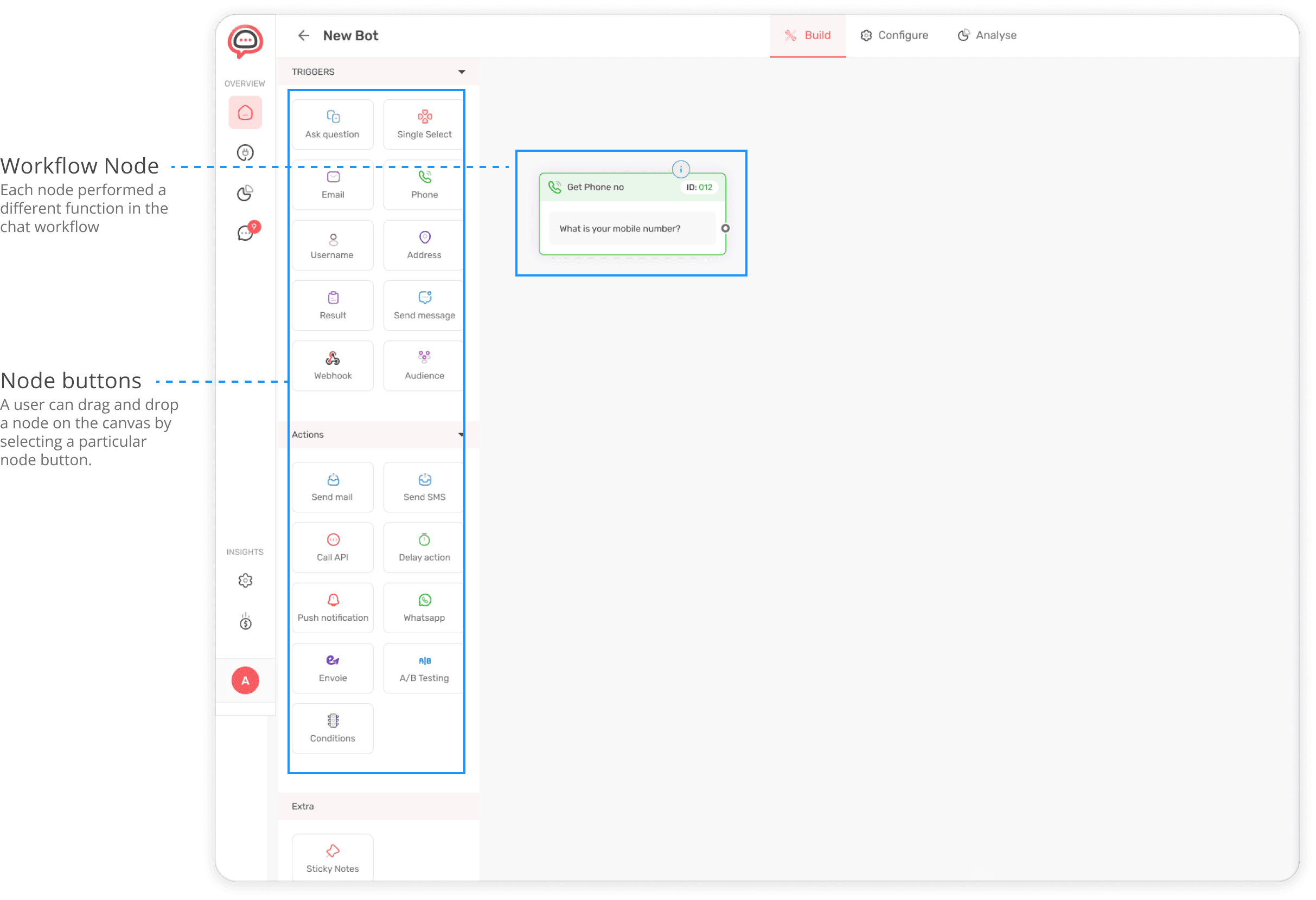


NOTE:
A node is a workflow component that performs a specialized function such as sending an email or using an API to fetch some data.
A trigger node is a workflow component that initiates an automated seqence of actions in a workflow.
An action node is a workflow component that executes a specific task or a set of tasks in a response to a trigger event such a sending an email after a user provides an email address.
Problem 2 : Inadequate space for entering and editing content
Problem 2 : Inadequate space for entering and editing content
Problem 2 : Inadequate space for entering and editing content
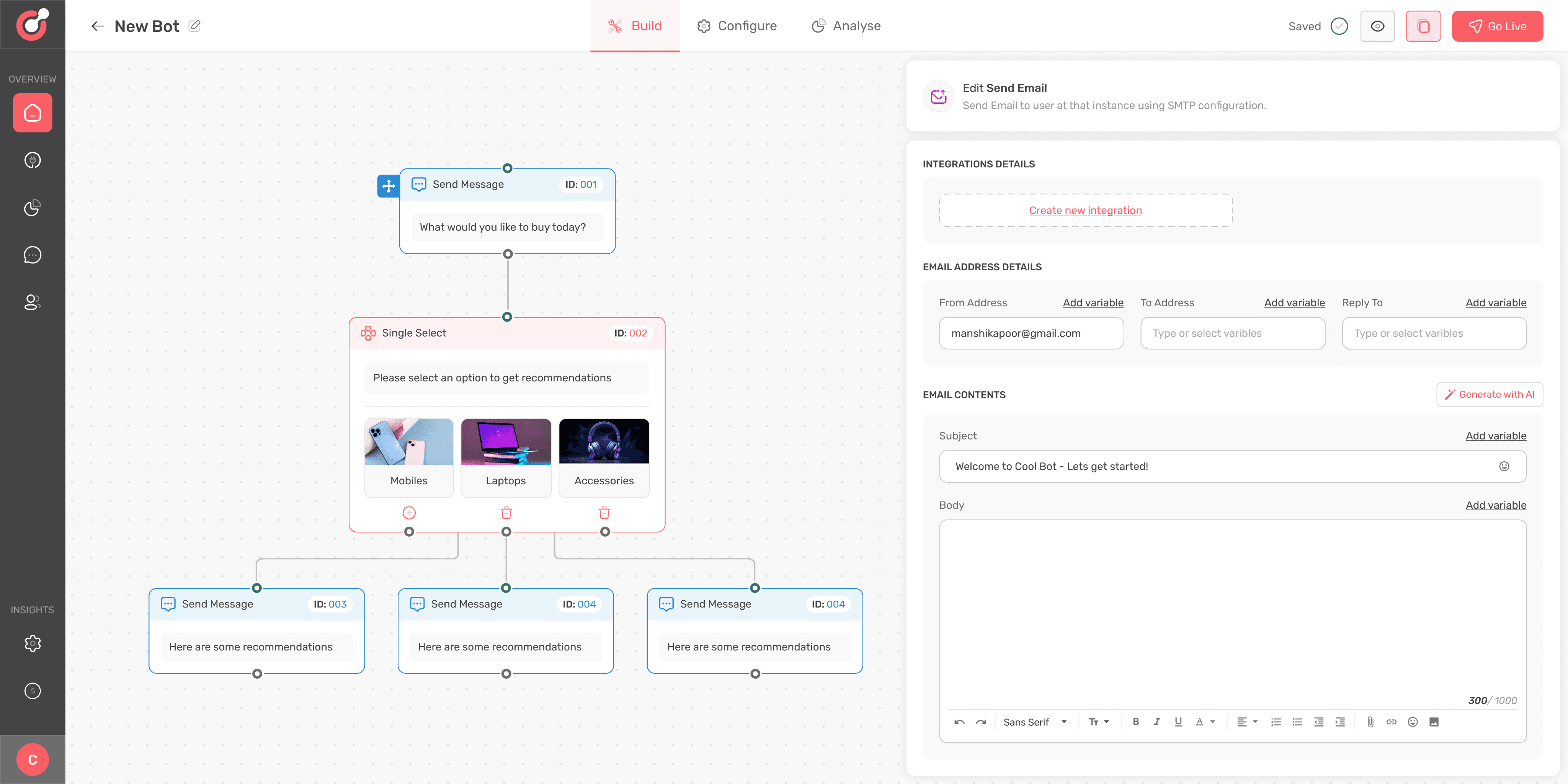
Each node values could be edited from the editor that opened on the right side of builder canvas. While many nodes did not require entering long content , some nodes such as send email, send SMS, WhatsApp and condition node needed entering of long content and had complex configuration options.
Each node values could be edited from the editor that opened on the right side of builder canvas. While many nodes did not require entering long content , some nodes such as send email, send SMS, WhatsApp and condition node needed entering of long content and had complex configuration options.
Each node values could be edited from the editor that opened on the right side of builder canvas. While many nodes did not require entering long content , some nodes such as send email, send SMS, WhatsApp and condition node needed entering of long content and had complex configuration options.
The space provided for entering email content seemed inadequate to the users. The internal teams also expressed the need for basic text editor so that user could select different fonts and align the content.
The space provided for entering email content seemed inadequate to the users. The internal teams also expressed the need for basic text editor so that user could select different fonts and align the content.
The space provided for entering email content seemed inadequate to the users. The internal teams also expressed the need for basic text editor so that user could select different fonts and align the content.
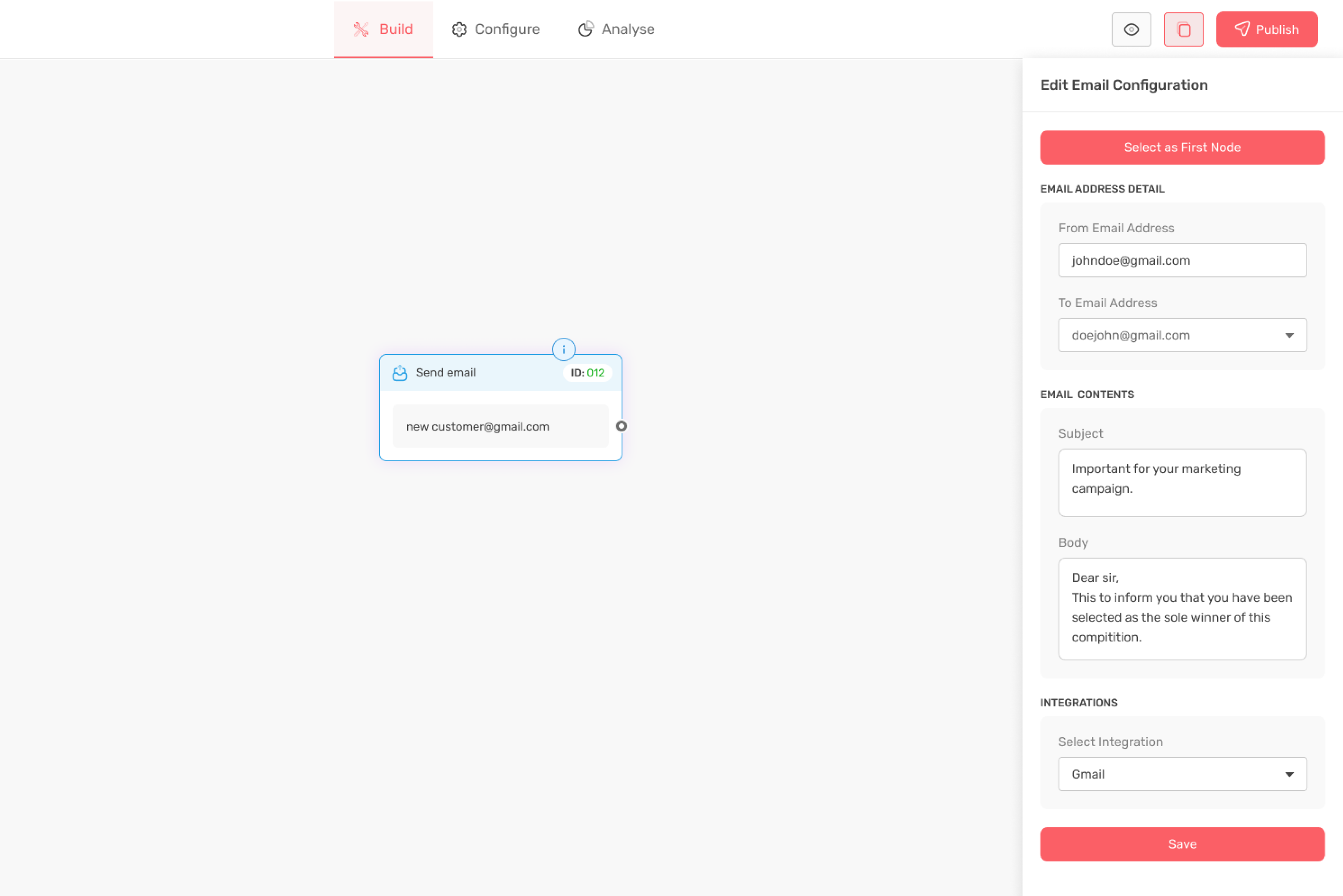
Node editor
Whenever a user clicked on a particular node, a node editor opened on the right side of the builder.

Node editor
Whenever a user clicked on a particular node, a node editor opened on the right side of the builder.

Node editor
Whenever a user clicked on a particular node, a node editor opened on the right side of the builder.

Node editor
Whenever a user clicked on a particular node, a node editor opened on the right side of the builder.
Solutions
Solutions
Solutions
Our design team worked in close collaboration with product and marketing teams seeking feedback on the designs as early as possible. This helped in faster iteration helping us deliver improved designs within deadlines.
Our design team worked in close collaboration with product and marketing teams seeking feedback on the designs as early as possible. This helped in faster iteration helping us deliver improved designs within deadlines.
Our design team worked in close collaboration with product and marketing teams seeking feedback on the designs as early as possible. This helped in faster iteration helping us deliver improved designs within deadlines.
Solution for problem 1
Solution for problem 1
Solution for problem 1
I discussed the problem with the product team and developers looking for a potential solution. Everything led to conclusion that the nodes need to be grouped appropriately so that user can identify which nodes to select for campaign and which for web bot.
I discussed the problem with the product team and developers looking for a potential solution. Everything led to conclusion that the nodes need to be grouped appropriately so that user can identify which nodes to select for campaign and which for web bot.
I discussed the problem with the product team and developers looking for a potential solution. Everything led to conclusion that the nodes need to be grouped appropriately so that user can identify which nodes to select for campaign and which for web bot.
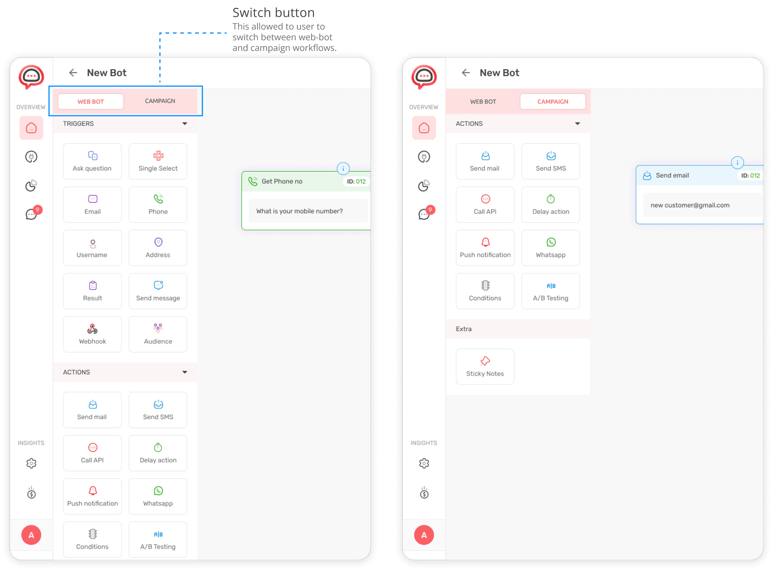
One of the early solutions for simplifying user journey was to introduce a switch button between that allowed the user to switch between web-bot and campaigns. As trigger nodes were not applicable for campaigns, so they were not shown to the user on the canvas.
One of the early solutions for simplifying user journey was to introduce a switch button between that allowed the user to switch between web-bot and campaigns. As trigger nodes were not applicable for campaigns, so they were not shown to the user on the canvas.
One of the early solutions for simplifying user journey was to introduce a switch button between that allowed the user to switch between web-bot and campaigns. As trigger nodes were not applicable for campaigns, so they were not shown to the user on the canvas.


Further exploration
Further exploration
Further exploration
The decision to add a switch button seemed right at that stage during the design process. On further exploration, we discovered that user still need to be educated about the type of workflow they want to make.
The decision to add a switch button seemed right at that stage during the design process. On further exploration, we discovered that user still need to be educated about the type of workflow they want to make.
The decision to add a switch button seemed right at that stage during the design process. On further exploration, we discovered that user still need to be educated about the type of workflow they want to make.
We observed our competitors and noted how they were solving this problem. We gained the following insights from our research on other similar platforms in the market.
We observed our competitors and noted how they were solving this problem. We gained the following insights from our research on other similar platforms in the market.
We observed our competitors and noted how they were solving this problem. We gained the following insights from our research on other similar platforms in the market.
Insights
Insights
Insights
Segmeted offerings
Segmeted offerings
Segmeted offerings
The competitors have strategically segmented their offerings into different options such as WhatsApp, web, Instagram and messenger before users initiate the workflow building process. This helps the user what things they can achieve with builder.
The competitors have strategically segmented their offerings into different options such as WhatsApp, web, Instagram and messenger before users initiate the workflow building process. This helps the user what things they can achieve with builder.
The competitors have strategically segmented their offerings into different options such as WhatsApp, web, Instagram and messenger before users initiate the workflow building process. This helps the user what things they can achieve with builder.
Reduced cognitive load
Reduced cognitive load
Reduced cognitive load
After a user selects a specific workflow, they are directed to the builder where they are presented with various building options related to the specific workflow only. This reduces the cognitive load on the user by showing them only specific building tools for each type of workflow.
After a user selects a specific workflow, they are directed to the builder where they are presented with various building options related to the specific workflow only. This reduces the cognitive load on the user by showing them only specific building tools for each type of workflow.
After a user selects a specific workflow, they are directed to the builder where they are presented with various building options related to the specific workflow only. This reduces the cognitive load on the user by showing them only specific building tools for each type of workflow.
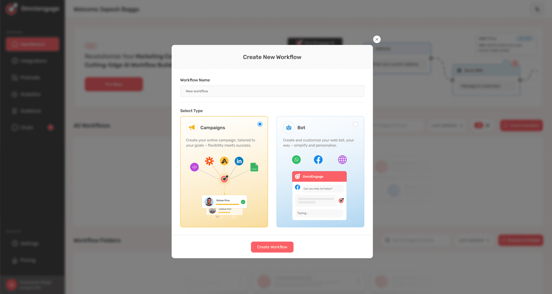
I developed another solution based on the insights. So in this case, whenever a user wanted to make a new workflow, they were asked whether they wanted to create a campaign or a Bot.
I developed another solution based on the insights. So in this case, whenever a user wanted to make a new workflow, they were asked whether they wanted to create a campaign or a Bot.
I developed another solution based on the insights. So in this case, whenever a user wanted to make a new workflow, they were asked whether they wanted to create a campaign or a Bot.


One more iteration
One more iteration
One more iteration
While testing the designs, it was observed that the modal design increased the number of clicks for the user and increased friction in the workflow creation.
While testing the designs, it was observed that the modal design increased the number of clicks for the user and increased friction in the workflow creation.
While testing the designs, it was observed that the modal design increased the number of clicks for the user and increased friction in the workflow creation.
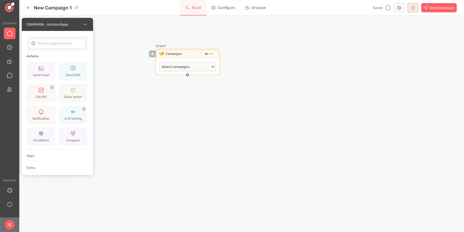
After several iterations, I made another design where the user could reach the builder from dashboard in single click. This design was finally selected and sent for development.
After several iterations, I made another design where the user could reach the builder from dashboard in single click. This design was finally selected and sent for development.
After several iterations, I made another design where the user could reach the builder from dashboard in single click. This design was finally selected and sent for development.
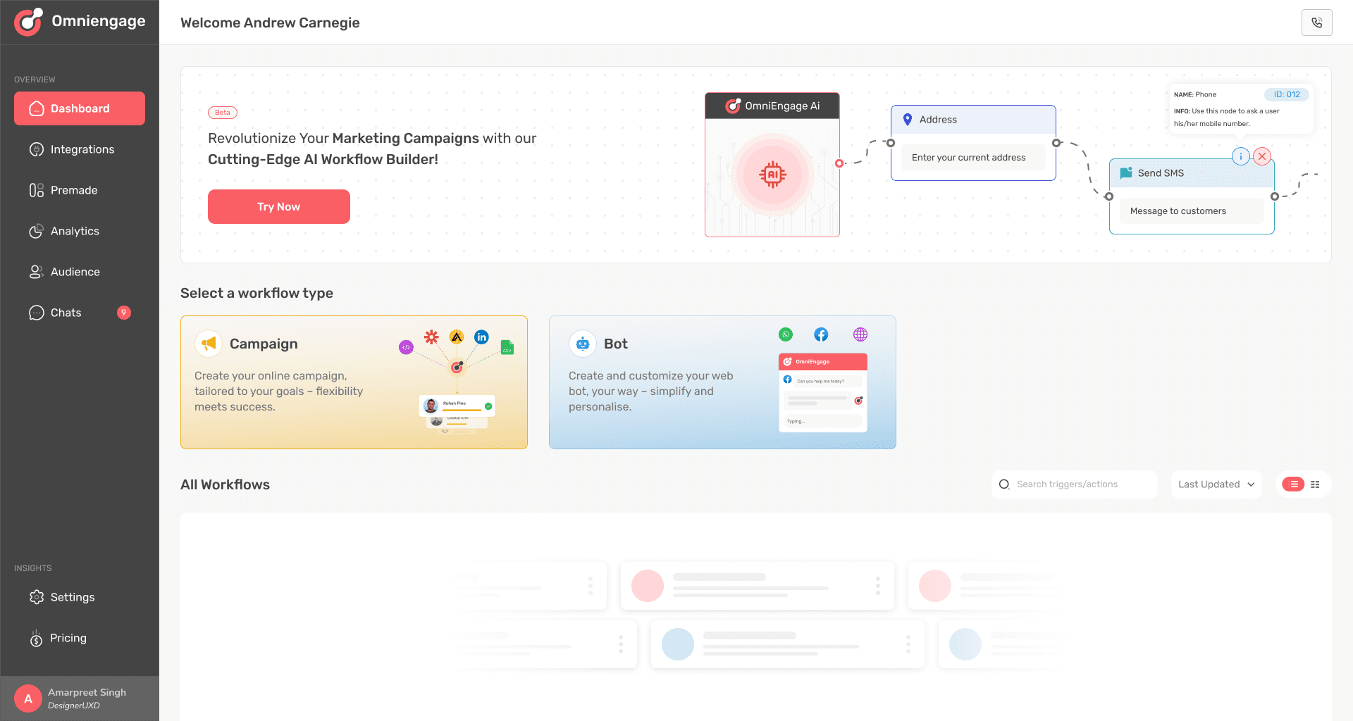


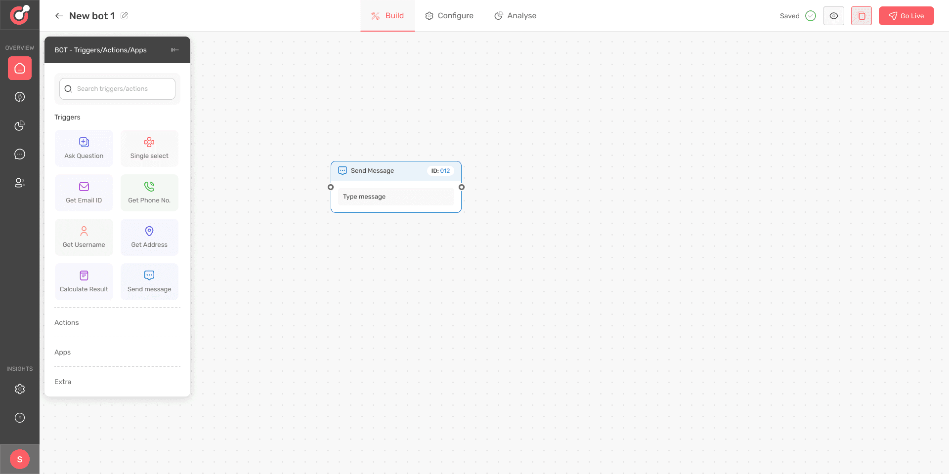
Builder screen after user selects to create a new campaign
Builder screen after user selects to create a new campaign
Builder screen after user selects to create a new campaign


Builder screen after user selects to create a new bot
Builder screen after user selects to create a new bot
Builder screen after user selects to create a new bot


Solution for problem 2
Solution for problem 2
Solution for problem 2
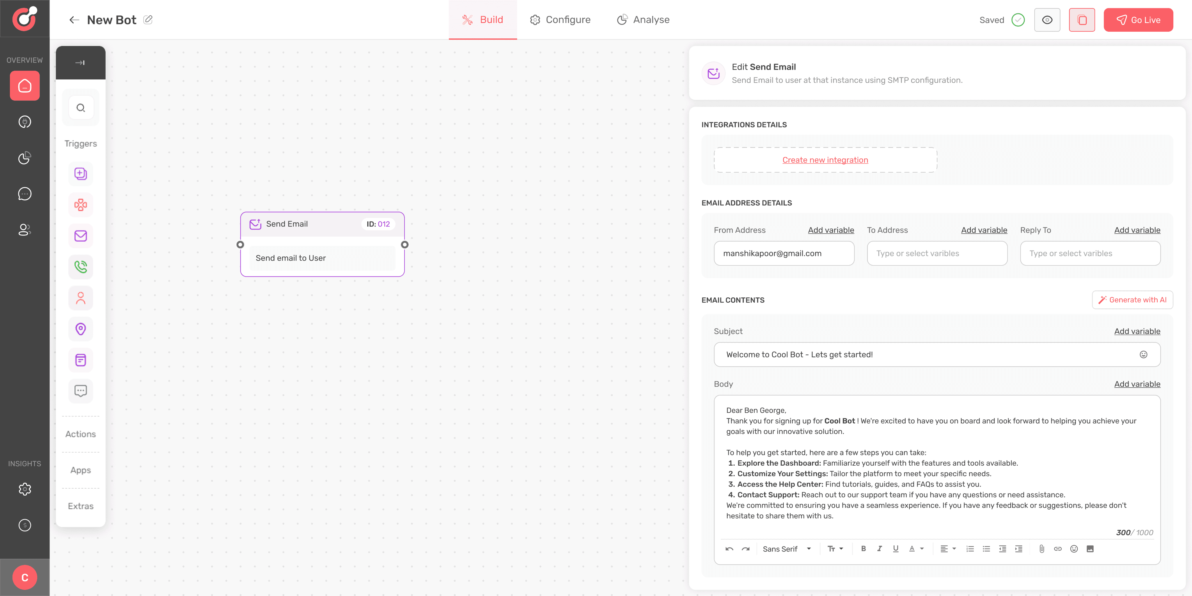
The second problem related to inadequate space for entering content had a straight forward solution. I just increased the overall width of the whole node editor section. It solved the problem to a large extent.
The second problem related to inadequate space for entering content had a straight forward solution. I just increased the overall width of the whole node editor section. It solved the problem to a large extent.
The second problem related to inadequate space for entering content had a straight forward solution. I just increased the overall width of the whole node editor section. It solved the problem to a large extent.
Other notable changes in the design included a button “Generate with AI” that helped the user write content with support from chatGPT by entering a short prompt. The user could now format the text with the introduction of text editor.
Other notable changes in the design included a button “Generate with AI” that helped the user write content with support from chatGPT by entering a short prompt. The user could now format the text with the introduction of text editor.
Other notable changes in the design included a button “Generate with AI” that helped the user write content with support from chatGPT by entering a short prompt. The user could now format the text with the introduction of text editor.


New solution leads to another problem
New solution leads to another problem
New solution leads to another problem
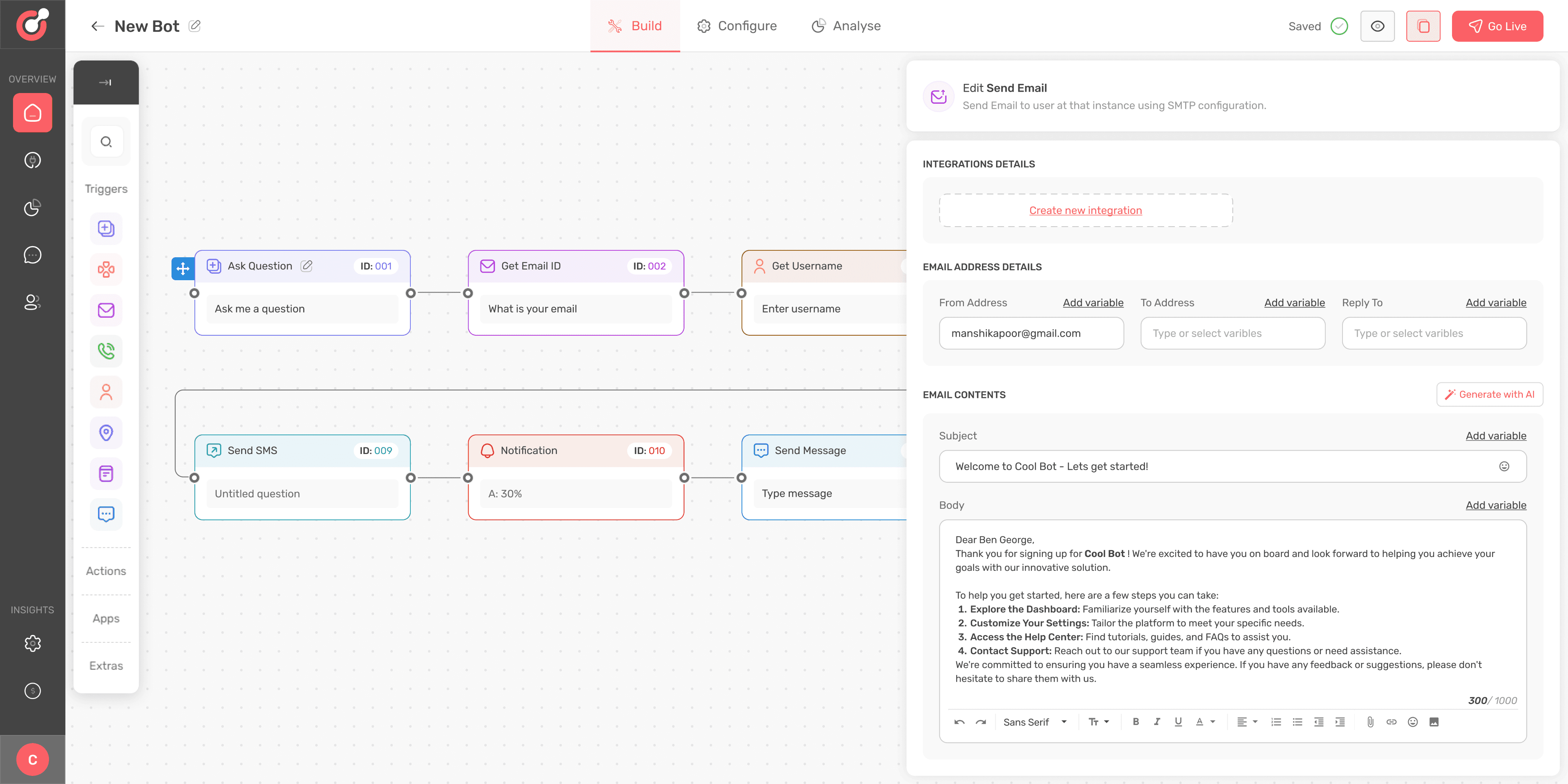
Increasing the width for node editor solved the problem of spacing but created another problem. This problem occurred when the workflow consisted of greater number of nodes and they are all placed across the width of canvas.
Increasing the width for node editor solved the problem of spacing but created another problem. This problem occurred when the workflow consisted of greater number of nodes and they are all placed across the width of canvas.
Increasing the width for node editor solved the problem of spacing but created another problem. This problem occurred when the workflow consisted of greater number of nodes and they are all placed across the width of canvas.
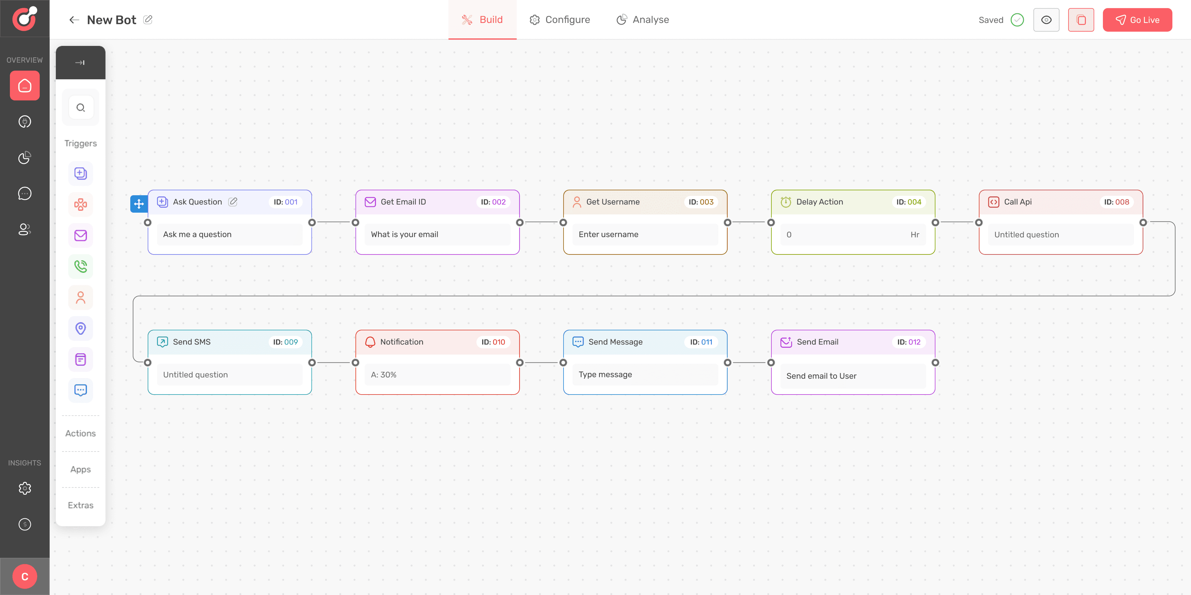


So whenever a user was working with long workflows , their view was obstructed by the node editor. So the whenever the user needed to refer the full workflow , they needed to close the editor and then view the canvas.
So whenever a user was working with long workflows , their view was obstructed by the node editor. So the whenever the user needed to refer the full workflow , they needed to close the editor and then view the canvas.
So whenever a user was working with long workflows , their view was obstructed by the node editor. So the whenever the user needed to refer the full workflow , they needed to close the editor and then view the canvas.


Keeping the flow vertical
Keeping the flow vertical
Keeping the flow vertical
This time I tried to use the existing elements on the builder canvas to guide the user about the flow. I introduced a flow list inside the node sidebar. This flow list showed all the nodes in the sequential order used by user in the workflow. This helped the user get a quick summary of how many nodes were there in workflow and what was the order of nodes.
This time I tried to use the existing elements on the builder canvas to guide the user about the flow. I introduced a flow list inside the node sidebar. This flow list showed all the nodes in the sequential order used by user in the workflow. This helped the user get a quick summary of how many nodes were there in workflow and what was the order of nodes.
This time I tried to use the existing elements on the builder canvas to guide the user about the flow. I introduced a flow list inside the node sidebar. This flow list showed all the nodes in the sequential order used by user in the workflow. This helped the user get a quick summary of how many nodes were there in workflow and what was the order of nodes.
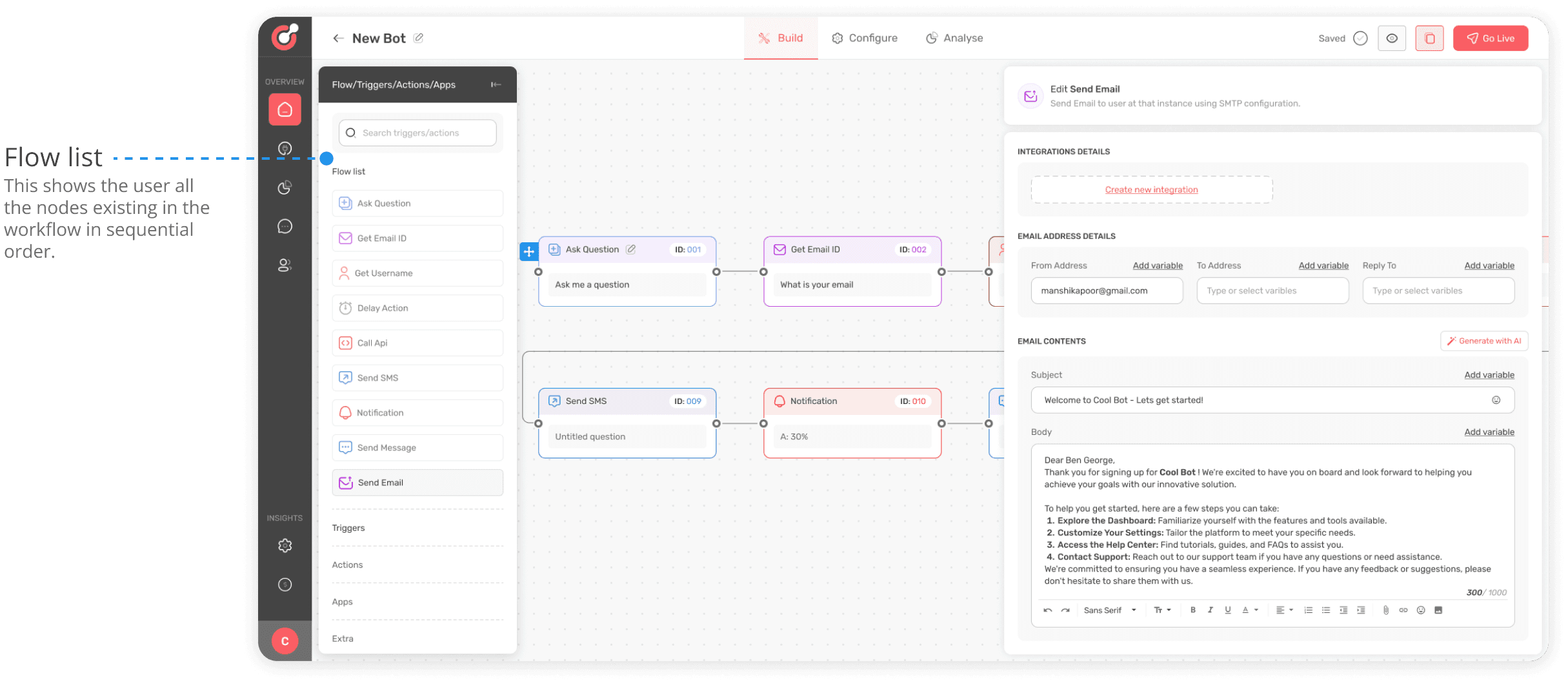


After introduction of wider node editor , there was strong feedback from the internal QA and marketing team for improvements in node layout. The current horizonal layout for the workflow was not working well for marketing team.
After introduction of wider node editor , there was strong feedback from the internal QA and marketing team for improvements in node layout. The current horizonal layout for the workflow was not working well for marketing team.
After introduction of wider node editor , there was strong feedback from the internal QA and marketing team for improvements in node layout. The current horizonal layout for the workflow was not working well for marketing team.
It was decided after several discussions with the product team that workflow layout needs to be done vertical now. While doing it in design was easy , it seemed difficult for the development team.
It was decided after several discussions with the product team that workflow layout needs to be done vertical now. While doing it in design was easy , it seemed difficult for the development team.
It was decided after several discussions with the product team that workflow layout needs to be done vertical now. While doing it in design was easy , it seemed difficult for the development team.
Hard work for the development team
Hard work for the development team
Hard work for the development team
The decision to keep the layout vertical seemed simple to implement at first. But there was a strong barrier in executing that decision. The reason was design of node element where flow connector were provided at the left and right ends.
The decision to keep the layout vertical seemed simple to implement at first. But there was a strong barrier in executing that decision. The reason was design of node element where flow connector were provided at the left and right ends.
The decision to keep the layout vertical seemed simple to implement at first. But there was a strong barrier in executing that decision. The reason was design of node element where flow connector were provided at the left and right ends.
To make the layout vertical , the connector need to be position at the top and bottom of nodes. The development team had to spend a lot of effort while doing this that led to delay in shipping the project.
To make the layout vertical , the connector need to be position at the top and bottom of nodes. The development team had to spend a lot of effort while doing this that led to delay in shipping the project.
To make the layout vertical , the connector need to be position at the top and bottom of nodes. The development team had to spend a lot of effort while doing this that led to delay in shipping the project.


Final designs for vertical workflow layout
Final designs for vertical workflow layout
Final designs for vertical workflow layout
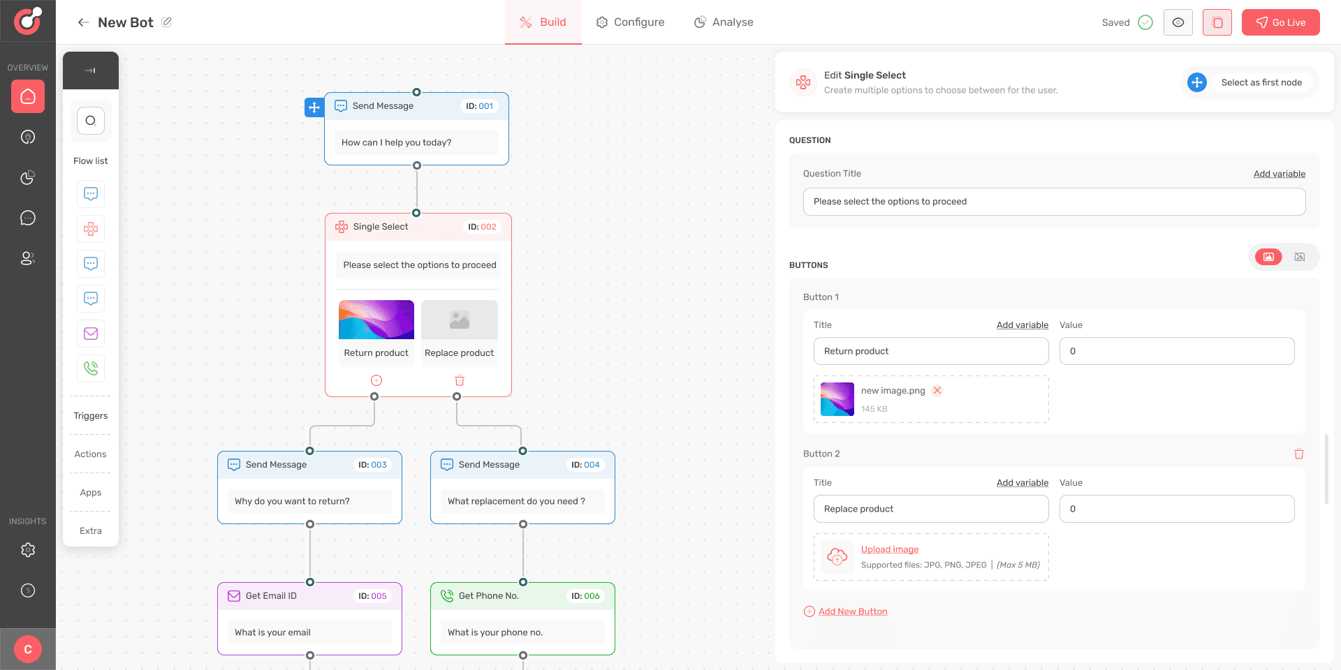


Creating a basic workflow for a bot (Prototype video)
Creating a basic workflow for a bot (Prototype video)
Creating a basic workflow for a bot (Prototype video)
Key takeaways
Key takeaways
Key takeaways
Balancing usability & development constraints
Balancing usability & development constraints
Balancing usability & development constraints
Sometimes the designer has to make a trade-off between usability and constraints related to development. While a particular design decision may improve the usability of an interface by 10% but may increase the development costs by 50%.
Sometimes the designer has to make a trade-off between usability and constraints related to development. While a particular design decision may improve the usability of an interface by 10% but may increase the development costs by 50%.
Sometimes the designer has to make a trade-off between usability and constraints related to development. While a particular design decision may improve the usability of an interface by 10% but may increase the development costs by 50%.
Collaboration leads to faster progress
Collaboration leads to faster progress
Collaboration leads to faster progress
The project could not have been successful without constant feedback offered by development , QA and product teams. Healthy discussion with different teams led to many breakthroughs that eventually shaped the latest designs.
The project could not have been successful without constant feedback offered by development , QA and product teams. Healthy discussion with different teams led to many breakthroughs that eventually shaped the latest designs.
The project could not have been successful without constant feedback offered by development , QA and product teams. Healthy discussion with different teams led to many breakthroughs that eventually shaped the latest designs.
Iteration is the key
Iteration is the key
Iteration is the key
The more I worked on past designs to improve them, the greater I realised the value of iteration in design. Any solution that may seem relevant at any particular stage of a project can become irrelevant and ineffective after the product evolves. So designer should always be ready to improve and refine his original ideas through iteration.
The more I worked on past designs to improve them, the greater I realised the value of iteration in design. Any solution that may seem relevant at any particular stage of a project can become irrelevant and ineffective after the product evolves. So designer should always be ready to improve and refine his original ideas through iteration.
The more I worked on past designs to improve them, the greater I realised the value of iteration in design. Any solution that may seem relevant at any particular stage of a project can become irrelevant and ineffective after the product evolves. So designer should always be ready to improve and refine his original ideas through iteration.
Lets create excellent products!
CONTACT
vikassethi2007@gmail.com
91-96546 65889
SOCIALS
vsdesigns.com
Lets create excellent products!
CONTACT
vikassethi2007@gmail.com
91-96546 65889
SOCIALS
vsdesigns.com
Lets create excellent products!
vikassethi2007@gmail.com
96546 65889
vsdesigns.com
Lets create excellent products!
CONTACT
vikassethi2007@gmail.com
91-96546 65889
SOCIALS
vsdesigns.com
Lets create excellent products!
CONTACT
vikassethi2007@gmail.com
91-96546 65889
SOCIALS
vsdesigns.com
Problems
Our Quality assurance and marketing teams tested the products after every development cycle. We received feedback about some major issues that the teams were facing.
Problem 2 : Inadequate space for entering and editing content
Each node values could be edited from the editor that opened on the right side of builder canvas. While many nodes did not require entering long content , some nodes such as send email, send SMS, WhatsApp and condition node needed entering of long content and had complex configuration options.
The space provided for entering email content seemed inadequate to the users. The internal teams also expressed the need for basic text editor so that user could select different fonts and align the content.


Node editor
Whenever a user clicked on a particular node, a node editor opened on the right side of the builder.
Solutions
Our design team worked in close collaboration with product and marketing teams seeking feedback on the designs as early as possible. This helped in faster iteration helping us deliver improved designs within deadlines.
Solution for problem 1
I discussed the problem with the product team and developers looking for a potential solution. Everything led to conclusion that the nodes need to be grouped appropriately so that user can identify which nodes to select for campaign and which for web bot.
One of the early solutions for simplifying user journey was to introduce a switch button between that allowed the user to switch between web-bot and campaigns. As trigger nodes were not applicable for campaigns, so they were not shown to the user on the canvas.


Further exploration
The decision to add a switch button seemed right at that stage during the design process. On further exploration, we discovered that user still need to be educated about the type of workflow they want to make.
We observed our competitors and noted how they were solving this problem. We gained the following insights from our research on other similar platforms in the market.
Insights
Segmeted offerings
The competitors have strategically segmented their offerings into different options such as WhatsApp, web, Instagram and messenger before users initiate the workflow building process. This helps the user what things they can achieve with builder.
Reduced cognitive load
After a user selects a specific workflow, they are directed to the builder where they are presented with various building options related to the specific workflow only. This reduces the cognitive load on the user by showing them only specific building tools for each type of workflow.
I developed another solution based on the insights. So in this case, whenever a user wanted to make a new workflow, they were asked whether they wanted to create a campaign or a Bot.


One more iteration
While testing the designs, it was observed that the modal design increased the number of clicks for the user and increased friction in the workflow creation.
After several iterations, I made another design where the user could reach the builder from dashboard in single click. This design was finally selected and sent for development.


Builder screen after user selects to create a new campaign


Builder screen after user selects to create a new bot


Solution for problem 2
The second problem related to inadequate space for entering content had a straight forward solution. I just increased the overall width of the whole node editor section. It solved the problem to a large extent.
Other notable changes in the design included a button “Generate with AI” that helped the user write content with support from chatGPT by entering a short prompt. The user could now format the text with the introduction of text editor.


New solution leads to another problem
Increasing the width for node editor solved the problem of spacing but created another problem. This problem occurred when the workflow consisted of greater number of nodes and they are all placed across the width of canvas.


So whenever a user was working with long workflows , their view was obstructed by the node editor. So the whenever the user needed to refer the full workflow , they needed to close the editor and then view the canvas.


Key takeaways
Balancing usability & development constraints
Sometimes the designer has to make a trade-off between usability and constraints related to development. While a particular design decision may improve the usability of an interface by 10% but may increase the development costs by 50%.
Collaboration leads to faster progress
The project could not have been successful without constant feedback offered by development , QA and product teams. Healthy discussion with different teams led to many breakthroughs that eventually shaped the latest designs.
Iteration is the key
The more I worked on past designs to improve them, the greater I realised the value of iteration in design. Any solution that may seem relevant at any particular stage of a project can become irrelevant and ineffective after the product evolves. So designer should always be ready to improve and refine his original ideas through iteration.
Keeping the flow vertical
This time I tried to use the existing elements on the builder canvas to guide the user about the flow. I introduced a flow list inside the node sidebar. This flow list showed all the nodes in the sequential order used by user in the workflow. This helped the user get a quick summary of how many nodes were there in workflow and what was the order of nodes.


After introduction of wider node editor , there was strong feedback from the internal QA and marketing team for improvements in node layout. The current horizonal layout for the workflow was not working well for marketing team.
It was decided after several discussions with the product team that workflow layout needs to be done vertical now. While doing it in design was easy , it seemed difficult for the development team.


Final designs for vertical workflow layout


Hard work for the development team
The decision to keep the layout vertical seemed simple to implement at first. But there was a strong barrier in executing that decision. The reason was design of node element where flow connector were provided at the left and right ends.
To make the layout vertical , the connector need to be position at the top and bottom of nodes. The development team had to spend a lot of effort while doing this that led to delay in shipping the project.
Creating a basic workflow for a bot (Prototype video)
Lets create excellent products!
vikassethi2007@gmail.com
96546 65889
vsdesigns.com
Lets create excellent products!
vikassethi2007@gmail.com
96546 65889
vsdesigns.com
Problem 1 : Too many options slowed the workflow creation process
As the product evolved , it was figured out by the product team that major use cases for the product was to send campaigns and build bots. There were 8 action nodes that were needed for making a campaign workflow and 16 nodes (8 action & 8 trigger) for making a bot. But the user is presented with all 16 nodes on the builder canvas.
When a user wanted to build a campaign workflow, they had to select from 16 different nodes listed on the left side panel of canvas. This increased the cognitive load on the user and made the workflow creation process slower.


NOTE:
A node is a workflow component that performs a specialized function such as sending an email or using an API to fetch some data.
A trigger node is a workflow component that initiates an automated seqence of actions in a workflow.
An action node is a workflow component that executes a specific task or a set of tasks in a response to a trigger event such a sending an email after a user provides an email address.
Switch to Desktop/Tablet for better viewing experience
Switch to Desktop/Tablet for better viewing experience
Switch to Desktop/Tablet for better viewing experience
Switch to Desktop/Tablet for better viewing experience