
SUSTAIN TRACK
Helping businesses become more sustainable and responsible

SUSTAIN TRACK
Helping businesses become more sustainable and responsible


SUSTAIN TRACK
Helping businesses become more sustainable and responsible


SUSTAIN TRACK
Helping businesses become more sustainable and responsible


SUSTAIN TRACK
Helping businesses become more sustainable and responsible


SUSTAIN TRACK
Helping businesses become more sustainable and responsible

INTRODUCTION
Design isn’t just about crafting user-friendly interfaces; it’s about transforming concepts into impactful solutions that can change the course of a business.
Design isn’t just about crafting user-friendly interfaces; it’s about transforming concepts into impactful solutions that can change the course of a business.
When I joined my previous employer, I was tasked with an ambitious challenge: to create a high-fidelity prototype for "SustainTrack," a cutting-edge software aimed at streamlining Business Responsibility and Sustainability Reporting (BRSR) for companies across India. This is the story of how a concept evolved into an investor-ready product, how collaboration fuelled creativity, and how we turned a complex challenge into a success story.
When I joined my previous employer, I was tasked with an ambitious challenge: to create a high-fidelity prototype for "SustainTrack," a cutting-edge software aimed at streamlining Business Responsibility and Sustainability Reporting (BRSR) for companies across India. This is the story of how a concept evolved into an investor-ready product, how collaboration fuelled creativity, and how we turned a complex challenge into a success story.




INTRODUCTION
Design isn’t just about crafting user-friendly interfaces; it’s about transforming concepts into impactful solutions that can change the course of a business.
When I joined my previous employer, I was tasked with an ambitious challenge: to create a high-fidelity prototype for "SustainTrack," a cutting-edge software aimed at streamlining Business Responsibility and Sustainability Reporting (BRSR) for companies across India. This is the story of how a concept evolved into an investor-ready product, how collaboration fuelled creativity, and how we turned a complex challenge into a success story.


Environment
Social
Governance
Environment
Social
Governance
THE PROBLEM
Complex and cumbersome reporting
Complex and cumbersome reporting
When I joined the company, the groundwork had been laid, but the project needed direction, structure, and a design that could turn an idea into a tangible product. The secondary research further reavealed key insights about painpoints of businesses and users.
When I joined the company, the groundwork had been laid, but the project needed direction, structure, and a design that could turn an idea into a tangible product. The secondary research further reavealed key insights about painpoints of businesses and users.
Companies struggled with the detailed nature of BRSR, especially when it came to data collection and accuracy.
Implementing BRSR compliance was time-consuming and costly.
Companies required tailored solutions that aligned with both Indian regulations and global sustainability standards.
Companies struggled with the detailed nature of BRSR, especially when it came to data collection and accuracy.
Implementing BRSR compliance was time-consuming and costly.
Companies required tailored solutions that aligned with both Indian regulations and global sustainability standards.
The stakes were high—the company needed to pitch the design to investors, and I was the solo designer tasked with developing the MVP.
The stakes were high—the company needed to pitch the design to investors, and I was the solo designer tasked with developing the MVP.
Environment
Social
Governance
THE PROBLEM
Complex and cumbersome reporting
When I joined the company, the groundwork had been laid, but the project needed direction, structure, and a design that could turn an idea into a tangible product. The secondary research further reavealed key insights about painpoints of businesses and users.
Companies struggled with the detailed nature of BRSR, especially when it came to data collection and accuracy.
Implementing BRSR compliance was time-consuming and costly.
Companies required tailored solutions that aligned with both Indian regulations and global sustainability standards.
The stakes were high—the company needed to pitch the design to investors, and I was the solo designer tasked with developing the MVP.
THE SOLUTION
Simplifying sustainable reporting
Simplifying sustainable reporting
Simplifying sustainable reporting
The objective was clear: build a solution that helps companies collect, manage, and report on their ESG (Environmental, Social, and Governance) data in line with SEBI’s BRSR guidelines. The software would simplify the process of generating reports, ensuring compliance with regulations while reducing the burden on organizations.
The project’s scope initially felt overwhelming. Designing software to manage complex sustainability data wasn’t something I had done before. I turned to cross-functional collaboration—sustainability experts, data scientists, and the marketing team all played critical roles in shaping the product’s features.
The final design consisted of three major modules: Home, Report, and Data.
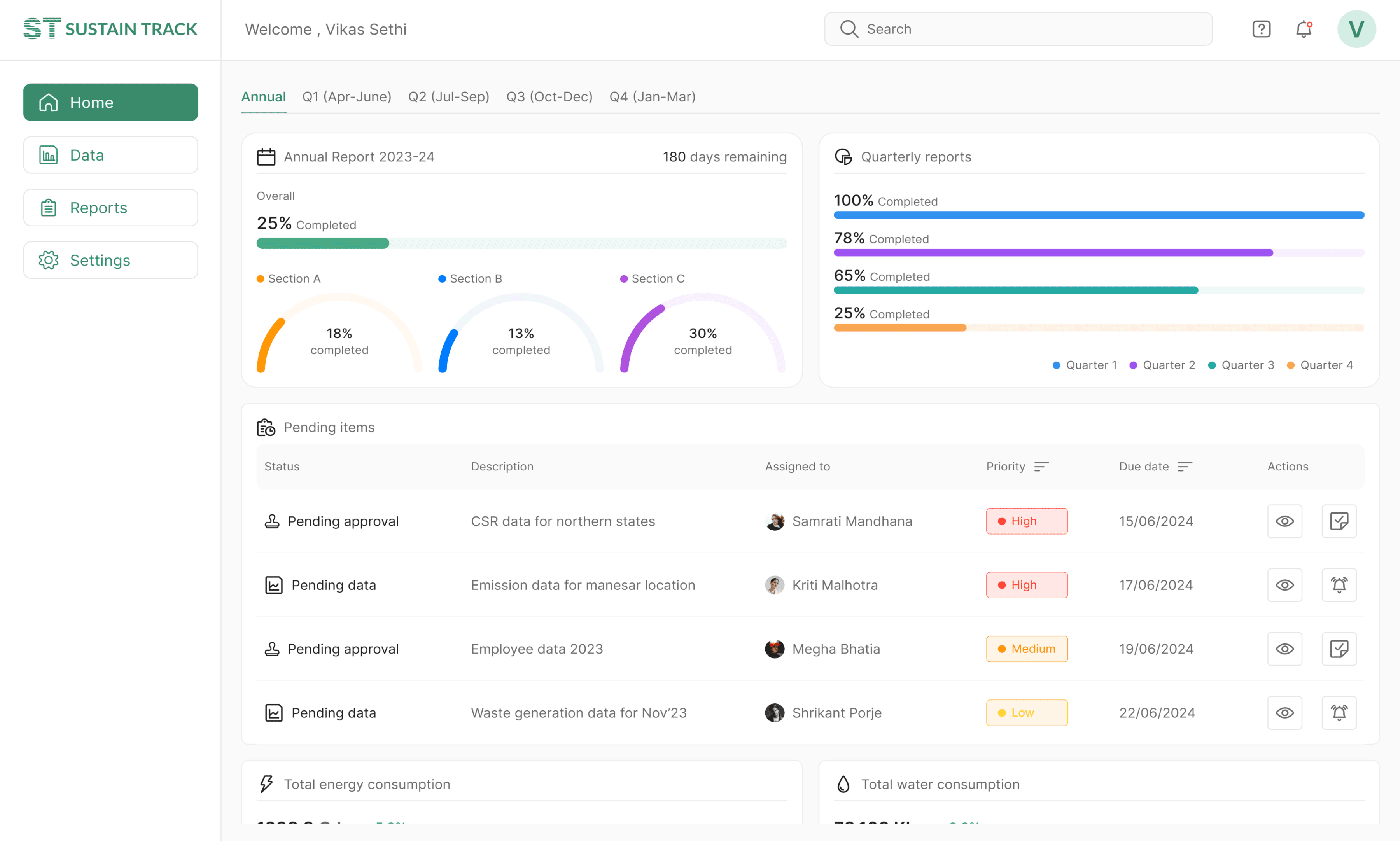
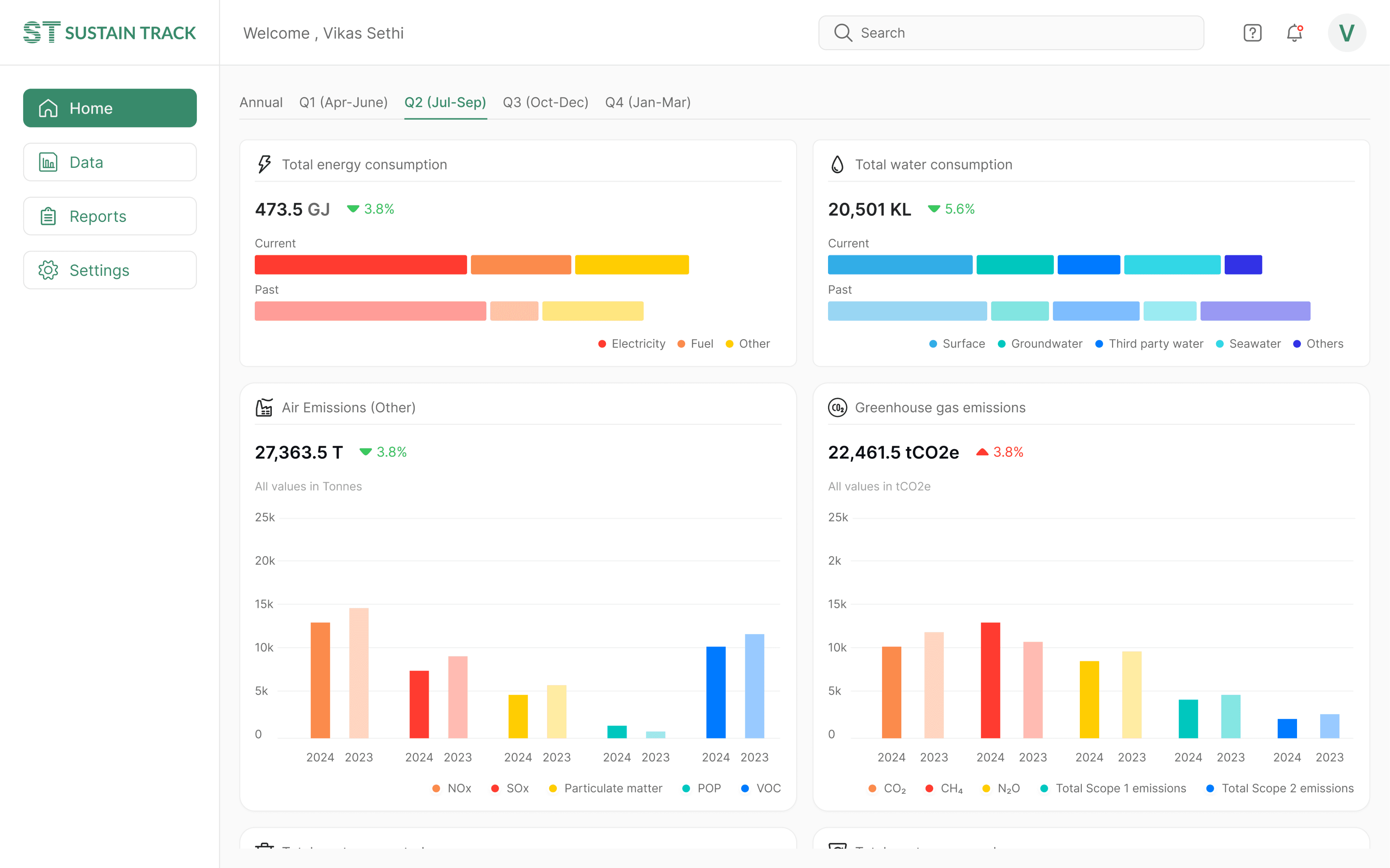
Home Section: This dashboard provides an overview of the report’s status, tracking progress across annual and quarterly reports. It displayed pending tasks, completion status, and key ESG metrics like energy consumption, emissions, and employee data.
Report Tab: This section allows users to navigate different parts of the report via a sidebar and view reports from different quarters. Users can enter data into reports which is not updated from data integrations or cannot be updated automatically.
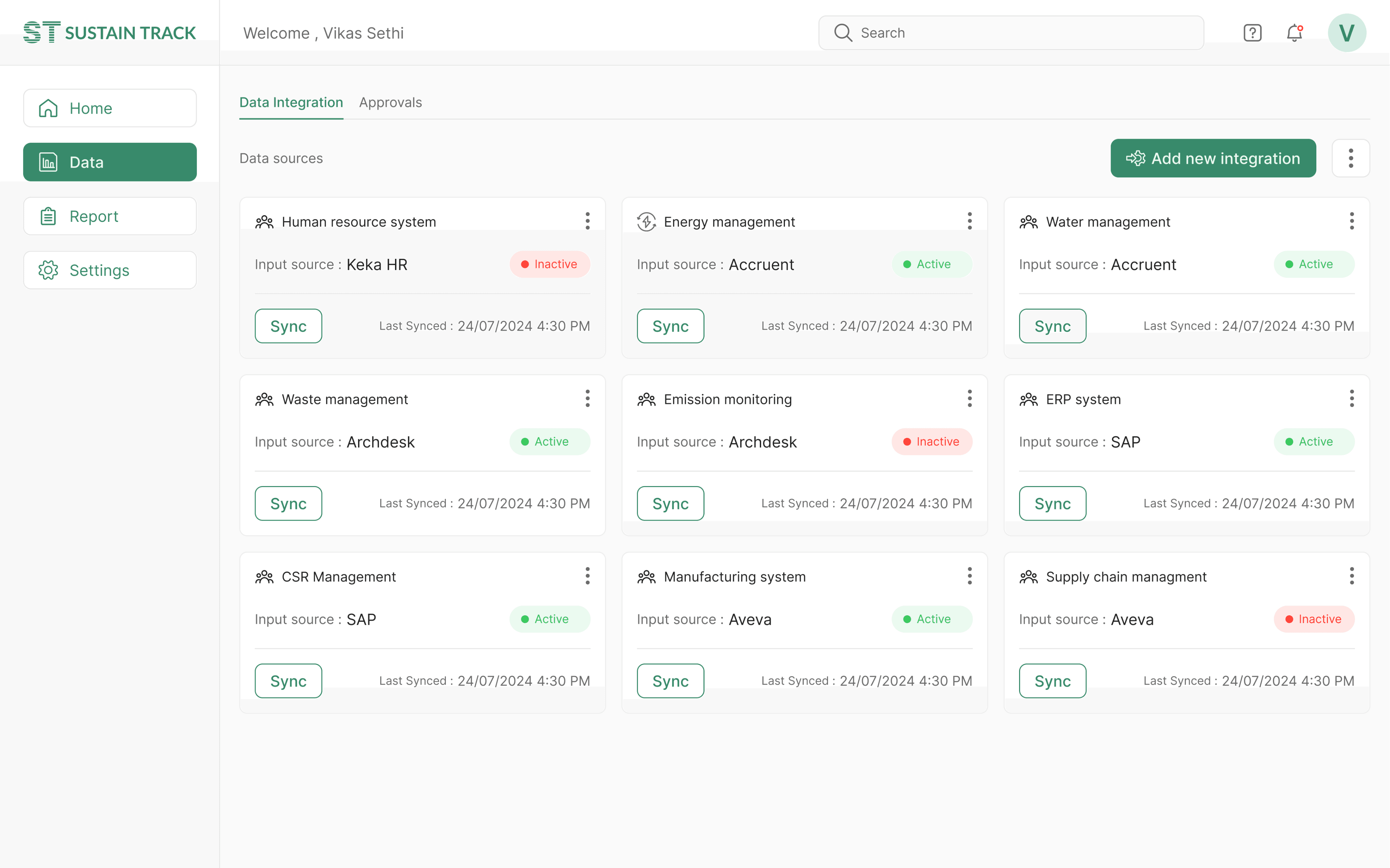
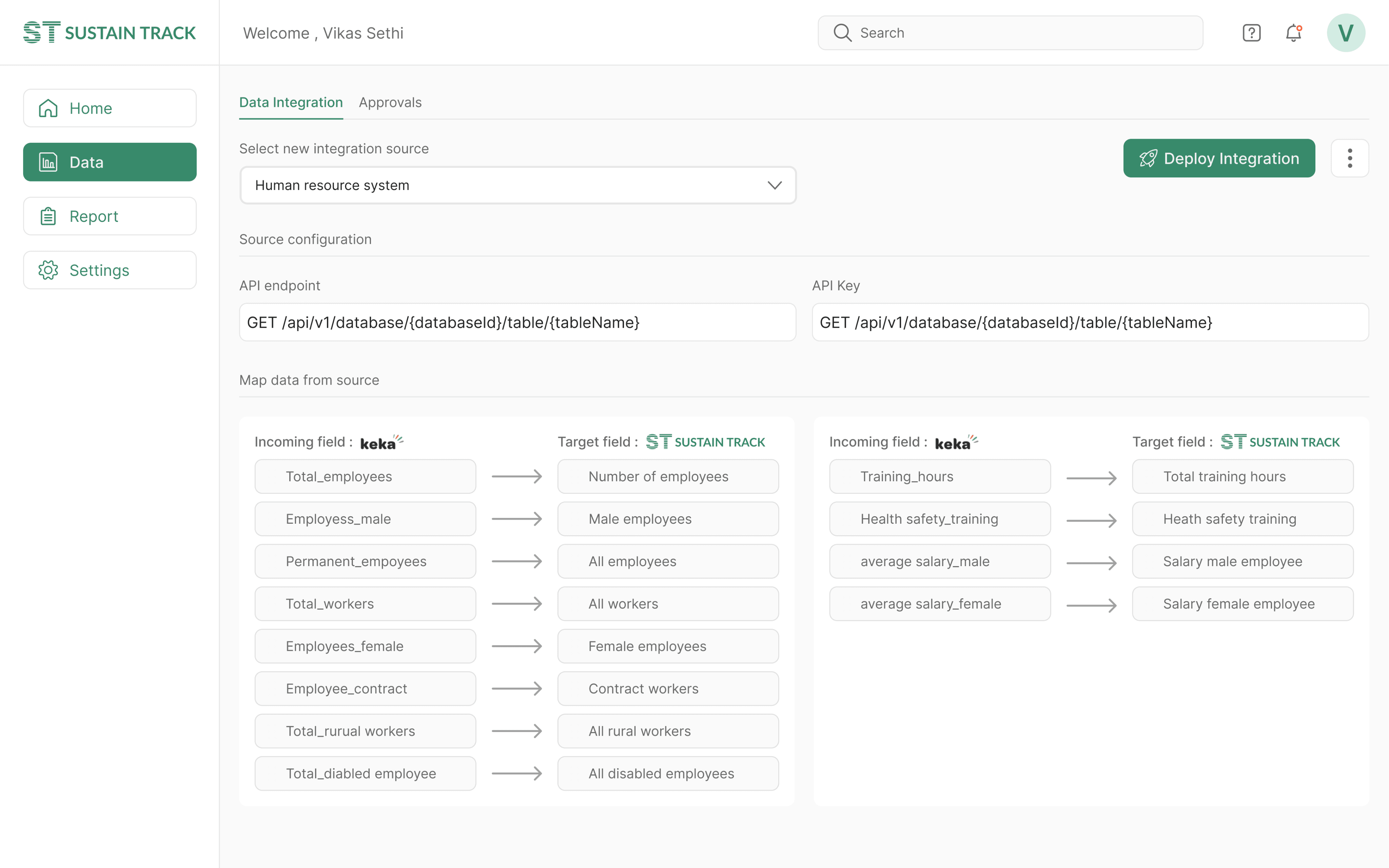
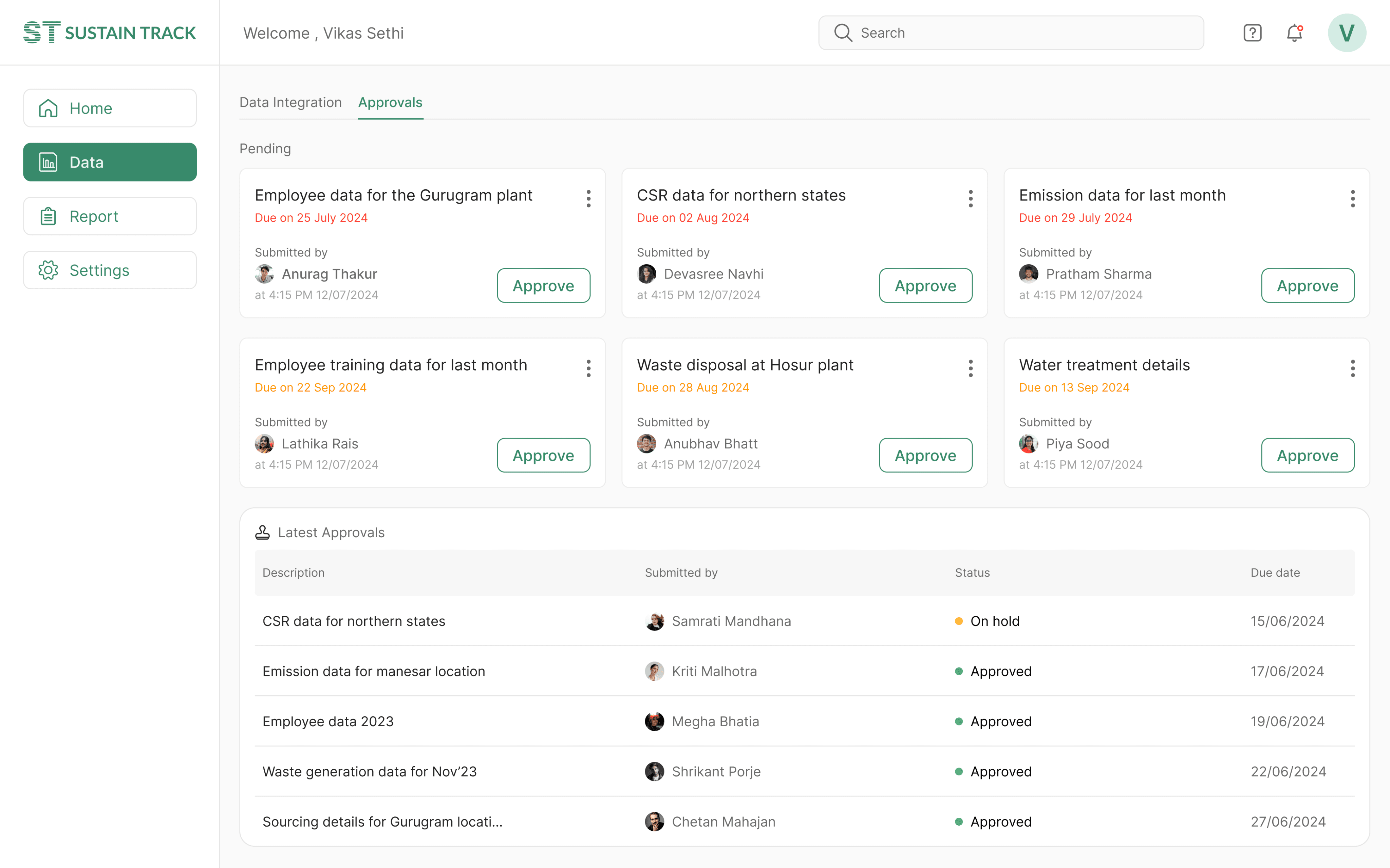
Data Tab: Split into Data Integration, Data Entry, and Approvals, this section helped users manage data sources, and track tasks pending approval. The integration feature allowed users to add new data sources, making the platform adaptable to different company needs.
Latest design - Prototype
Latest design - Prototype
Latest design - Prototype
THE SOLUTION
Simplifying sustainable reporting
The objective was clear: build a solution that helps companies collect, manage, and report on their ESG (Environmental, Social, and Governance) data in line with SEBI’s BRSR guidelines. The software would simplify the process of generating reports, ensuring compliance with regulations while reducing the burden on organizations.
The project’s scope initially felt overwhelming. Designing software to manage complex sustainability data wasn’t something I had done before. I turned to cross-functional collaboration—sustainability experts, data scientists, and the marketing team all played critical roles in shaping the product’s features.
The final design consisted of three major modules: Home, Report, and Data.
Home Section: This dashboard provides an overview of the report’s status, tracking progress across annual and quarterly reports. It displayed pending tasks, completion status, and key ESG metrics like energy consumption, emissions, and employee data.
Report Tab: This section allows users to navigate different parts of the report via a sidebar and view reports from different quarters. Users can enter data into reports which is not updated from data integrations or cannot be updated automatically.
Data Tab: Split into Data Integration, Data Entry, and Approvals, this section helped users manage data sources, and track tasks pending approval. The integration feature allowed users to add new data sources, making the platform adaptable to different company needs.
Latest design - Prototype
PRELEMINARY DESIGN
What research, Just deliver the design in 2 days
Fifteen days into my new role, I was assigned to a sustainability project that had been stalled for four months. The previous designer had been unable to deliver the necessary designs due to a heavy workload and communication challenges with the sustainability team. I was provided with extensive reading materials, including official documents outlining the project vision and Go-to-Market strategy.
After a brief call with the sustainability manager to gain a deeper understanding of the project's goals, I was called into a meeting with our CTO and co-founder. He inquired about the project's progress and emphasized the urgency of moving forward. I requested additional time to conduct thorough research before finalizing the designs. However, due to the existing delays, I was tasked with delivering a prototype within three days.
I dedicated myself to the project and successfully delivered a mid-fidelity prototype within the tight deadline. My background knowledge of energy auditing and mechanical engineering came in handy as I comprehended complex sustainability reporting parameters.
Old design - Prototype
STAKEHOLDER FEEDBACK
Prototype is Ok, but something is missing
The stakeholders were impressed with the progress I made on the project, and the prototype received positive feedback. However, the team identified a few gaps in the design that I had not initially considered:
There was no functionality for integrating external data into the system.
A progress indicator to track the status of report completion was missing.
There were no mechanisms to validate the entered data to ensure compliance.
In response, I secured additional time from management to conduct further research, emphasizing the importance of following a user-centered design process to achieve better, more comprehensive outcomes.
RESEARCH
A Deep Dive into BRSR and ESG
Before jumping into design, I immersed myself in the world of sustainability reporting. The sustainability experts in the company shared their deep knowledge of BRSR requirements and industry pain points. I also conducted secondary research to understand market trends, challenges, and best practices.
The research revealed some key insights:

Complex data
Companies struggled with the detailed nature of BRSR, especially when it came to data collection and accuracy.

Cumbersome process
Implementing BRSR compliance was time-consuming and costly.
Customized solution
Companies required tailored solutions that aligned with both Indian regulations and global sustainability standards.
PROCESS
Navigating the Complexity
After conducting several brainstorming sessions with the team, we identified the following goals that our solution need to accomplish:
Generate reports as per statutory(government) requirements within specified time.
The report generation needs minimum manual effort and time on data collection.
The solution needs to be seamlessly integrated with other business systems (such as ERP, HR, and financial systems) to import relevant data directly into the system.
Users should be able to track and monitor key ESG parameters.
Users can examine the data to ensure compliance with requirements.
Next I came up with features for each user goal and defined user scenarios for each goals. Then we defined key user flows for each user interactions. I listed all the interaction elements and labels that are needed in a particular user flow. All the details are tabulated below.
Goals
Supporting feature
User interaction scenario
User flow
Content labels
Generate reports as per regularity requirements within specified time.
Report section
User views the status of reports
User clicks on the report tab.
User views the reports.
User clicks on any report to view it.
User navigates to different sections of the report from side navigation.
User generates pdf reports based on requirement
User clicks on the report.
User selects any report from all reports.
User opens and submits the report for approval.
User generates a pdf of report for submission.
Annual report, Q1 report, Q2 report, Q3 report, Q4 report, edit report , add new report, completion status, due date, last update, approval status, Report sections
The report generation needs minimum manual effort and time on data collection.
The solution need to have seamless integration with other business systems (like ERP, HR, and financial systems) to import relevant data directly into the system.
Users can examine the data to ensure compliance with requirements.
Data section
User connects an existing data system to software.
User clicks on data tab.
User clicks on new integration button.
User enters the details related to new integration.
User matches the data fields for the integration.
User submits all details to connect the integration.
Data is manually entered by user.
User clicks on the data tab.
User then selects the data entry tab.
User selects a report and clicks on edit report.
User enter data into the report.
User submits report for approval.
User examines the correctness of data and approves it.
User opens the data tab.
User clicks on approval tab from top navigation.
User views and selects tasks for approval.
User clicks on any card to view the task.
User approves the task after examining the task details
Data integration, data source, add new integration, Input source, last sync, sync, active, inactive, configure, save configuration, map data, target source, fetch data, source field, target field, API endpoint, API key, Deploy integration, Approvals, submitted by, latest approvals, description, due date, status
Users should be able to track and monitor key ESG parameters.
Home section
User views data on the dashboard
User opens the home tab.
User navigates to different tabs to view data from a particular time period.
User hovers over any element to view further details.
Annual report, quarter report, pending items, assigned to, status, description, priority, due date, actions, pending data, pending approval
PROCESS
Solving the information puzzle
After outlining all the content and navigation labels, I focused on organizing these elements into a coherent and meaningful hierarchical structure. This process was intellectually demanding, requiring multiple iterations and adjustments on paper before arriving at a suitable information architecture for the application.
As I progressed with designing additional screens, the information architecture evolved. Initially straightforward navigation paths became more complex once integrated into the prototype, revealing areas that needed refinement. The final information structure, depicted below, reflects these iterations and adjustments.

RESEARCH
A Deep Dive into BRSR and ESG
Before jumping into design, I immersed myself in the world of sustainability reporting. The sustainability experts in the company shared their deep knowledge of BRSR requirements and industry pain points. I also conducted secondary research to understand market trends, challenges, and best practices.
The research revealed some key insights:

Complex data
Companies struggled with the detailed nature of BRSR, especially when it came to data collection and accuracy.

Cumbersome process
Implementing BRSR compliance was time-consuming and costly.
Customized solution
Companies required tailored solutions that aligned with both Indian regulations and global sustainability standards.
PROCESS
Navigating the Complexity
After conducting several brainstorming sessions with the team, we identified the following goals that our solution need to accomplish:
Generate reports as per statutory(government) requirements within specified time.
The report generation needs minimum manual effort and time on data collection.
The solution needs to be seamlessly integrated with other business systems (such as ERP, HR, and financial systems) to import relevant data directly into the system.
Users should be able to track and monitor key ESG parameters.
Users can examine the data to ensure compliance with requirements.
Next I came up with features for each user goal and defined user scenarios for each goals. Then we defined key user flows for each user interactions. I listed all the interaction elements and labels that are needed in a particular user flow. All the details are tabulated below.
Goals
Supporting feature
User interaction scenario
User flow
Content labels
Generate reports as per regularity requirements within specified time.
Report section
User views the status of reports
User clicks on the report tab.
User views the reports.
User clicks on any report to view it.
User navigates to different sections of the report from side navigation.
User generates pdf reports based on requirement
User clicks on the report.
User selects any report from all reports.
User opens and submits the report for approval.
User generates a pdf of report for submission.
Annual report, Q1 report, Q2 report, Q3 report, Q4 report, edit report , add new report, completion status, due date, last update, approval status, Report sections
The report generation needs minimum manual effort and time on data collection.
The solution need to have seamless integration with other business systems (like ERP, HR, and financial systems) to import relevant data directly into the system.
Users can examine the data to ensure compliance with requirements.
Data section
User connects an existing data system to software.
User clicks on data tab.
User clicks on new integration button.
User enters the details related to new integration.
User matches the data fields for the integration.
User submits all details to connect the integration.
Data is manually entered by user.
User clicks on the data tab.
User then selects the data entry tab.
User selects a report and clicks on edit report.
User enter data into the report.
User submits report for approval.
User examines the correctness of data and approves it.
User opens the data tab.
User clicks on approval tab from top navigation.
User views and selects tasks for approval.
User clicks on any card to view the task.
User approves the task after examining the task details
Data integration, data source, add new integration, Input source, last sync, sync, active, inactive, configure, save configuration, map data, target source, fetch data, source field, target field, API endpoint, API key, Deploy integration, Approvals, submitted by, latest approvals, description, due date, status
Users should be able to track and monitor key ESG parameters.
Home section
User views data on the dashboard
User opens the home tab.
User navigates to different tabs to view data from a particular time period.
User hovers over any element to view further details.
Annual report, quarter report, pending items, assigned to, status, description, priority, due date, actions, pending data, pending approval
PROCESS
Solving the information puzzle
After outlining all the content and navigation labels, I focused on organizing these elements into a coherent and meaningful hierarchical structure. This process was intellectually demanding, requiring multiple iterations and adjustments on paper before arriving at a suitable information architecture for the application.
As I progressed with designing additional screens, the information architecture evolved. Initially straightforward navigation paths became more complex once integrated into the prototype, revealing areas that needed refinement. The final information structure, depicted below, reflects these iterations and adjustments.

VISUAL DESIGN
Selecting the typographical elements
I selected Inter for designing for this project due to its exceptional readability at smaller sizes, ensuring clarity for dense data displays. Its modern, clean aesthetic aligns with the professional nature of sustainability reporting.

VISUAL DESIGN
Filling the colors
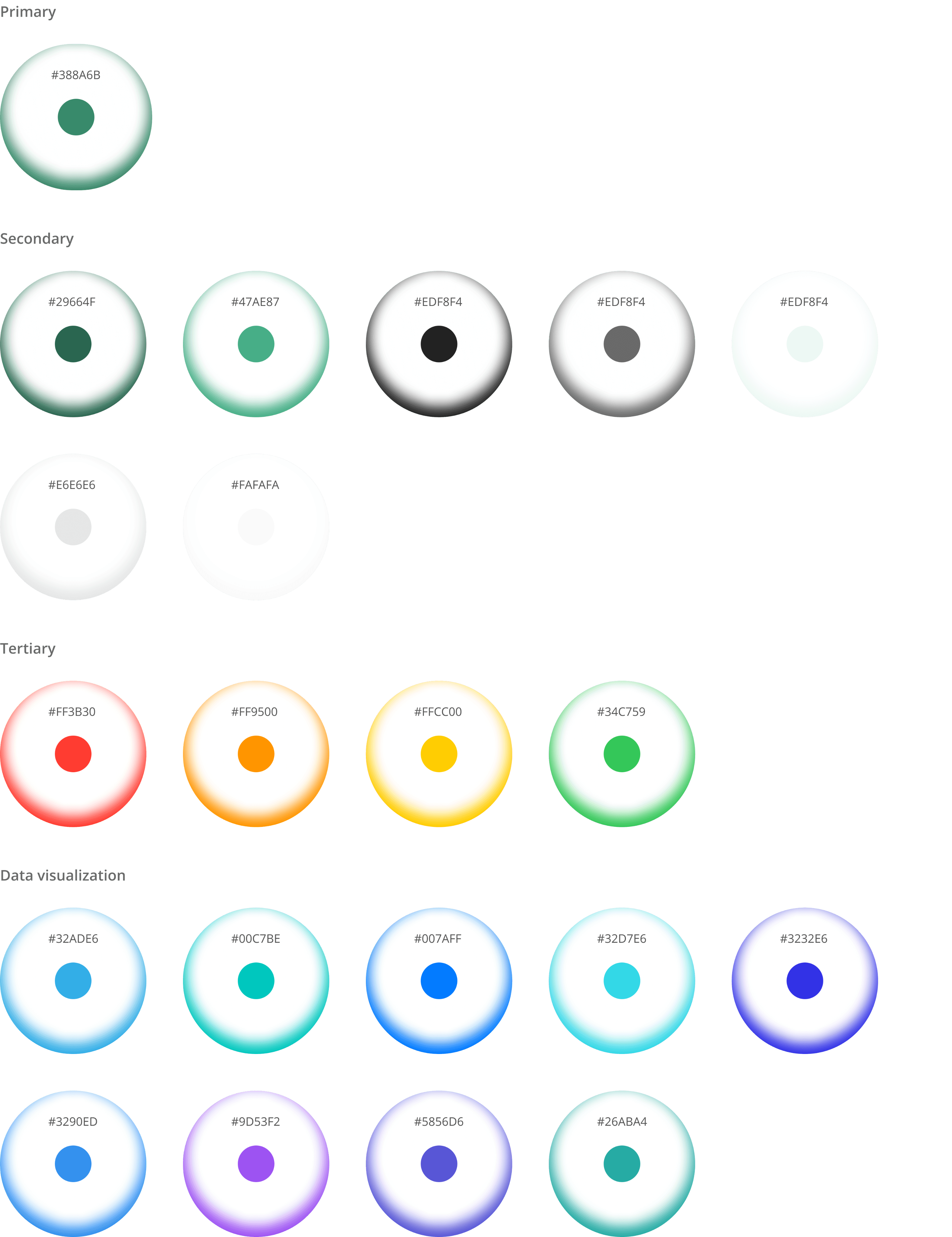
Sea Green (#388A6B) was perfect choice for me as the primary color for the this project. The color symbolizes sustainability, growth, and balance—perfectly reflecting the essence of sustainability reporting.

VISUAL DESIGN
Selecting the typographical elements
I selected Inter for designing for this project due to its exceptional readability at smaller sizes, ensuring clarity for dense data displays. Its modern, clean aesthetic aligns with the professional nature of sustainability reporting.

VISUAL DESIGN
Filling the colors
Sea Green (#388A6B) was perfect choice for me as the primary color for the this project. The color symbolizes sustainability, growth, and balance—perfectly reflecting the essence of sustainability reporting.


VISUAL DESIGN
Selecting the typographical elements
I selected Inter for designing for this project due to its exceptional readability at smaller sizes, ensuring clarity for dense data displays. Its modern, clean aesthetic aligns with the professional nature of sustainability reporting.

VISUAL DESIGN
Filling the colors
Sea Green (#388A6B) was perfect choice for me as the primary color for the this project. The color symbolizes sustainability, growth, and balance—perfectly reflecting the essence of sustainability reporting.


VISUAL DESIGN
Selecting the typographical elements
I selected Inter for designing for this project due to its exceptional readability at smaller sizes, ensuring clarity for dense data displays. Its modern, clean aesthetic aligns with the professional nature of sustainability reporting.

VISUAL DESIGN
Filling the colors
Sea Green (#388A6B) was perfect choice for me as the primary color for the this project. The color symbolizes sustainability, growth, and balance—perfectly reflecting the essence of sustainability reporting.


VISUAL DESIGN
Selecting the typographical elements
I selected Inter for designing for this project due to its exceptional readability at smaller sizes, ensuring clarity for dense data displays. Its modern, clean aesthetic aligns with the professional nature of sustainability reporting.

VISUAL DESIGN
Filling the colors
Sea Green (#388A6B) was perfect choice for me as the primary color for the this project. The color symbolizes sustainability, growth, and balance—perfectly reflecting the essence of sustainability reporting.


VISUAL DESIGN
Home page design : Showing what matters
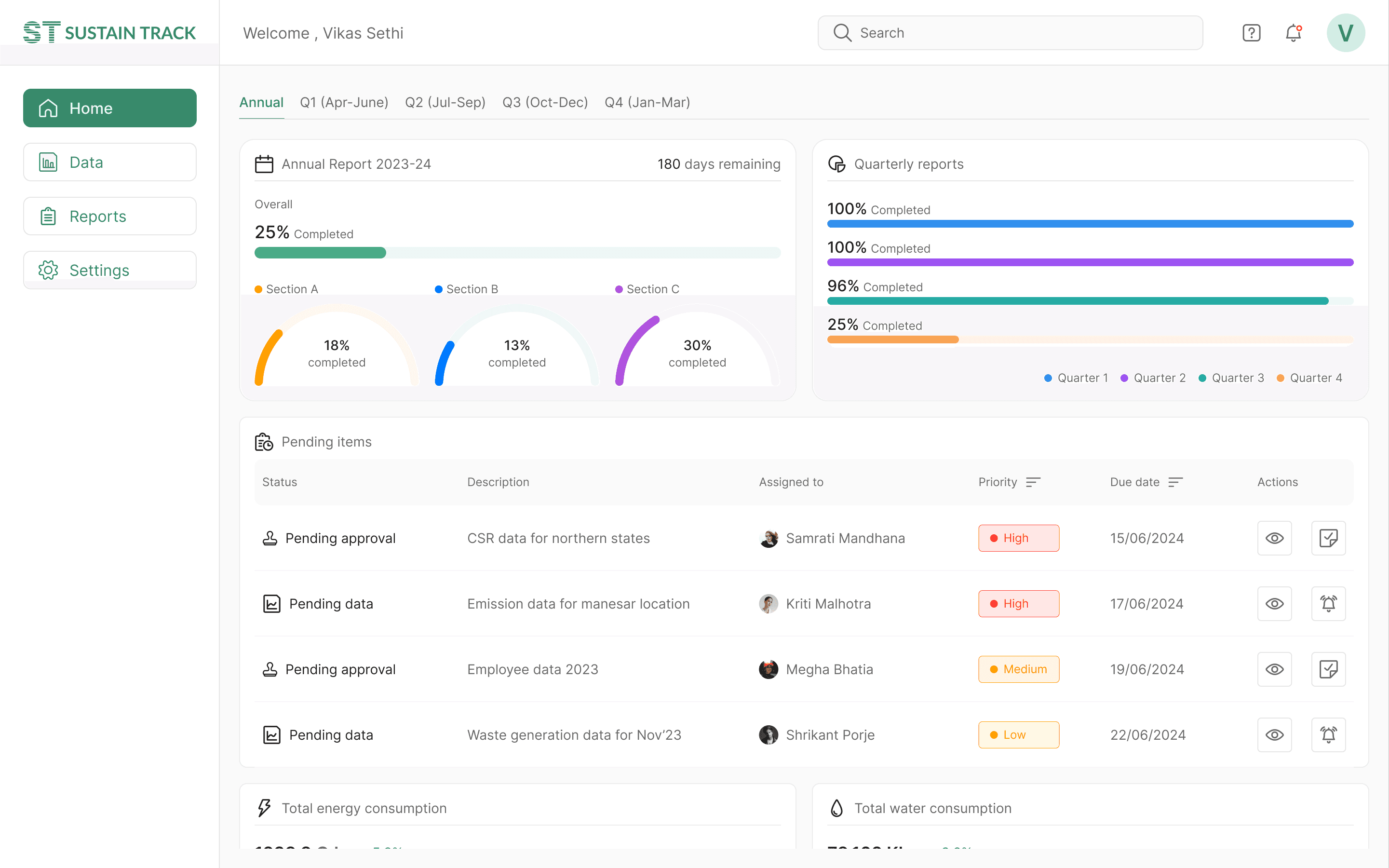
The biggest challenge in designing the home page was displaying data that’s relevant to all types of users. If the CEO opens the dashboard, they should grasp the overall status within seconds. For a sustainability manager, the page needs to provide a bird's-eye view of the full BRSR report.
The report covers three sections with over 100 data points. I worked with data scientists and sustainability managers to prioritize this information and choose what was most relevant for the dashboard. The data scientists also validated the graphical elements I selected based on my wireframes.
VISUAL DESIGN
Data page design : Data collection made easy
The report required hundreds of data points from various departments, including emissions, waste, consumer complaints, CSR activities, financials, and employee data.
This process was highly time-consuming and cumbersome for the sustainability manager. Most organizations used separate systems for tracking data, like ERP systems for operations and HR systems for employee information.
After several discussions with the team and drawing on their past experience, we proposed a data integration solution to collect data from all the organization's existing systems.
This posed a challenge for me, as I had never designed such a system before. After multiple iterations and extensive back-and-forth with the developers to find the optimal solution, we arrived at a final design for the data integration.
VISUAL DESIGN
Data page design : Ensuring quality of data
A shortcoming in previous iterations was the lack of quality control procedures within the program. I addressed this by implementing a verification system for each piece of information input into the system.
After several discussions with the team and drawing on their past experience, we proposed a data integration solution to collect data from all the organization's existing systems.
This posed a challenge for me, as I had never designed such a system before. After multiple iterations and extensive back-and-forth with the developers to find the optimal solution, we arrived at a final design for the data integration.
VISUAL DESIGN
Report page design : Stitching it all together
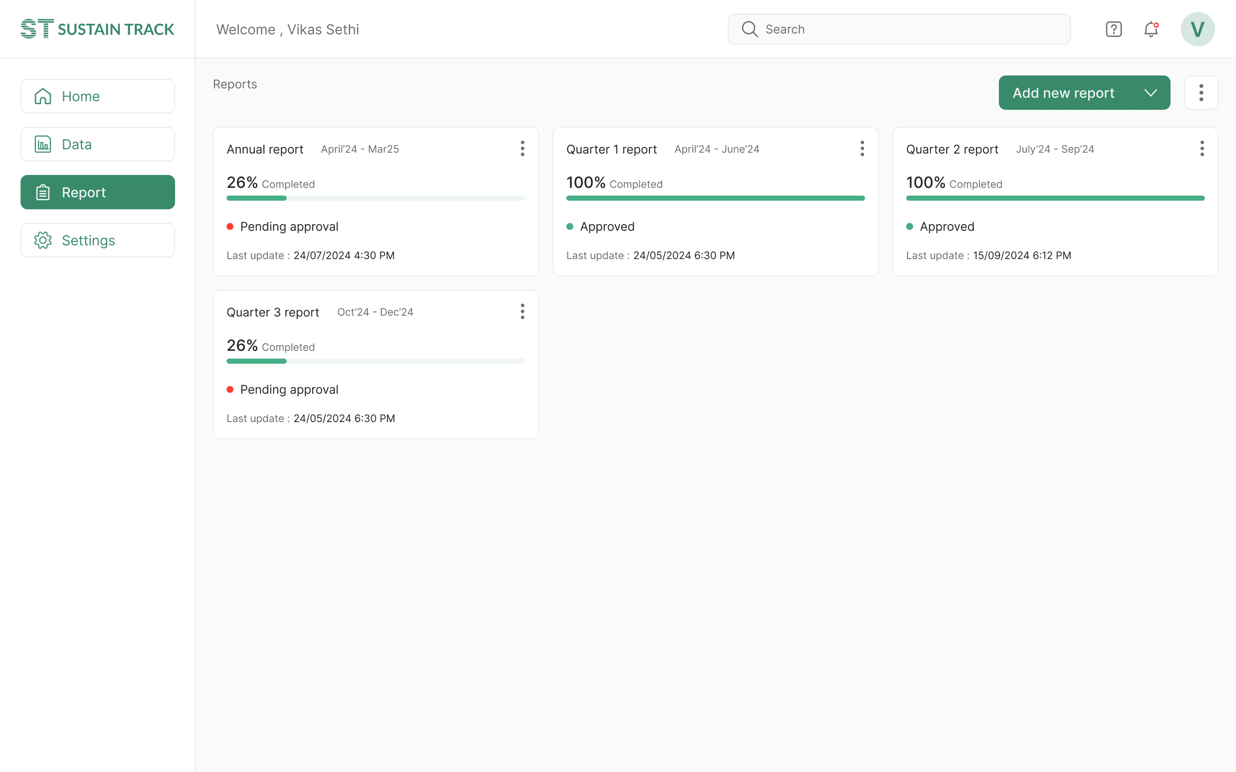
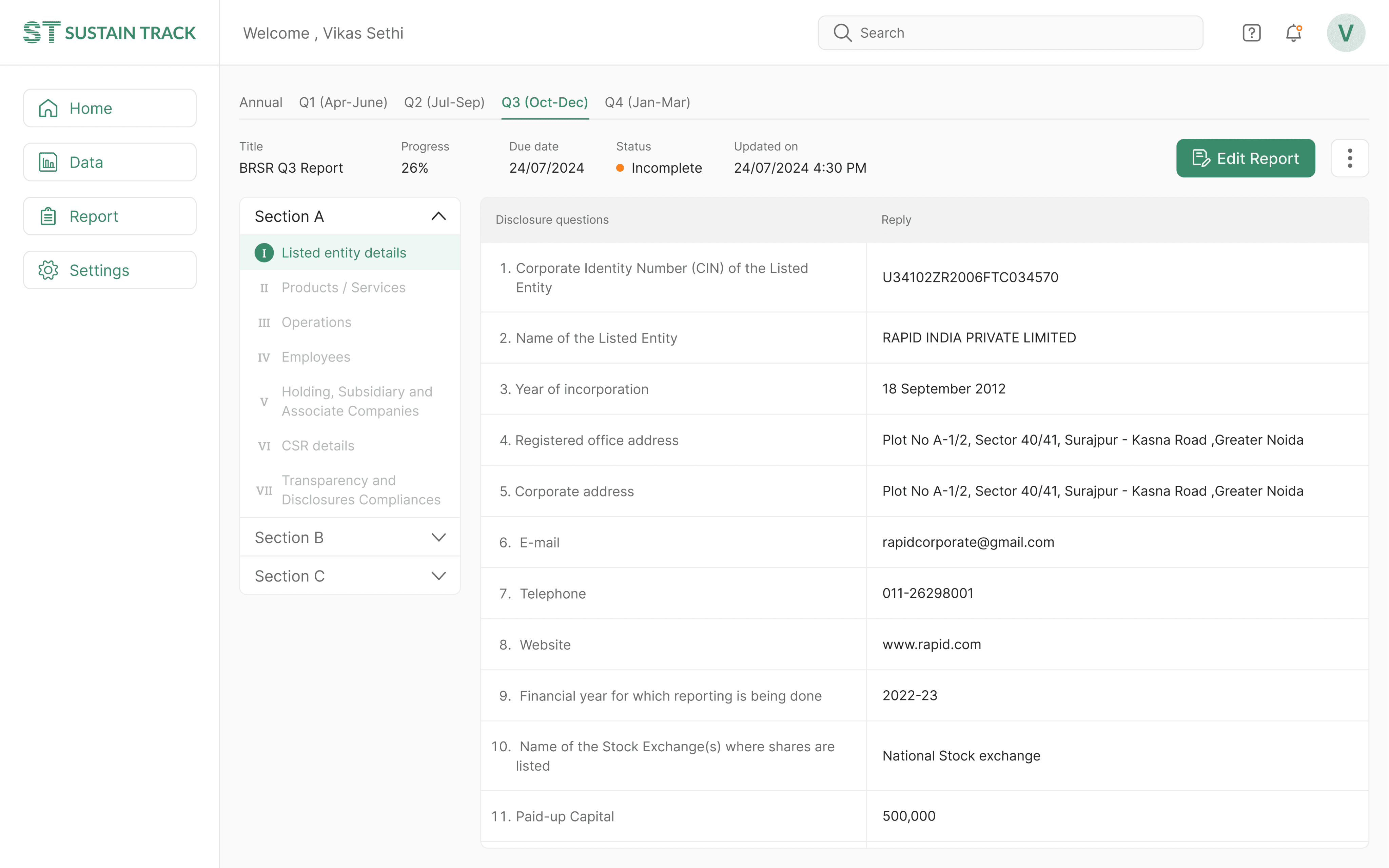
The primary goal of this application is to compile an annual Business Responsibility and Sustainability report. During the wireframing stage, I came up with the idea to divide the report into four sections, aligned with the quarters of a financial year. This approach would encourage organizations to gather and document data each quarter, preventing the workload from accumulating at the end of the year.
I presented this solution to the team and shared the wireframes. Initially, they were hesitant, but after I outlined the benefits, they agreed.
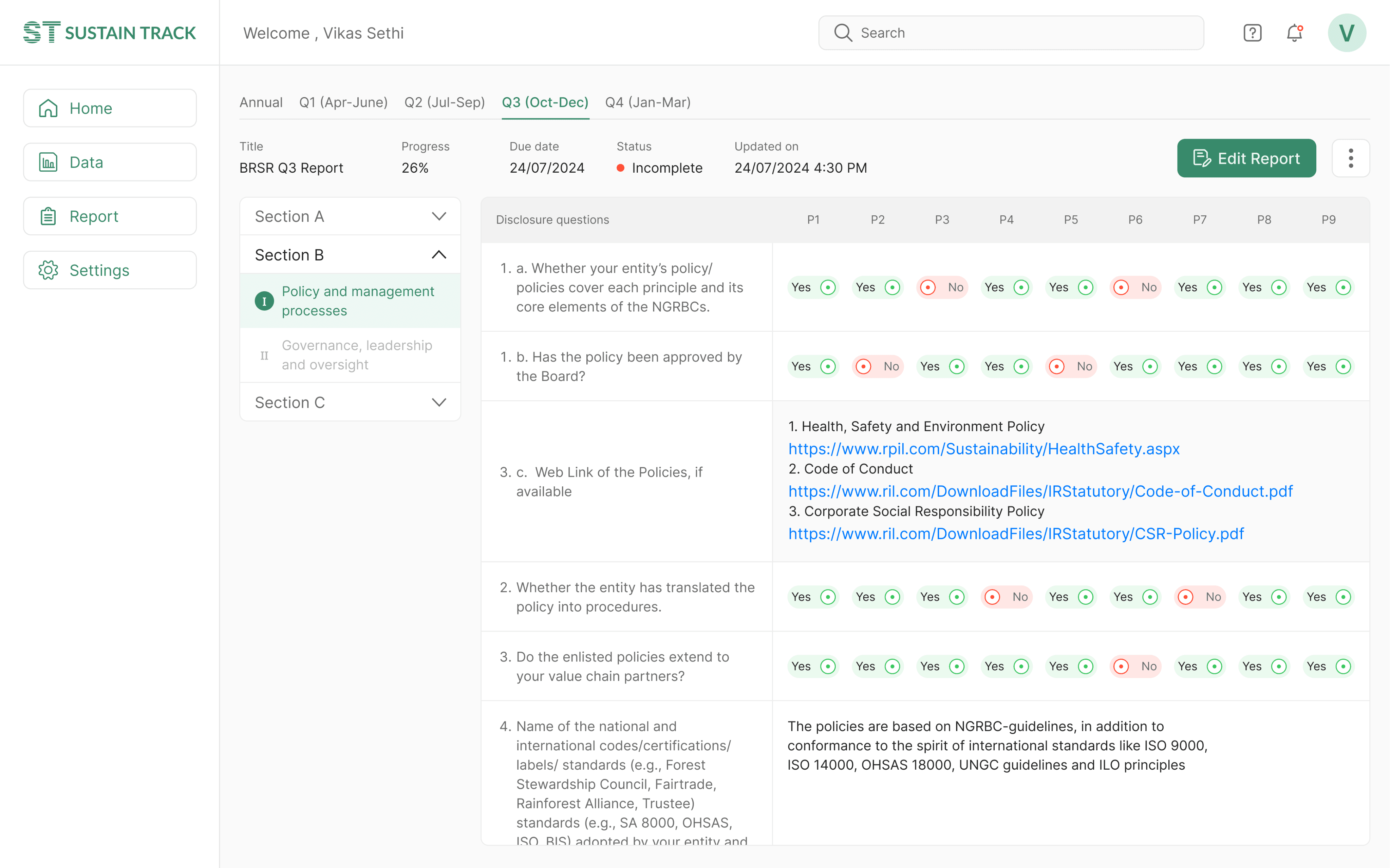
Another challenge arose since not all data points could be automatically updated through the data integration system. Some required manual input. To address this, I implemented data entry forms within the report section. Users could navigate through different parts of the report using the side navigation and fill in the missing data manually.
VISUAL DESIGN
Home page design : Showing what matters
The biggest challenge in designing the home page was displaying data that’s relevant to all types of users. If the CEO opens the dashboard, they should grasp the overall status within seconds. For a sustainability manager, the page needs to provide a bird's-eye view of the full BRSR report.
The report covers three sections with over 100 data points. I worked with data scientists and sustainability managers to prioritize this information and choose what was most relevant for the dashboard. The data scientists also validated the graphical elements I selected based on my wireframes.


VISUAL DESIGN
Data page design : Data collection made easy
The report required hundreds of data points from various departments, including emissions, waste, consumer complaints, CSR activities, financials, and employee data.
This process was highly time-consuming and cumbersome for the sustainability manager. Most organizations used separate systems for tracking data, like ERP systems for operations and HR systems for employee information.
After several discussions with the team and drawing on their past experience, we proposed a data integration solution to collect data from all the organization's existing systems.
This posed a challenge for me, as I had never designed such a system before. After multiple iterations and extensive back-and-forth with the developers to find the optimal solution, we arrived at a final design for the data integration.


VISUAL DESIGN
Data page design : Ensuring quality of data
A shortcoming in previous iterations was the lack of quality control procedures within the program. I addressed this by implementing a verification system for each piece of information input into the system.
After several discussions with the team and drawing on their past experience, we proposed a data integration solution to collect data from all the organization's existing systems.
This posed a challenge for me, as I had never designed such a system before. After multiple iterations and extensive back-and-forth with the developers to find the optimal solution, we arrived at a final design for the data integration.

VISUAL DESIGN
Report page design : Stitching it all together
The primary goal of this application is to compile an annual Business Responsibility and Sustainability report. During the wireframing stage, I came up with the idea to divide the report into four sections, aligned with the quarters of a financial year. This approach would encourage organizations to gather and document data each quarter, preventing the workload from accumulating at the end of the year.
I presented this solution to the team and shared the wireframes. Initially, they were hesitant, but after I outlined the benefits, they agreed.
Another challenge arose since not all data points could be automatically updated through the data integration system. Some required manual input. To address this, I implemented data entry forms within the report section. Users could navigate through different parts of the report using the side navigation and fill in the missing data manually.


OUTCOME
The final showdown
I presented the final solution to the stakeholder two weeks after our last meeting. They appreciated the designs and suggested a few minor changes. After incorporating those, I handed the prototype to the marketing team, who presented it to investors.
For several days, there were no updates, so I shifted my focus to other projects. Then one day, our team was called into a meeting where the founder announced that we had secured funding for the project. Everyone was thrilled. For me, it was a personal victory and a significant milestone in my design journey.
LEARNINGS
What did I learn
Simplifying Complexity with Structure
Dividing the BRSR report into quarterly sections turned a complicated, year-long task into something more manageable. This approach can be applied to similar problems where large datasets and long reporting periods are involved.
Clear Communication with Stakeholders
Being able to explain design decisions clearly and justify changes helped build trust within the team. Even when the stakeholders were skeptical at first, transparent communication led to alignment and success.
The Power of Prototyping
Delivering a well-thought-out prototype on a tight deadline showed how valuable rapid prototyping is. This skill played a key role in securing funding and moving the project forward.
Lets create excellent products!
CONTACT
vikassethi2007@gmail.com
91-96546 65889
SOCIALS
vsdesigns.com
Lets create excellent products!
CONTACT
vikassethi2007@gmail.com
91-96546 65889
SOCIALS
vsdesigns.com
Lets create excellent products!
CONTACT
vikassethi2007@gmail.com
91-96546 65889
SOCIALS
vsdesigns.com
Lets create excellent products!
vikassethi2007@gmail.com
96546 65889
vsdesigns.com
Lets create excellent products!
CONTACT
vikassethi2007@gmail.com
91-96546 65889
SOCIALS
vsdesigns.com
Lets create excellent products!
vikassethi2007@gmail.com
96546 65889
vsdesigns.com
RESEARCH
A Deep Dive into BRSR and ESG
Before jumping into design, I immersed myself in the world of sustainability reporting. The sustainability experts in the company shared their deep knowledge of BRSR requirements and industry pain points. I also conducted secondary research to understand market trends, challenges, and best practices.
The research revealed some key insights:

Complex data
Companies struggled with the detailed nature of BRSR, especially when it came to data collection and accuracy.

Cumbersome process
Implementing BRSR compliance was time-consuming and costly.
Customized solution
Companies required tailored solutions that aligned with both Indian regulations and global sustainability standards.
PROCESS
Navigating the Complexity
After conducting several brainstorming sessions with the team, we identified the following goals that our solution need to accomplish:
Generate reports as per statutory(government) requirements within specified time.
The report generation needs minimum manual effort and time on data collection.
The solution needs to be seamlessly integrated with other business systems (such as ERP, HR, and financial systems) to import relevant data directly into the system.
Users should be able to track and monitor key ESG parameters.
Users can examine the data to ensure compliance with requirements.
Next I came up with features for each user goal and defined user scenarios for each goals. Then we defined key user flows for each user interactions. I listed all the interaction elements and labels that are needed in a particular user flow. All the details are tabulated below.


PROCESS
Solving the information puzzle
After outlining all the content and navigation labels, I focused on organizing these elements into a coherent and meaningful hierarchical structure. This process was intellectually demanding, requiring multiple iterations and adjustments on paper before arriving at a suitable information architecture for the application.
As I progressed with designing additional screens, the information architecture evolved. Initially straightforward navigation paths became more complex once integrated into the prototype, revealing areas that needed refinement. The final information structure, depicted below, reflects these iterations and adjustments.

RESEARCH
A Deep Dive into BRSR and ESG
Before jumping into design, I immersed myself in the world of sustainability reporting. The sustainability experts in the company shared their deep knowledge of BRSR requirements and industry pain points. I also conducted secondary research to understand market trends, challenges, and best practices.
The research revealed some key insights:

Complex data
Companies struggled with the detailed nature of BRSR, especially when it came to data collection and accuracy.

Cumbersome process
Implementing BRSR compliance was time-consuming and costly.
Customized solution
Companies required tailored solutions that aligned with both Indian regulations and global sustainability standards.
PROCESS
Navigating the Complexity
After conducting several brainstorming sessions with the team, we identified the following goals that our solution need to accomplish:
Generate reports as per statutory(government) requirements within specified time.
The report generation needs minimum manual effort and time on data collection.
The solution needs to be seamlessly integrated with other business systems (such as ERP, HR, and financial systems) to import relevant data directly into the system.
Users should be able to track and monitor key ESG parameters.
Users can examine the data to ensure compliance with requirements.
Next I came up with features for each user goal and defined user scenarios for each goals. Then we defined key user flows for each user interactions. I listed all the interaction elements and labels that are needed in a particular user flow. All the details are tabulated below.


PROCESS
Solving the information puzzle
After outlining all the content and navigation labels, I focused on organizing these elements into a coherent and meaningful hierarchical structure. This process was intellectually demanding, requiring multiple iterations and adjustments on paper before arriving at a suitable information architecture for the application.
As I progressed with designing additional screens, the information architecture evolved. Initially straightforward navigation paths became more complex once integrated into the prototype, revealing areas that needed refinement. The final information structure, depicted below, reflects these iterations and adjustments.

RESEARCH
A Deep Dive into BRSR and ESG
Before jumping into design, I immersed myself in the world of sustainability reporting. The sustainability experts in the company shared their deep knowledge of BRSR requirements and industry pain points. I also conducted secondary research to understand market trends, challenges, and best practices.
The research revealed some key insights:

Complex data
Companies struggled with the detailed nature of BRSR, especially when it came to data collection and accuracy.

Cumbersome process
Implementing BRSR compliance was time-consuming and costly.
Customized solution
Companies required tailored solutions that aligned with both Indian regulations and global sustainability standards.
PROCESS
Navigating the Complexity
After conducting several brainstorming sessions with the team, we identified the following goals that our solution need to accomplish:
Generate reports as per statutory(government) requirements within specified time.
The report generation needs minimum manual effort and time on data collection.
The solution needs to be seamlessly integrated with other business systems (such as ERP, HR, and financial systems) to import relevant data directly into the system.
Users should be able to track and monitor key ESG parameters.
Users can examine the data to ensure compliance with requirements.
Next I came up with features for each user goal and defined user scenarios for each goals. Then we defined key user flows for each user interactions. I listed all the interaction elements and labels that are needed in a particular user flow. All the details are tabulated below.


PROCESS
Solving the information puzzle
After outlining all the content and navigation labels, I focused on organizing these elements into a coherent and meaningful hierarchical structure. This process was intellectually demanding, requiring multiple iterations and adjustments on paper before arriving at a suitable information architecture for the application.
As I progressed with designing additional screens, the information architecture evolved. Initially straightforward navigation paths became more complex once integrated into the prototype, revealing areas that needed refinement. The final information structure, depicted below, reflects these iterations and adjustments.

RESEARCH
A Deep Dive into BRSR and ESG
Before jumping into design, I immersed myself in the world of sustainability reporting. The sustainability experts in the company shared their deep knowledge of BRSR requirements and industry pain points. I also conducted secondary research to understand market trends, challenges, and best practices.
The research revealed some key insights:

Complex data
Companies struggled with the detailed nature of BRSR, especially when it came to data collection and accuracy.

Cumbersome process
Implementing BRSR compliance was time-consuming and costly.
Customized solution
Companies required tailored solutions that aligned with both Indian regulations and global sustainability standards.
PROCESS
Navigating the Complexity
After conducting several brainstorming sessions with the team, we identified the following goals that our solution need to accomplish:
Generate reports as per statutory(government) requirements within specified time.
The report generation needs minimum manual effort and time on data collection.
The solution needs to be seamlessly integrated with other business systems (such as ERP, HR, and financial systems) to import relevant data directly into the system.
Users should be able to track and monitor key ESG parameters.
Users can examine the data to ensure compliance with requirements.
Next I came up with features for each user goal and defined user scenarios for each goals. Then we defined key user flows for each user interactions. I listed all the interaction elements and labels that are needed in a particular user flow. All the details are tabulated below.


PROCESS
Solving the information puzzle
After outlining all the content and navigation labels, I focused on organizing these elements into a coherent and meaningful hierarchical structure. This process was intellectually demanding, requiring multiple iterations and adjustments on paper before arriving at a suitable information architecture for the application.
As I progressed with designing additional screens, the information architecture evolved. Initially straightforward navigation paths became more complex once integrated into the prototype, revealing areas that needed refinement. The final information structure, depicted below, reflects these iterations and adjustments.

VISUAL DESIGN
Home page design : Showing what matters
The biggest challenge in designing the home page was displaying data that’s relevant to all types of users. If the CEO opens the dashboard, they should grasp the overall status within seconds. For a sustainability manager, the page needs to provide a bird's-eye view of the full BRSR report.
The report covers three sections with over 100 data points. I worked with data scientists and sustainability managers to prioritize this information and choose what was most relevant for the dashboard. The data scientists also validated the graphical elements I selected based on my wireframes.


VISUAL DESIGN
Data page design : Data collection made easy
The report required hundreds of data points from various departments, including emissions, waste, consumer complaints, CSR activities, financials, and employee data.
This process was highly time-consuming and cumbersome for the sustainability manager. Most organizations used separate systems for tracking data, like ERP systems for operations and HR systems for employee information.
After several discussions with the team and drawing on their past experience, we proposed a data integration solution to collect data from all the organization's existing systems.
This posed a challenge for me, as I had never designed such a system before. After multiple iterations and extensive back-and-forth with the developers to find the optimal solution, we arrived at a final design for the data integration.


VISUAL DESIGN
Data page design : Ensuring quality of data
A shortcoming in previous iterations was the lack of quality control procedures within the program. I addressed this by implementing a verification system for each piece of information input into the system.
After several discussions with the team and drawing on their past experience, we proposed a data integration solution to collect data from all the organization's existing systems.
This posed a challenge for me, as I had never designed such a system before. After multiple iterations and extensive back-and-forth with the developers to find the optimal solution, we arrived at a final design for the data integration.

VISUAL DESIGN
Report page design : Stitching it all together
The primary goal of this application is to compile an annual Business Responsibility and Sustainability report. During the wireframing stage, I came up with the idea to divide the report into four sections, aligned with the quarters of a financial year. This approach would encourage organizations to gather and document data each quarter, preventing the workload from accumulating at the end of the year.
I presented this solution to the team and shared the wireframes. Initially, they were hesitant, but after I outlined the benefits, they agreed.
Another challenge arose since not all data points could be automatically updated through the data integration system. Some required manual input. To address this, I implemented data entry forms within the report section. Users could navigate through different parts of the report using the side navigation and fill in the missing data manually.


VISUAL DESIGN
Home page design : Showing what matters
The biggest challenge in designing the home page was displaying data that’s relevant to all types of users. If the CEO opens the dashboard, they should grasp the overall status within seconds. For a sustainability manager, the page needs to provide a bird's-eye view of the full BRSR report.
The report covers three sections with over 100 data points. I worked with data scientists and sustainability managers to prioritize this information and choose what was most relevant for the dashboard. The data scientists also validated the graphical elements I selected based on my wireframes.


VISUAL DESIGN
Data page design : Data collection made easy
The report required hundreds of data points from various departments, including emissions, waste, consumer complaints, CSR activities, financials, and employee data.
This process was highly time-consuming and cumbersome for the sustainability manager. Most organizations used separate systems for tracking data, like ERP systems for operations and HR systems for employee information.
After several discussions with the team and drawing on their past experience, we proposed a data integration solution to collect data from all the organization's existing systems.
This posed a challenge for me, as I had never designed such a system before. After multiple iterations and extensive back-and-forth with the developers to find the optimal solution, we arrived at a final design for the data integration.


VISUAL DESIGN
Data page design : Ensuring quality of data
A shortcoming in previous iterations was the lack of quality control procedures within the program. I addressed this by implementing a verification system for each piece of information input into the system.
After several discussions with the team and drawing on their past experience, we proposed a data integration solution to collect data from all the organization's existing systems.
This posed a challenge for me, as I had never designed such a system before. After multiple iterations and extensive back-and-forth with the developers to find the optimal solution, we arrived at a final design for the data integration.

VISUAL DESIGN
Report page design : Stitching it all together
The primary goal of this application is to compile an annual Business Responsibility and Sustainability report. During the wireframing stage, I came up with the idea to divide the report into four sections, aligned with the quarters of a financial year. This approach would encourage organizations to gather and document data each quarter, preventing the workload from accumulating at the end of the year.
I presented this solution to the team and shared the wireframes. Initially, they were hesitant, but after I outlined the benefits, they agreed.
Another challenge arose since not all data points could be automatically updated through the data integration system. Some required manual input. To address this, I implemented data entry forms within the report section. Users could navigate through different parts of the report using the side navigation and fill in the missing data manually.


VISUAL DESIGN
Home page design : Showing what matters
The biggest challenge in designing the home page was displaying data that’s relevant to all types of users. If the CEO opens the dashboard, they should grasp the overall status within seconds. For a sustainability manager, the page needs to provide a bird's-eye view of the full BRSR report.
The report covers three sections with over 100 data points. I worked with data scientists and sustainability managers to prioritize this information and choose what was most relevant for the dashboard. The data scientists also validated the graphical elements I selected based on my wireframes.


VISUAL DESIGN
Data page design : Data collection made easy
The report required hundreds of data points from various departments, including emissions, waste, consumer complaints, CSR activities, financials, and employee data.
This process was highly time-consuming and cumbersome for the sustainability manager. Most organizations used separate systems for tracking data, like ERP systems for operations and HR systems for employee information.
After several discussions with the team and drawing on their past experience, we proposed a data integration solution to collect data from all the organization's existing systems.
This posed a challenge for me, as I had never designed such a system before. After multiple iterations and extensive back-and-forth with the developers to find the optimal solution, we arrived at a final design for the data integration.


VISUAL DESIGN
Data page design : Ensuring quality of data
A shortcoming in previous iterations was the lack of quality control procedures within the program. I addressed this by implementing a verification system for each piece of information input into the system.
After several discussions with the team and drawing on their past experience, we proposed a data integration solution to collect data from all the organization's existing systems.
This posed a challenge for me, as I had never designed such a system before. After multiple iterations and extensive back-and-forth with the developers to find the optimal solution, we arrived at a final design for the data integration.

VISUAL DESIGN
Report page design : Stitching it all together
The primary goal of this application is to compile an annual Business Responsibility and Sustainability report. During the wireframing stage, I came up with the idea to divide the report into four sections, aligned with the quarters of a financial year. This approach would encourage organizations to gather and document data each quarter, preventing the workload from accumulating at the end of the year.
I presented this solution to the team and shared the wireframes. Initially, they were hesitant, but after I outlined the benefits, they agreed.
Another challenge arose since not all data points could be automatically updated through the data integration system. Some required manual input. To address this, I implemented data entry forms within the report section. Users could navigate through different parts of the report using the side navigation and fill in the missing data manually.


VISUAL DESIGN
Home page design : Showing what matters
The biggest challenge in designing the home page was displaying data that’s relevant to all types of users. If the CEO opens the dashboard, they should grasp the overall status within seconds. For a sustainability manager, the page needs to provide a bird's-eye view of the full BRSR report.
The report covers three sections with over 100 data points. I worked with data scientists and sustainability managers to prioritize this information and choose what was most relevant for the dashboard. The data scientists also validated the graphical elements I selected based on my wireframes.


VISUAL DESIGN
Data page design : Data collection made easy
The report required hundreds of data points from various departments, including emissions, waste, consumer complaints, CSR activities, financials, and employee data.
This process was highly time-consuming and cumbersome for the sustainability manager. Most organizations used separate systems for tracking data, like ERP systems for operations and HR systems for employee information.
After several discussions with the team and drawing on their past experience, we proposed a data integration solution to collect data from all the organization's existing systems.
This posed a challenge for me, as I had never designed such a system before. After multiple iterations and extensive back-and-forth with the developers to find the optimal solution, we arrived at a final design for the data integration.


VISUAL DESIGN
Data page design : Ensuring quality of data
A shortcoming in previous iterations was the lack of quality control procedures within the program. I addressed this by implementing a verification system for each piece of information input into the system.
After several discussions with the team and drawing on their past experience, we proposed a data integration solution to collect data from all the organization's existing systems.
This posed a challenge for me, as I had never designed such a system before. After multiple iterations and extensive back-and-forth with the developers to find the optimal solution, we arrived at a final design for the data integration.

VISUAL DESIGN
Report page design : Stitching it all together
The primary goal of this application is to compile an annual Business Responsibility and Sustainability report. During the wireframing stage, I came up with the idea to divide the report into four sections, aligned with the quarters of a financial year. This approach would encourage organizations to gather and document data each quarter, preventing the workload from accumulating at the end of the year.
I presented this solution to the team and shared the wireframes. Initially, they were hesitant, but after I outlined the benefits, they agreed.
Another challenge arose since not all data points could be automatically updated through the data integration system. Some required manual input. To address this, I implemented data entry forms within the report section. Users could navigate through different parts of the report using the side navigation and fill in the missing data manually.


Switch to Desktop/Tablet for better viewing experience
Switch to Desktop/Tablet for better viewing experience
Switch to Desktop/Tablet for better viewing experience
Switch to Desktop/Tablet for better viewing experience