Guide my

Career

Helping people make better career decisions

A UX Case study

Guide my

Career

Helping people make better career decisions

A UX Case study

Guide my

Career

Helping people make better career decisions

A UX Case study

The Problem

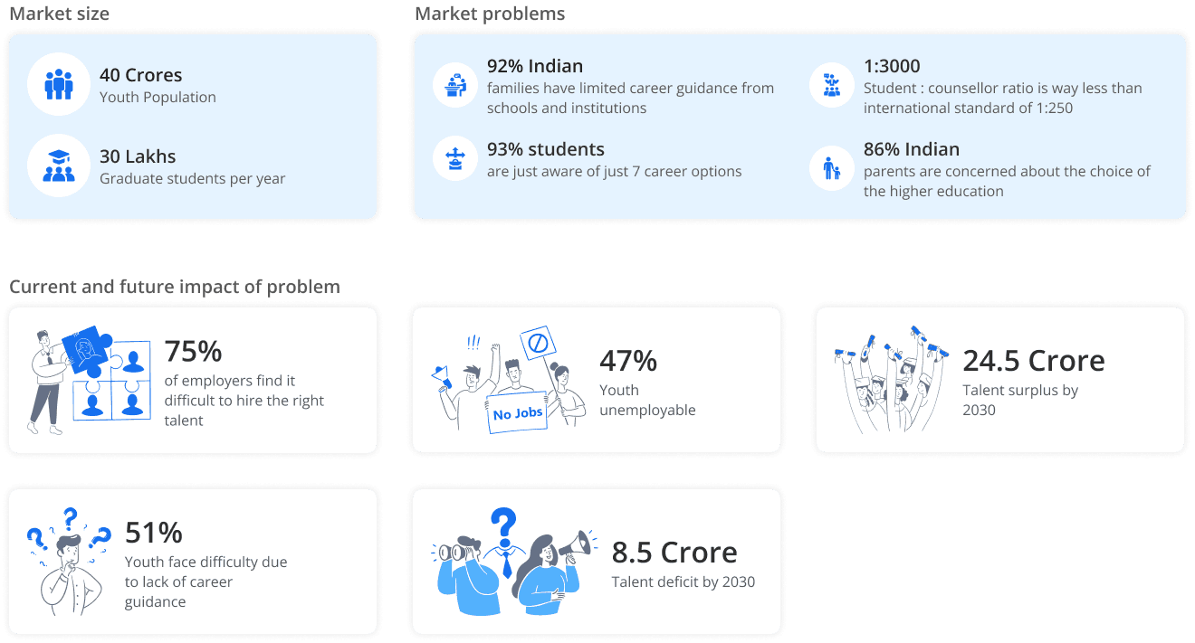
More than 90% of Indian households have limited or no access to Career Guidance.

Let me illustrate the problem with a short story about Hrithik.

Hrithik Kapoor

Hrithik, a 12th class student is enrolled in engineering entrance coaching which he hates.

His father wants him to become a chemical engineer like him and do a government job. Hrithik thinks he does not belong to engineering field.


He is passionate about art, sketching things and building model aero planes. But he does not know what to do with his passion and choose a career that offers some interesting work for him.

Due to lack of guidance and influence of his parents, Hrithik had to study chemical engineering despite his lack of interest in the field.

Guide my

Career

Mobile application for students and working professionals

Expected to help users in making career decisions

Offers solutions to questions like

What career to choose?

What to study for a selected career?

How to grow in a chosen career?

The Solution

Guide my

Career

Mobile application for students and working professionals

Expected to help users in making career decisions

Offers solutions to questions like

What career to choose?

What to study for a selected career?

How to grow in a chosen career?

The Solution

WHAT

Market Research

why

To understand and gain a deeper understanding of the problem

how

Read and collected data from differnet sources on the internet

WHAT

Market Research

why

To understand and gain a deeper understanding of the problem

how

Read and collected data from differnet sources on the internet

WHAT

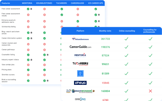
Secondary Research

why

To gain greater understanding target audience, competing products & services and mental models of existing users.

how

Conducted demographic study, comparative study and mental model analysis.

WHAT

Secondary Research

why

To gain greater understanding target audience, competing products & services and mental models of existing users.

how

Conducted demographic study, comparative study and mental model analysis.

1

Demographic study

Collected quantitative and qualitative information from target audience base to define focused demographic profiles.

2

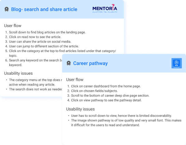
Comparative study

Studied competitors offering similar services. Key features of products were identified and benchmarked.

3

Mental model analysis

Mental model of the current audience was identified from the user flow of the benchmarked features.

Research insights

There is no collaborative platform existing today that can connect students, professionals, and counselors for knowledge sharing and cooperation.

There is an absence of any feature where students and early-stage professionals can experience different occupations through short assignments and internships.

There is no feature available in existing apps that list industry professionals who can mentor people about their areas of expertise.

WHAT

Primary Research

why

To gain insights and understand audience behavior, needs, preferences, and experiences with career guidance products and services.

how

Conducted 3 different surveys and interviewed 11 users to gain insights about their pain points and challenges.

THE PROCESS

The following activities were conduced as a part of Primary research.

Qualitative Influential Attributes (QIAs) Survey
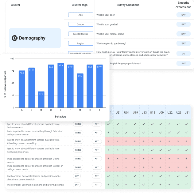
This survey was conducted to validate the behaviors, habits, aptitudes and attitudes of audience identified during secondary research.


Exploratory Survey
This activity was done to validate the finding of secondary research and generate user response data that is utilized in the formation of user groups


User Study & User Group Formation
This study was done to collate and evaluate user response data received form surveys to form user groups based on similarities and patterns in user responses.

User Interview and outcomes
User interviews were conducted to discover qualitative insights about user attitudes, beliefs, desires and experiences. Interview recordings were analyzed for deriving the user problems.

Causal Survey
This survey was conducted to validate the user problems derived from the user interviews. Insights from the survey responses were further studied and Interpretations were made.

WHAT

User Interviews

why

To gain qualitative insights user attitudes, beliefs, and experiences. To understand the exact pain points of users related to career guidance.
how

Conducted online structured interviews with participants and recorded the interviews for further study.
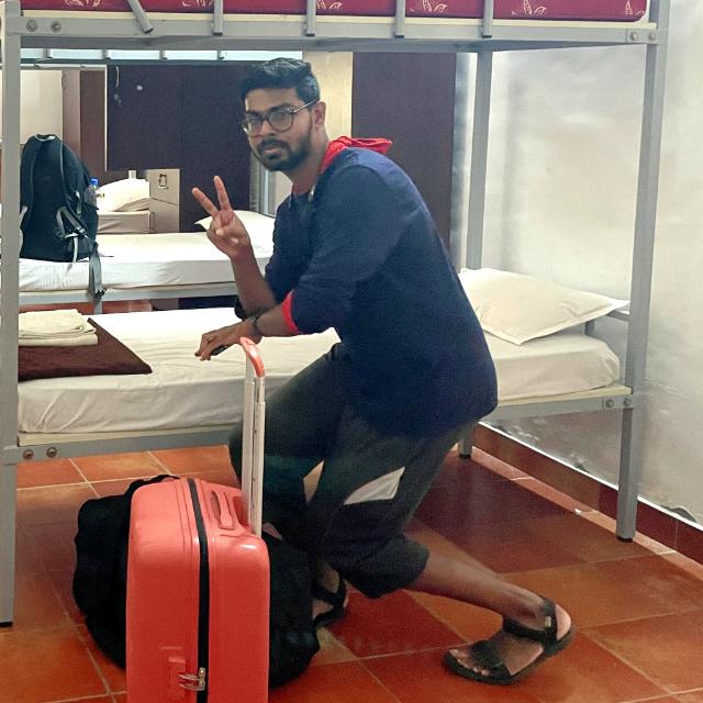
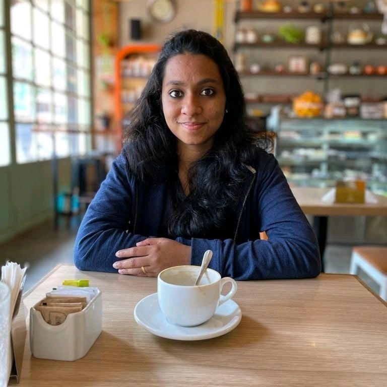
I managed to interview only 11 users out of 16 users who agreed as some people did not show up and some had other urgent issues at the time.

IMAGES ARE BLURRED TO PROTECT IDENTITY

Participants from User group 1

USER 04

USER 09

USER 22

USER 33

Participants from User group 2

USER 03

USER 17

USER 24

Participants from User group 3

USER 16

USER 29

USER 07

USER 14

After deep study of user interview recordings, key user problems related to the business case were identified. Some major user problems identified are as follows.

User problems

Uncertainty and confusion in identifying personal interests and aligning them with skills

Limited understanding of the rapidly changing skill requirements

Uncertainty regarding personal passion and interest in any field.

Challenges in sustaining and improving skills to stay competitive

Influence of family and external expectations on decision-making related to careers.

Limited research , lack of awareness and comprehensive information about career options.

Difficulty in transitioning to a new skill

Lack of career guidance and mentorship in their career.

Difficulty in determining the important career skills

WHAT

Analysis

why

To make sense of huge amount of data generated from primary and secondary research

how

Did experience and thematic analysis to find out possible solutions to problems and designed a navigation structure for the application.

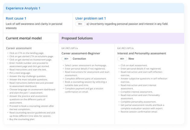
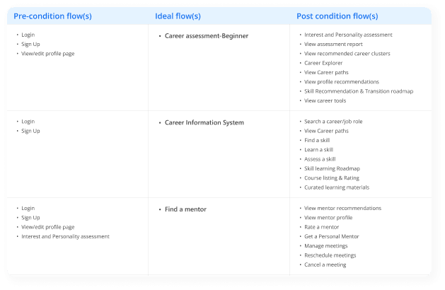
Experience analysis

The following activities were performed as a part of experience analysis.

Problem-solving : The existing mental models derived from secondary research and solutions were brainstormed for the user problems.

Solution recommendation : The unique linear flows were identified and listed in detail in this stage.

Experience threading : The whole experience of users was threaded in this stage by referring to all listed unique ideal flows and necessary peripheral flows. While all the flows are collated , they are getting mapped as per-condition flows, ideal flows and post-condition flows to make sure that threading of experience is complete.

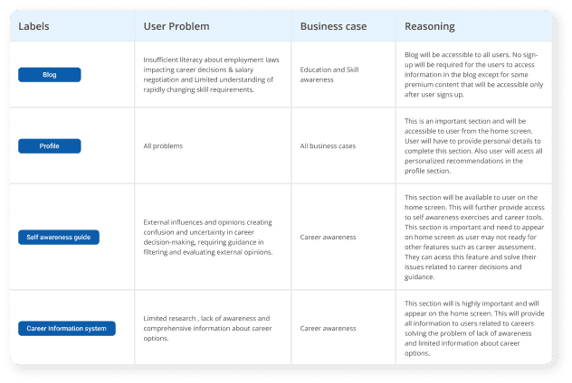
Thematic Analysis

The following activities were performed in thematic analysis.

Affinity Mapping : All ideal flows identified in the experience analysis were listed and main menu items were provided with labels. Hierarchy of the information was established by defining a navigation system.

Navigation prototype testing : A navigation prototype with all the navigation labels was shared with the participants on a zoom session. The participants validated the prototype and provided insights about the possible improvement in the navigation of the app.

WHAT

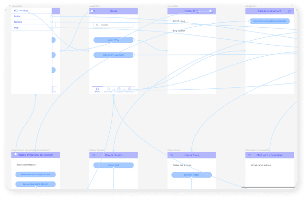
Wireframes

why

To sketch out the structure of complete app with basic details before jumping into visual designs. It helped identify basic issues with flows and layout of basic features.

how

Made wireframes for each main section that solved a particular problem by listing out all functionality details. Detailed steps to reach that screen were also listed.

The prototype is fully clickable.
Try it!

Prototype

Onboarding

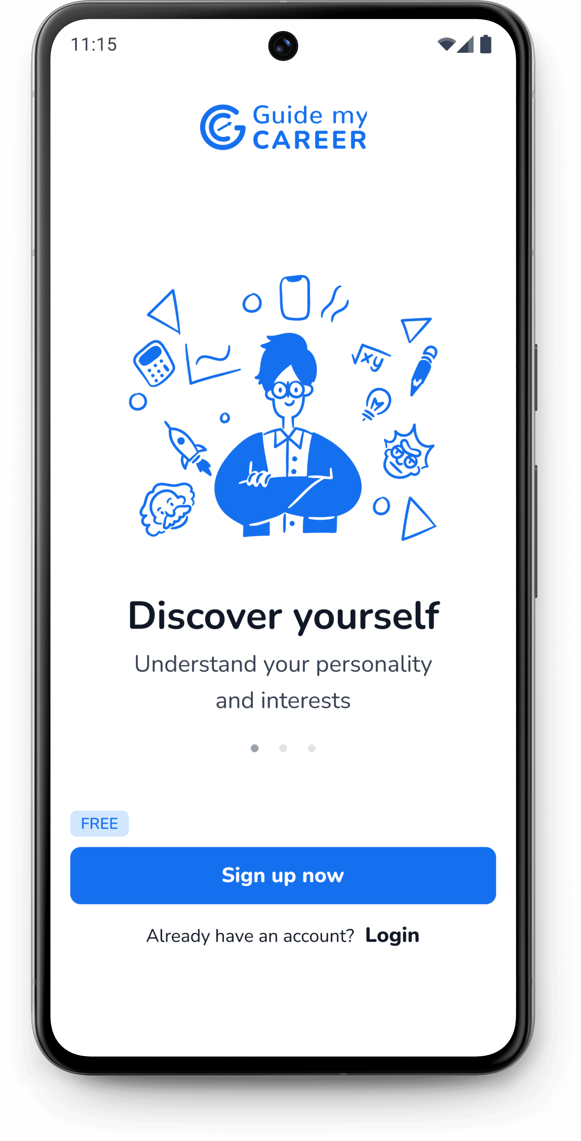
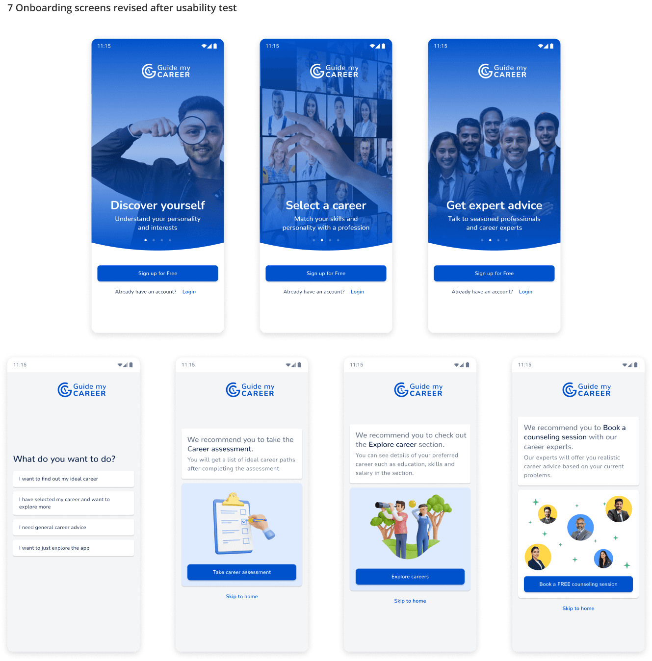
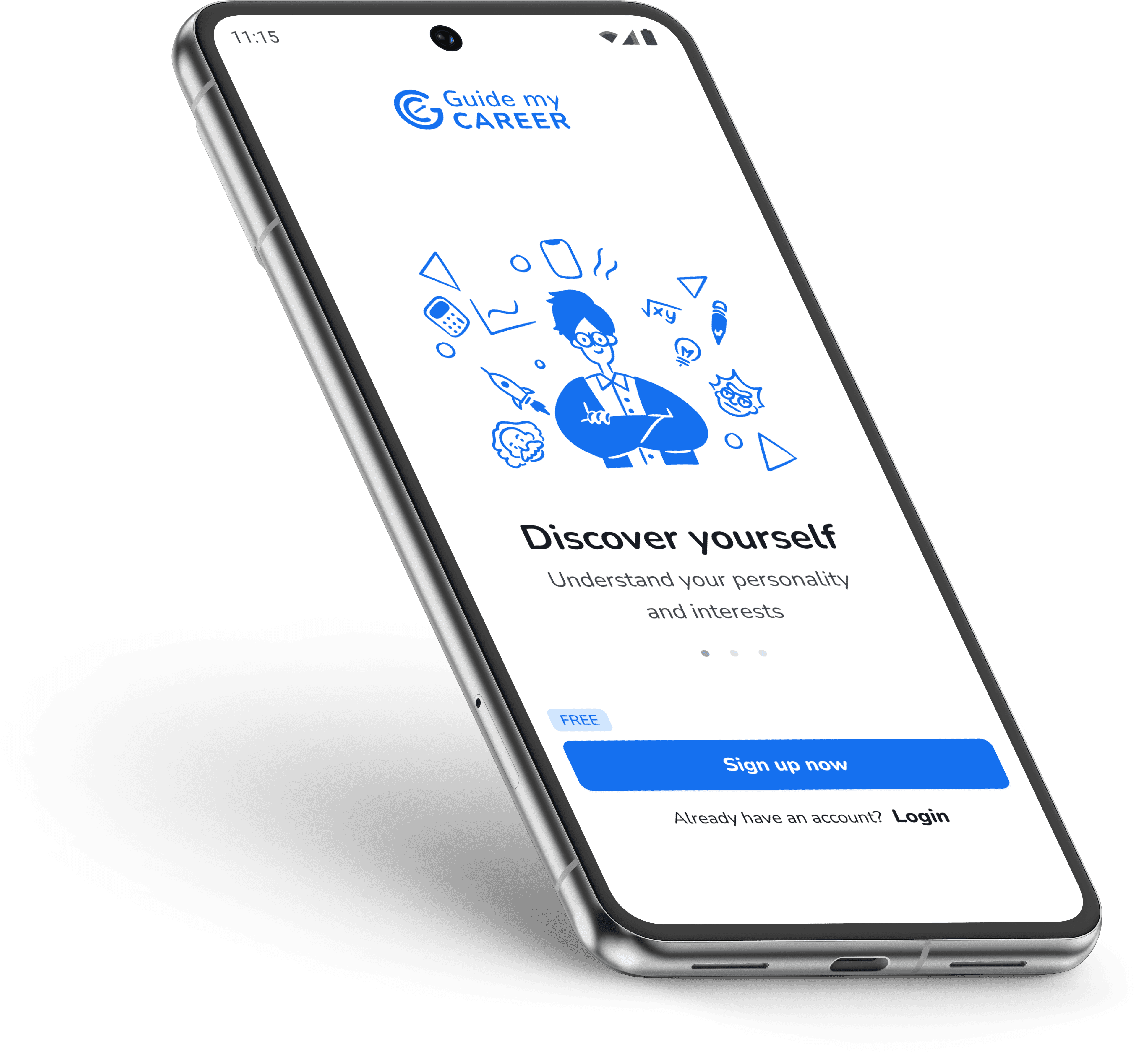
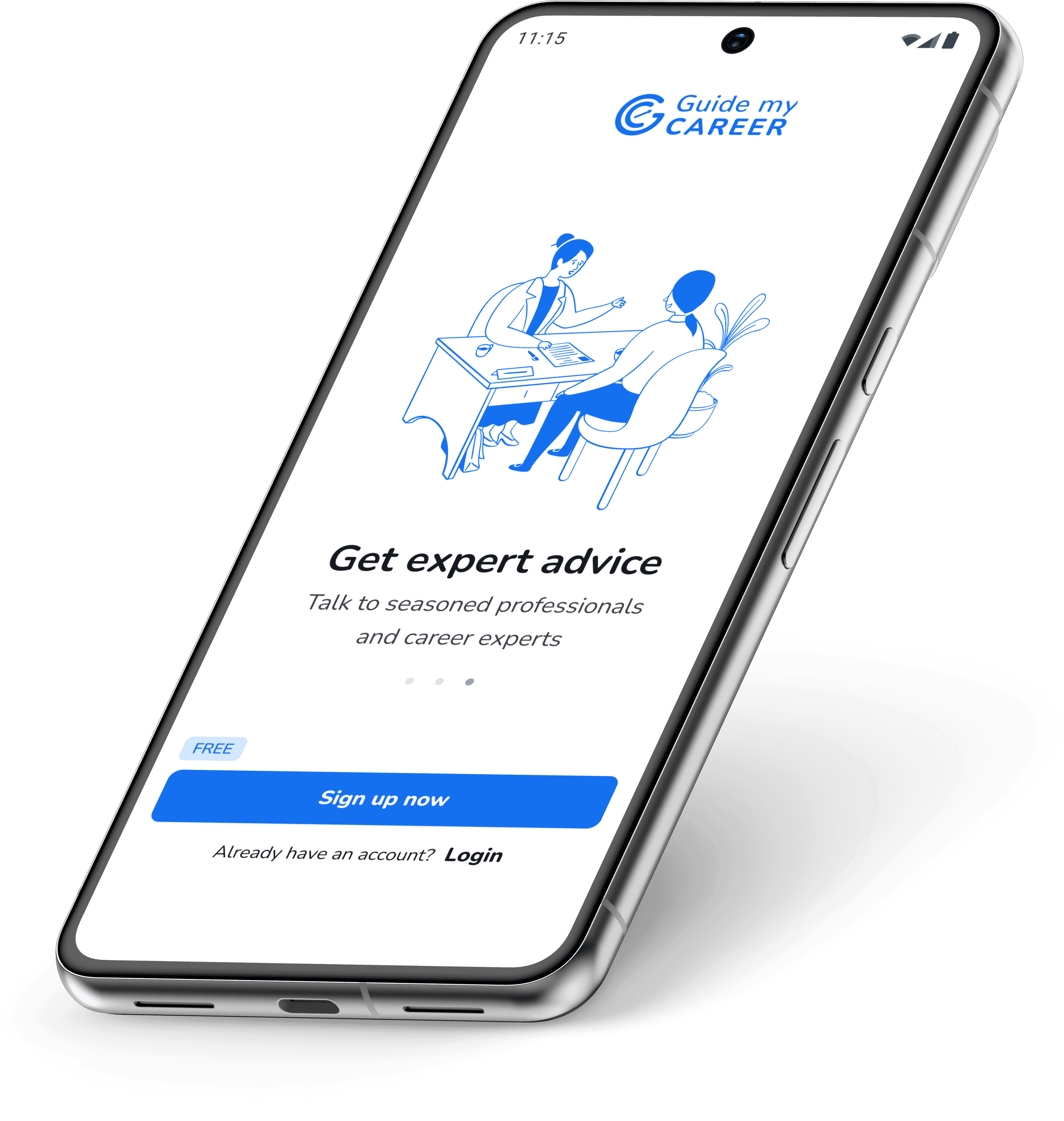
The early versions of onboarding included 3 screens only that showcased the 3 major features of the application including career discovery, exploration and advice.

During usability test, 2 out of 5 users faced difficulty while deciding what section they wanted to explore when they did not had any idea about their careers.

So the onboarding screens were increased to 7 with a questionnaire to guide the user based on what the user had in mind while using the app the for the first time.

Latest Onboarding

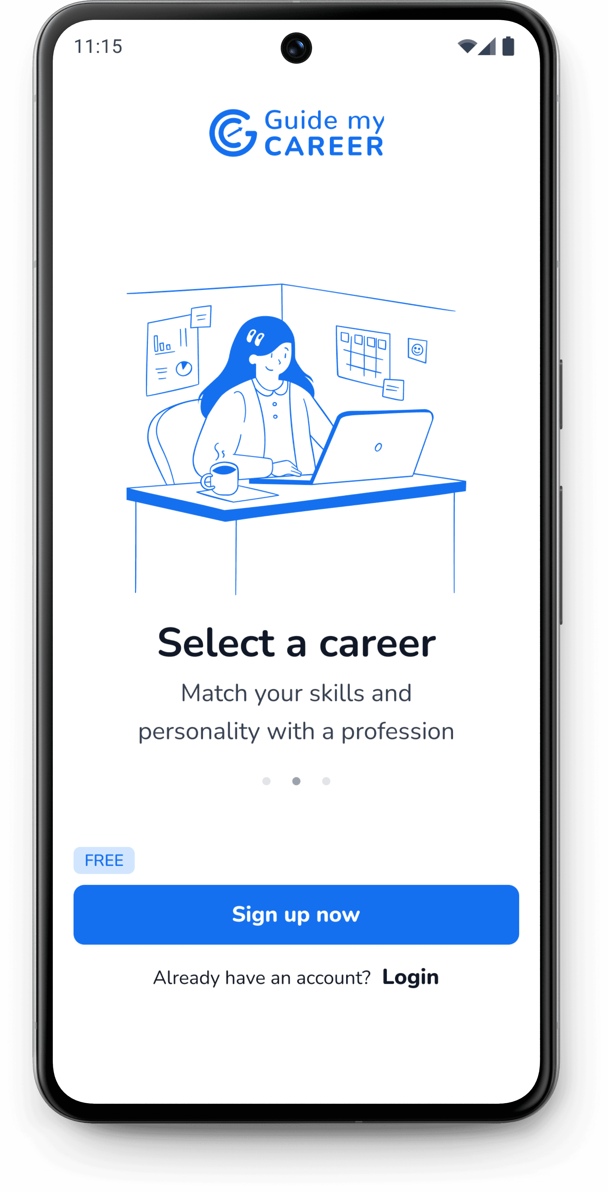
After several iterations, it was realized based on feedback from design mentor that onboarding was quit long for the new user. So a new shorter onboarding was designed that included 3 screens showing the major offerings of the application.

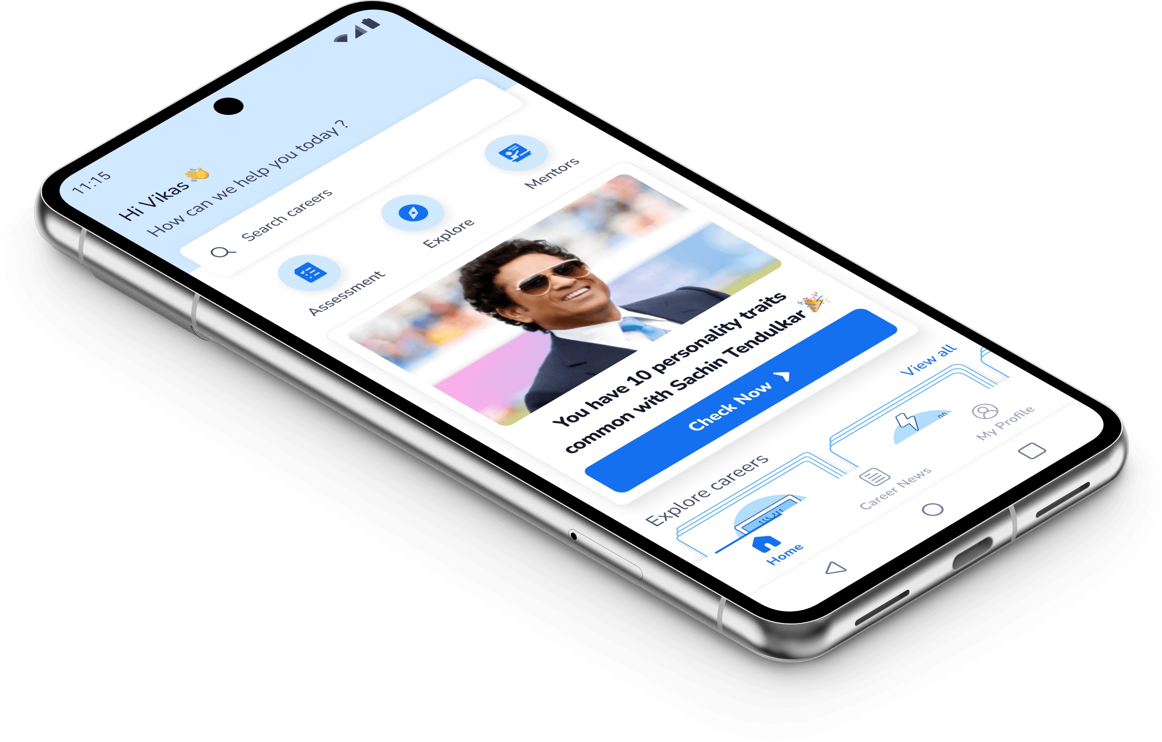
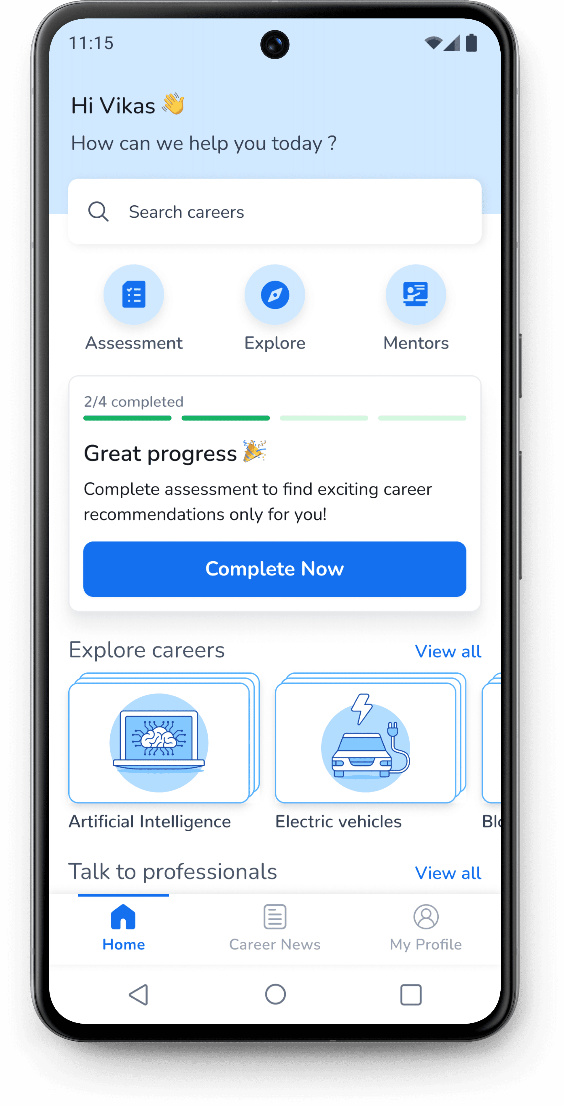
Home screen

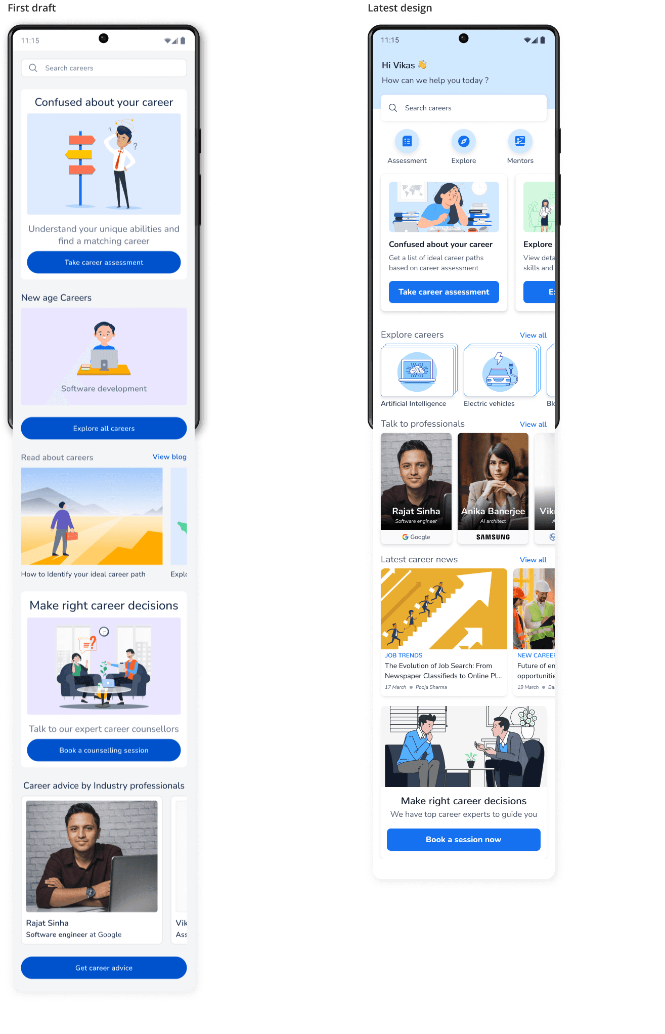
The home screen of first draft was designed to include all the different sections/features of the app.

Different CTA’s were provided for the users to navigate to various solutions that appealed to them.

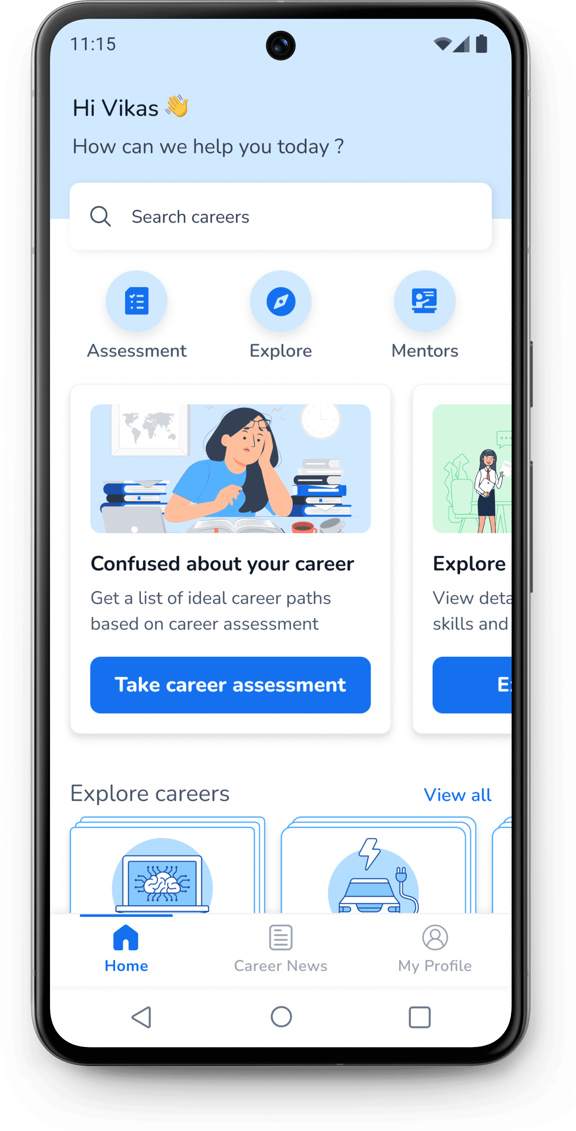
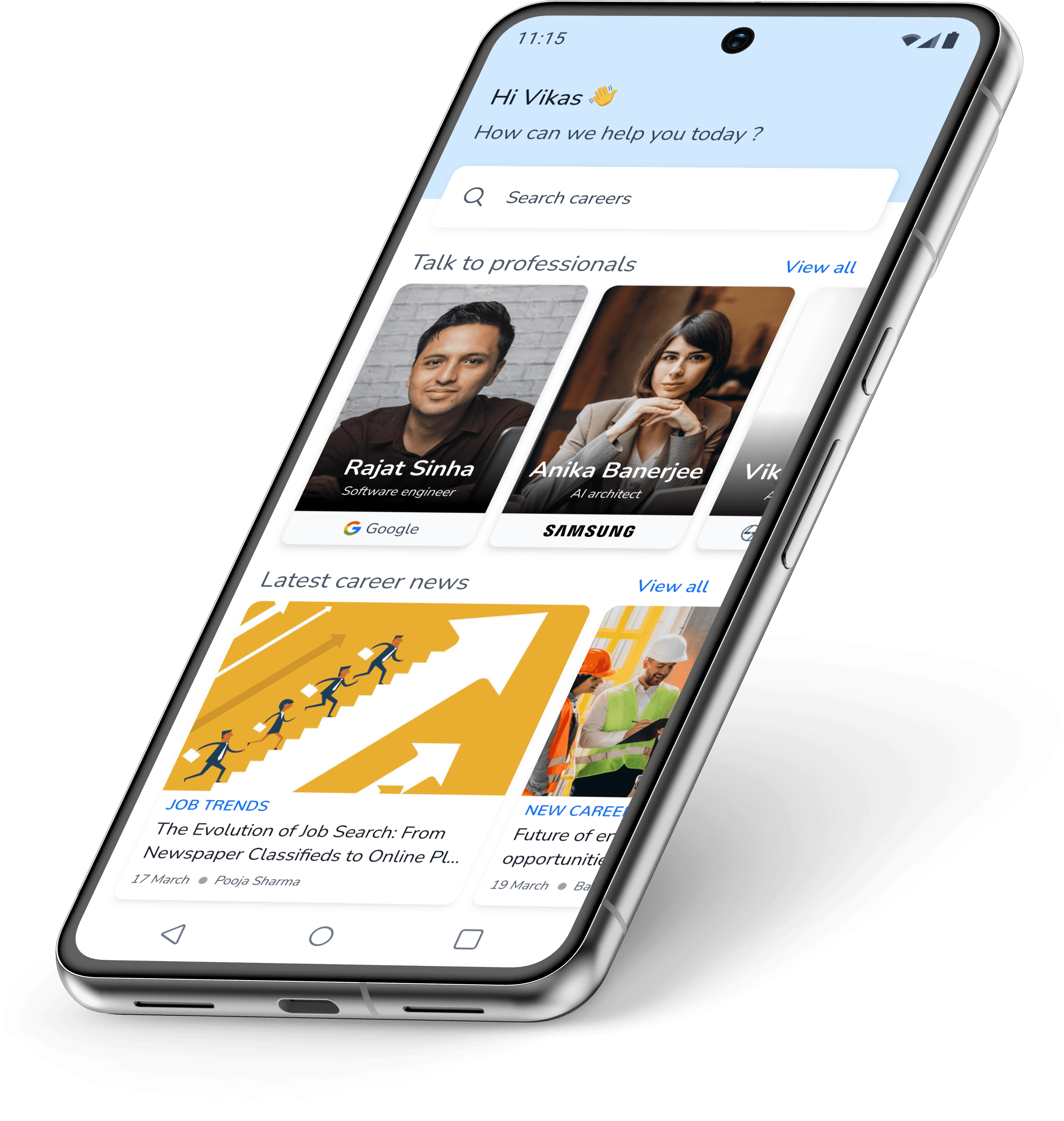
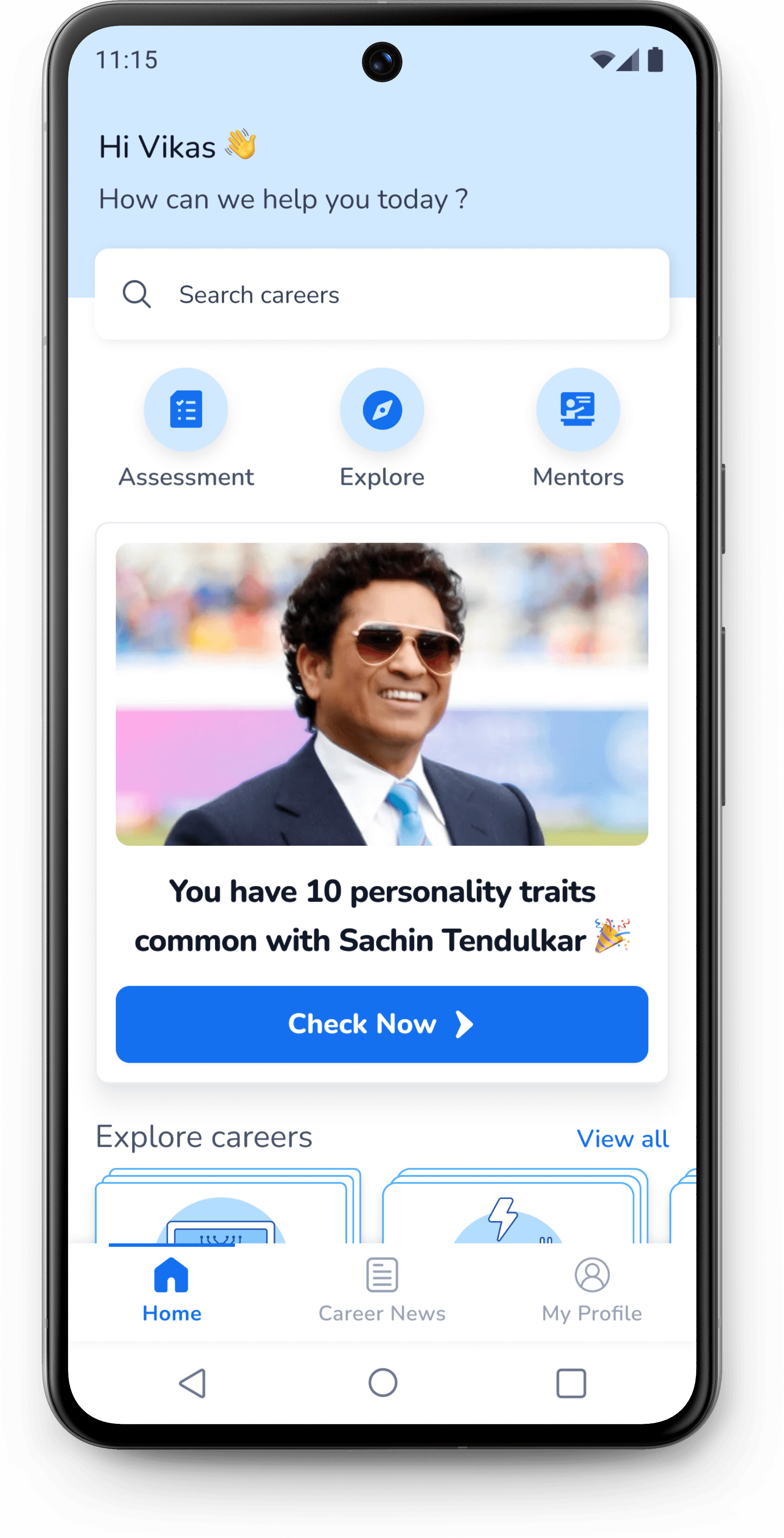
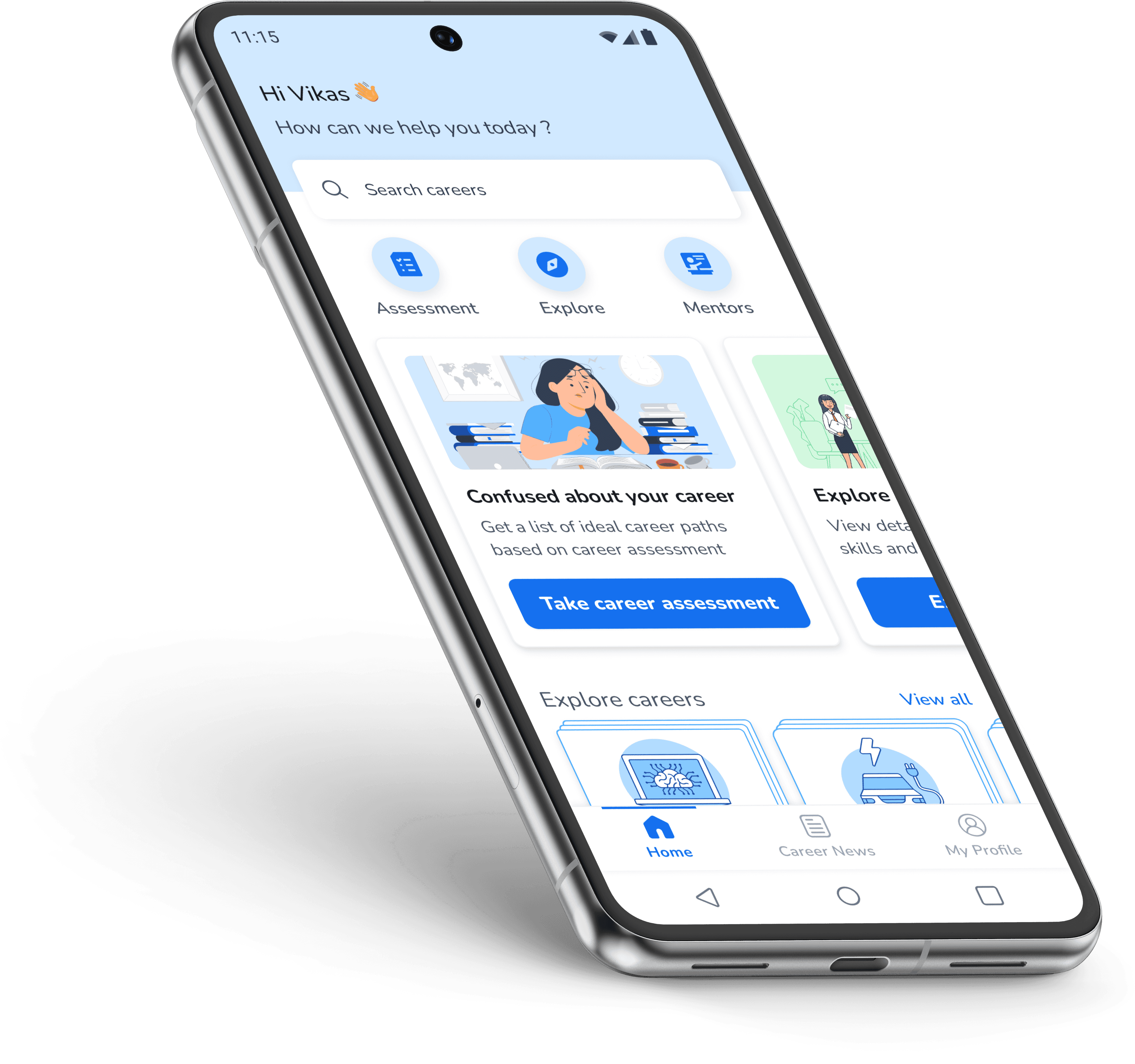
The latest home screen design was arrived after several iterations and feedback from mentor.

I optimized the home screen so that user can view all features of the app in the first fold itself.

A new section that covered all the major offerings of the app was introduced in the first fold.

This section was expected to reduce confusion among user about the first steps to be taken when they arrive on the home screen for the first time.

JOB TRENDS

The Evolution of Job Search: From Newspaper Classifieds to Online

17 March

Pooja Sharma

NEW CAREERS

Future of engineering: Trends and opportunities for BTech students

19 March

Balaji Srinivas

INDUSTRY EVENTS

Tata Punch gets all the limelight in the recent EV expo

20 March

Ankita Tiwari

NEW CAREERS

The future of work: Advantages of pursuing a career in AI

21 March

Tarun Karthikeyan

Rajat Sinha

Software engineer

Google

Anika Banerjee

AI architect

Vikram Singh

Asst. Manager

Bhavna Sharma

Project manager

Reliance Jio

Improved the mentor section by showing the company name more prominently and improved the design of cards

Introduced the career news section instead of blogs to increase engagement with users.

When a user returns to home screen after completing assessment

When a user returns to home screen without completing the assessment

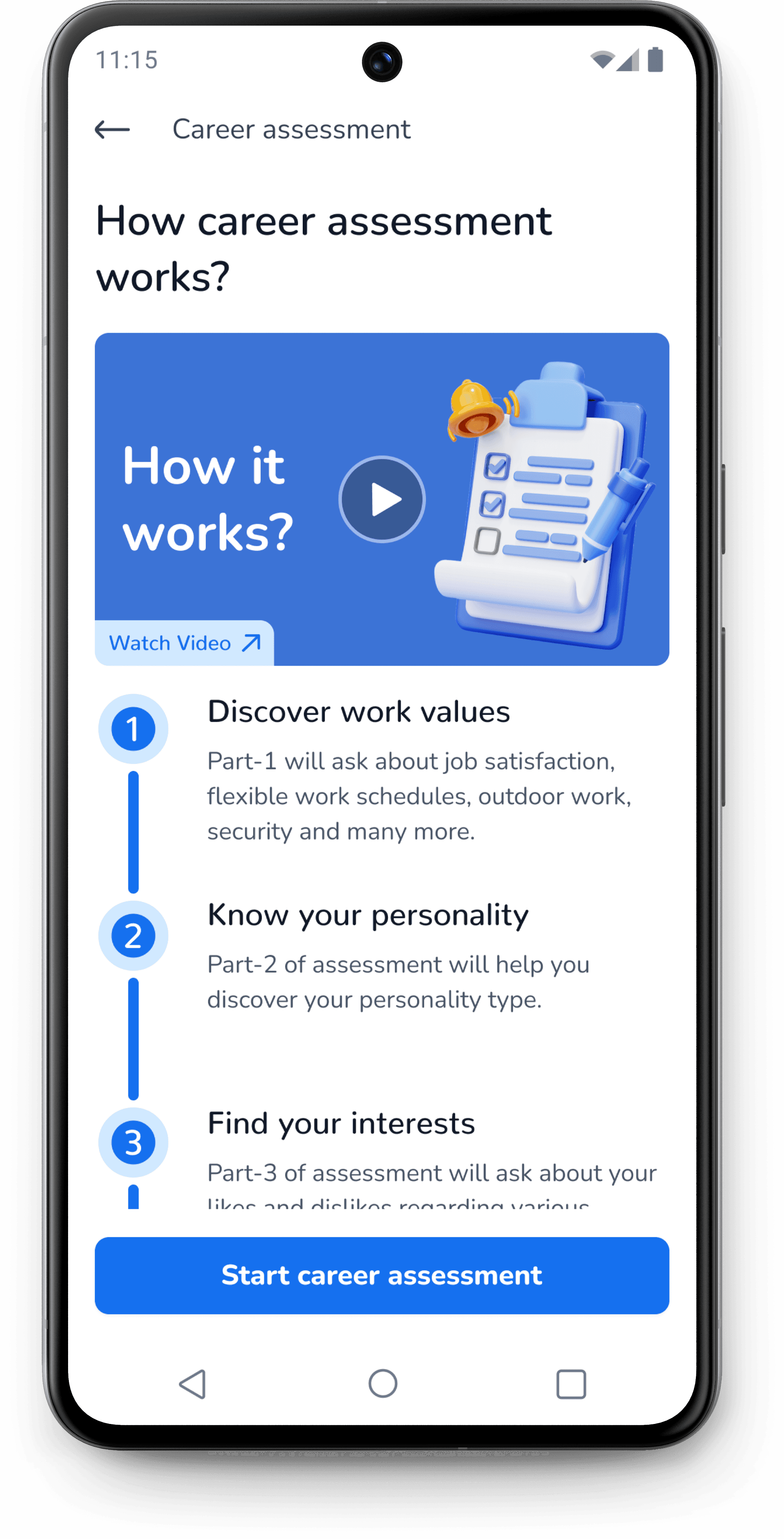
Career Assessment

The first draft for the career assessment home screen included brief description about the career assessment section.

It was discovered during the usability studies that participants found the assessment too long and they did not understand the need for every section.

I improved the introduction screen to educate the user better about how is the assessment section is structured and what each section will accomplish.

First draft

Discover yourself

Discover your interests, work values, personality and find a career that matches your unique capabilities

This assessment will help you finding career interests, personality type and work values

Lets begin

Career assessment

11:15

Career assessment

2

3

4

1

General inftormation

The career assessment is divided into four parts.

Each part will take around 20 minutes to complete.

There is time gap of 8 hrs between each part.

Start assessment part-1

11:15

Latest design

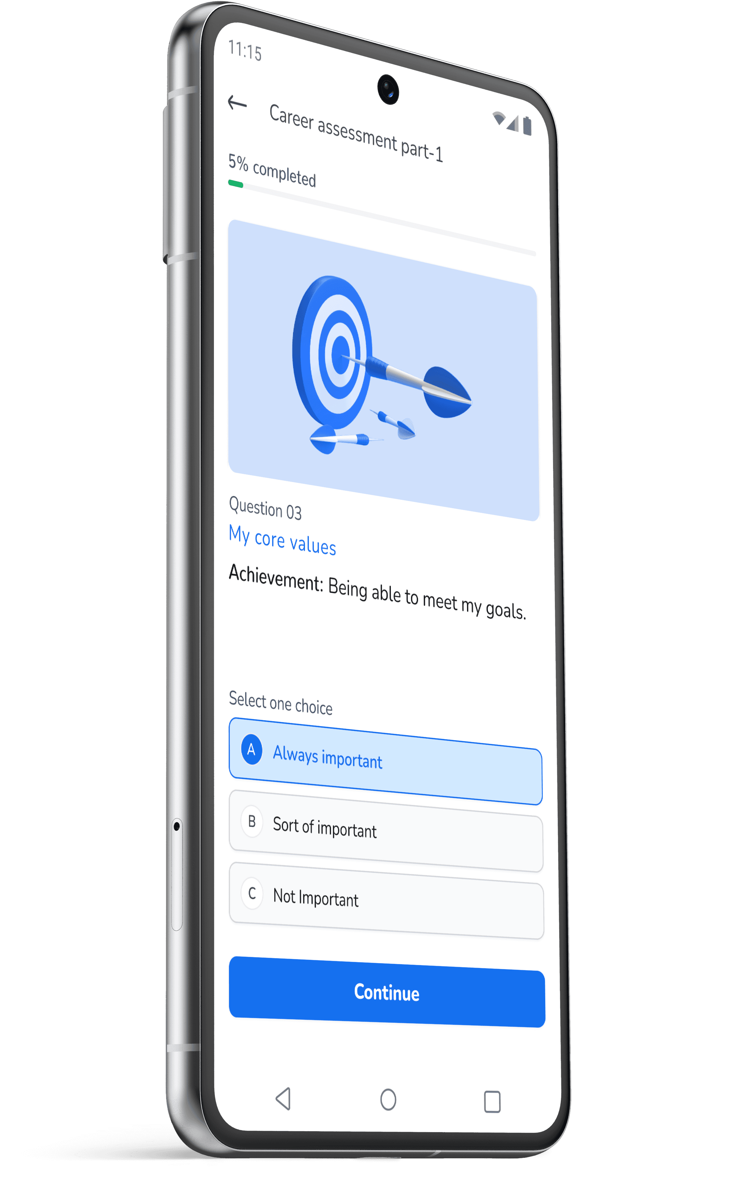
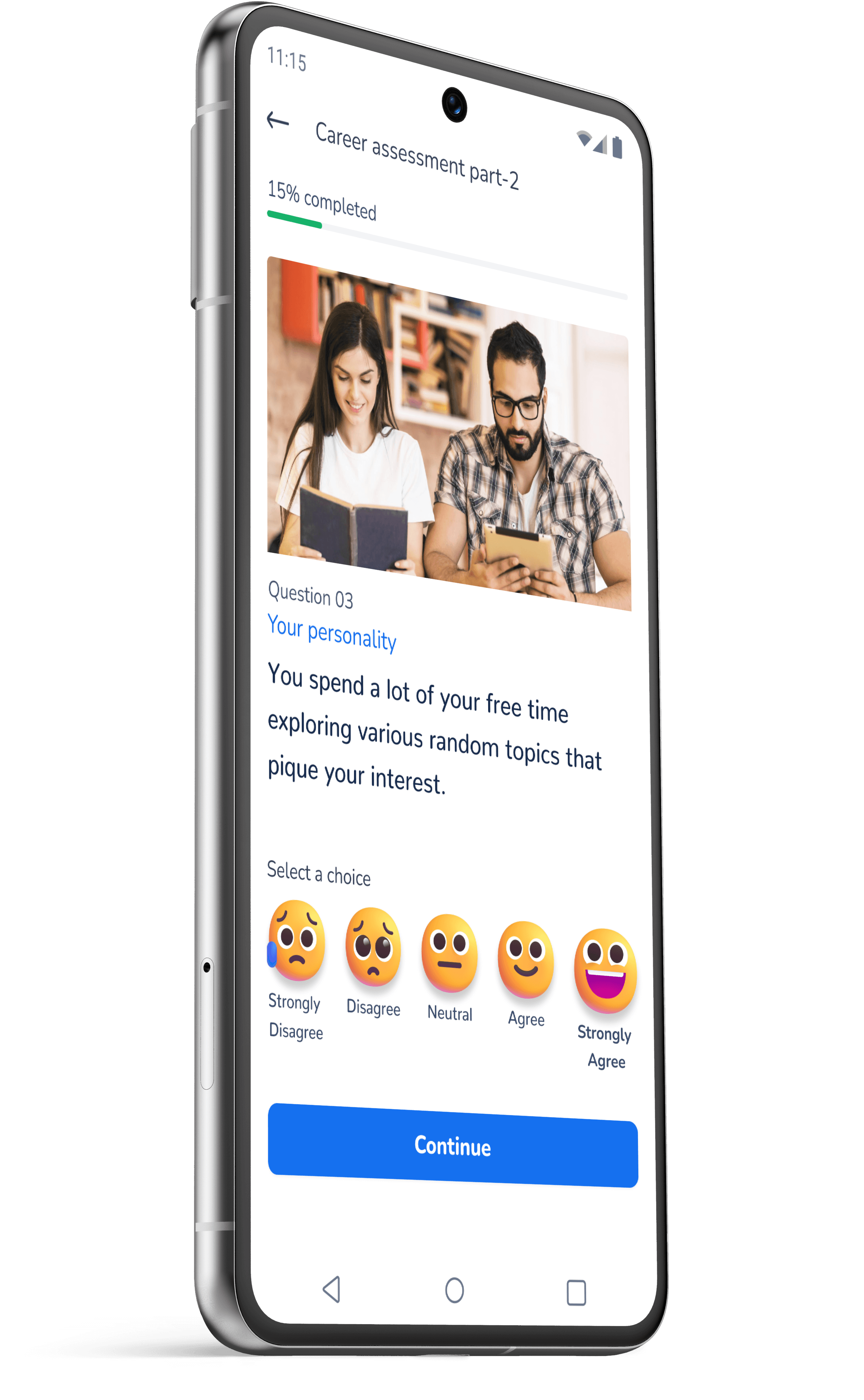
Different assessment sections

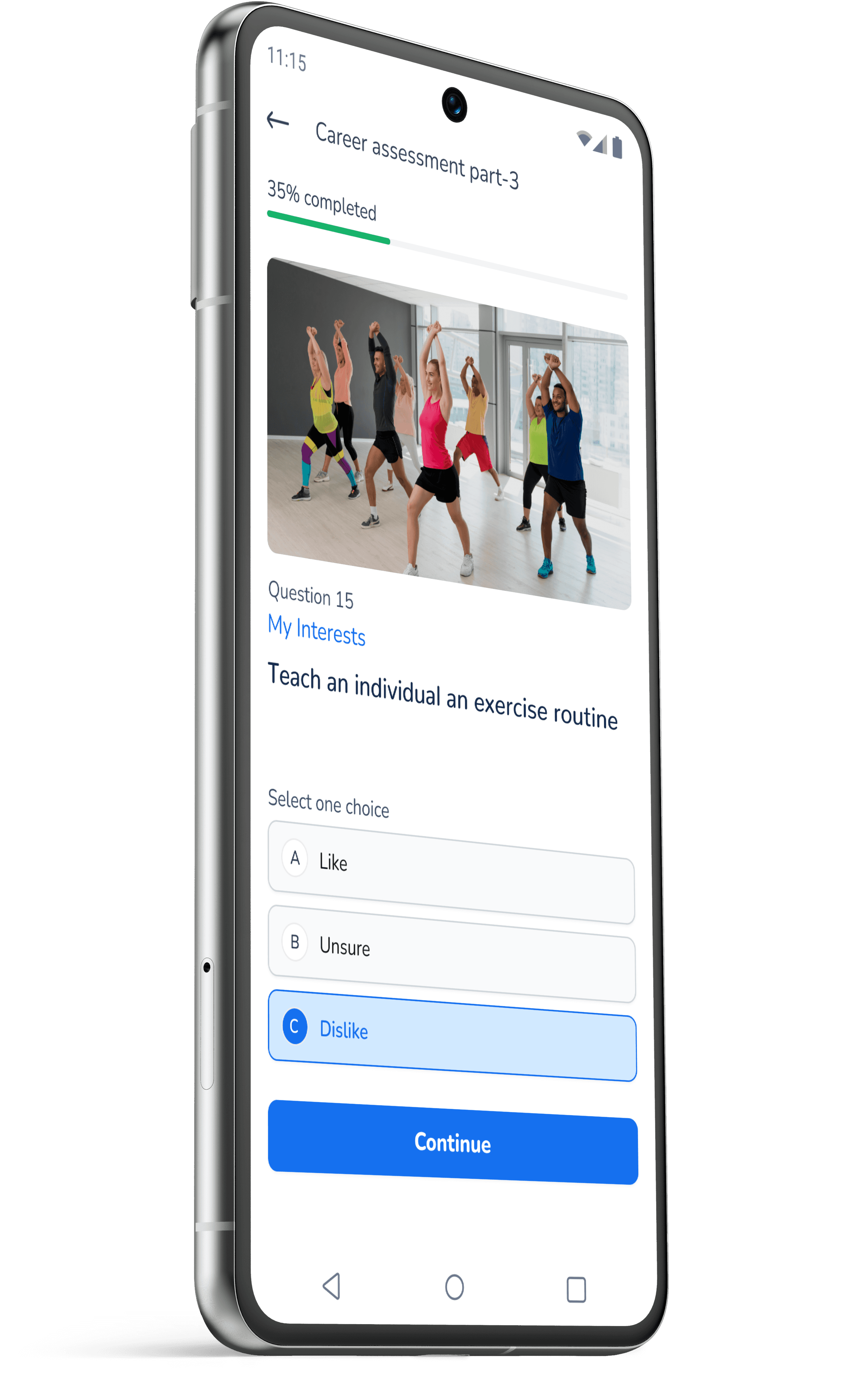
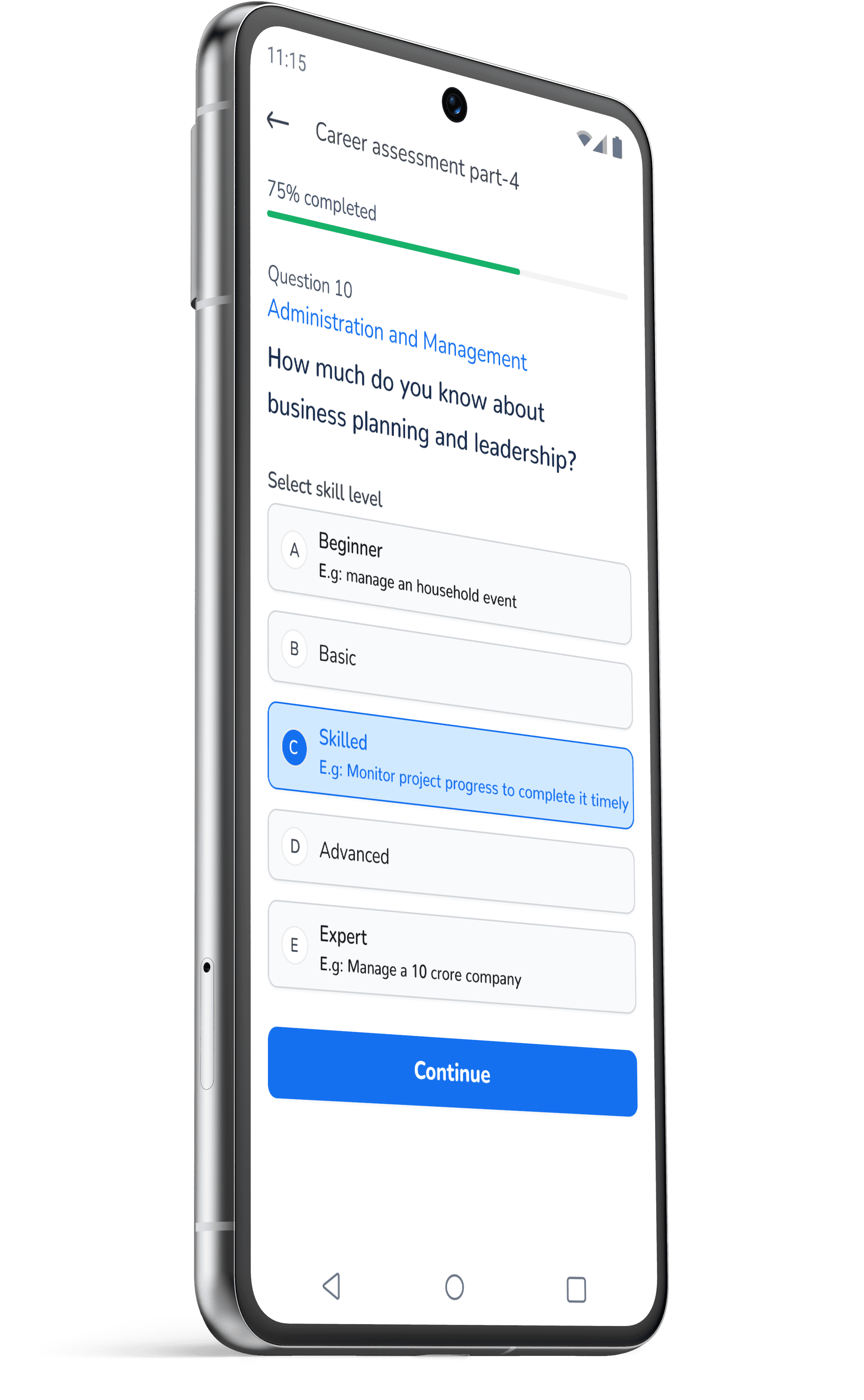
The complete career assessment was divided into four different sections.

Images and illustrations were used for providing clear context to the user.

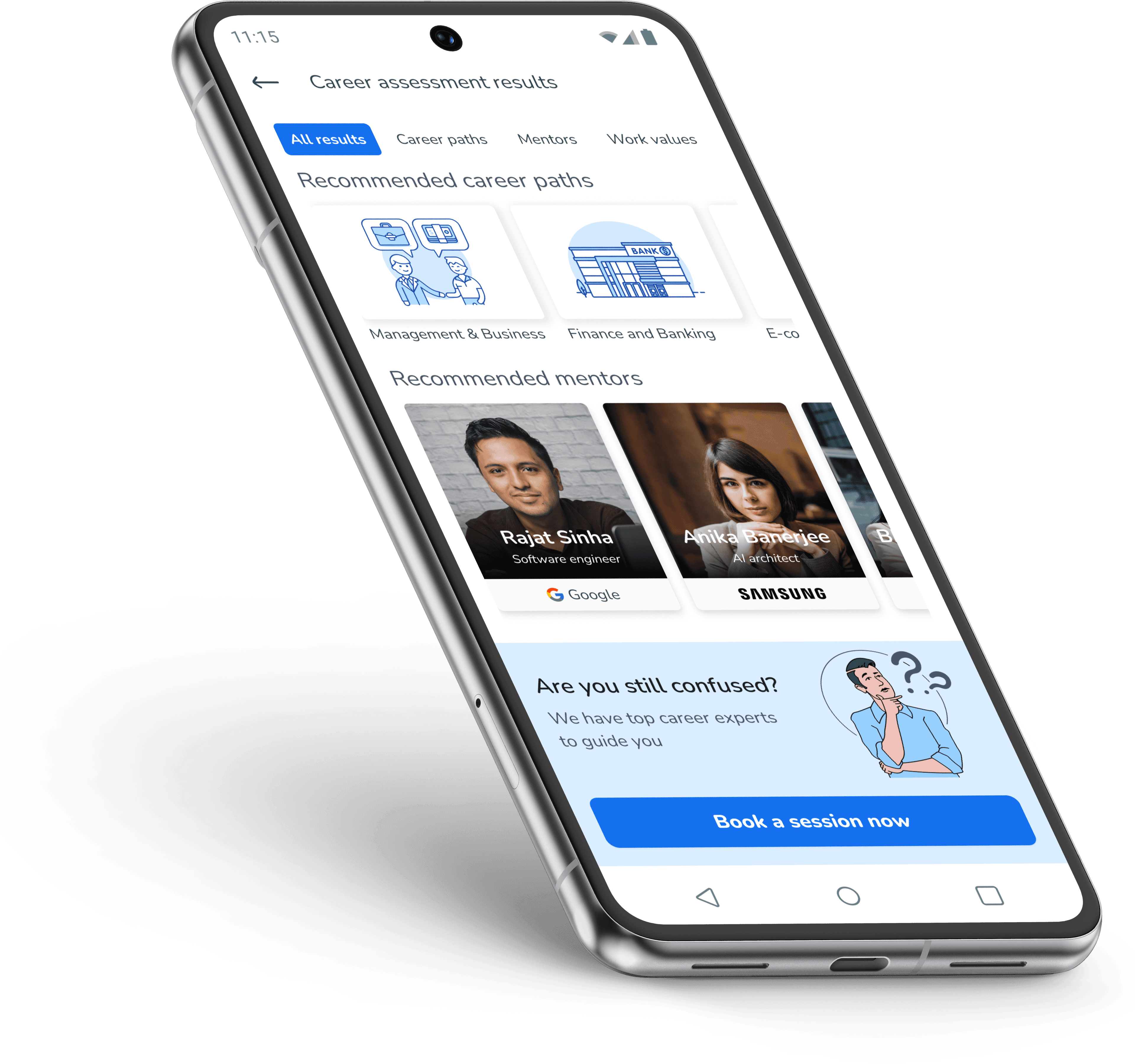
Assessment Results

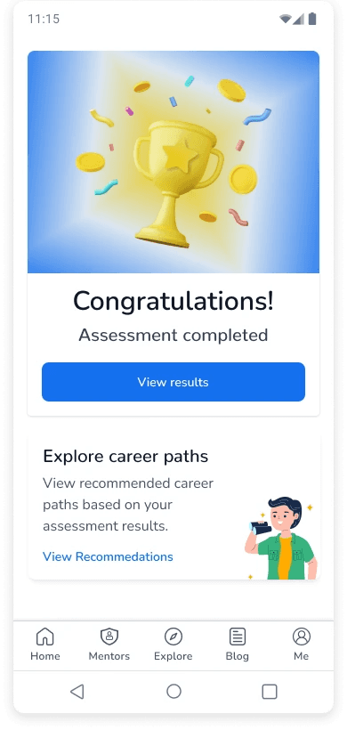
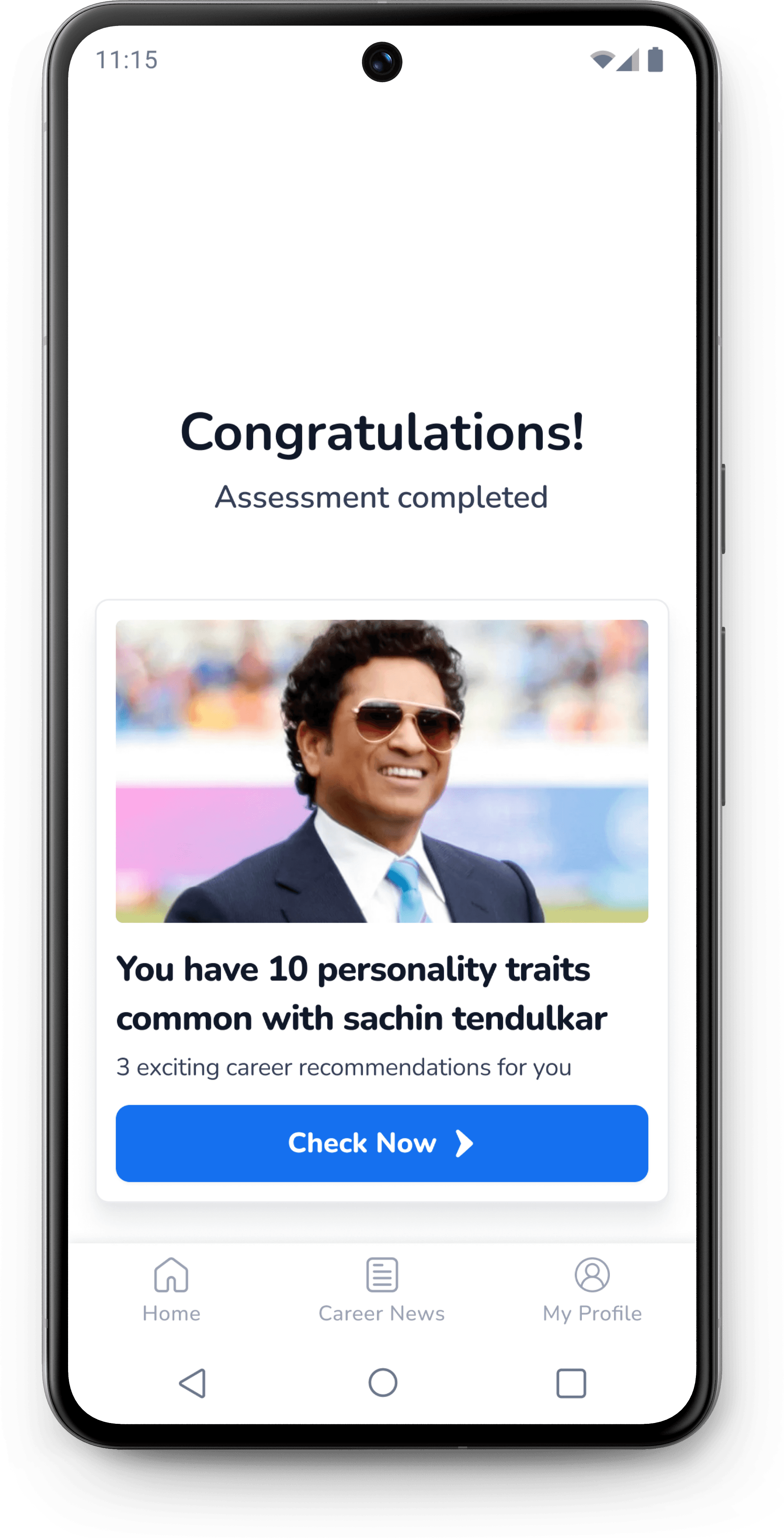
The initial design of results screen showed only a congratulatory message with different CTAs for viewing results and career recommendations.

I optimized the design by providing only 1 CTA. The copy was made more interesting by including the name public figure to create interest in user to click and check results.

3rd design iteration

Latest design

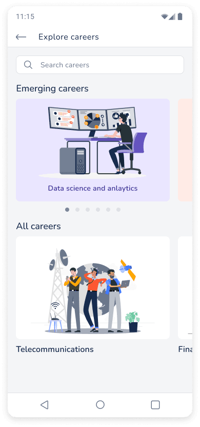
Explore careers

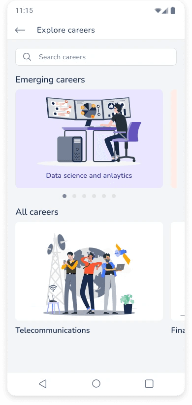
The first draft of the explore career section included two horizontal sliders for emerging and all careers. This design did not appealed visually and was following a similar pattern.

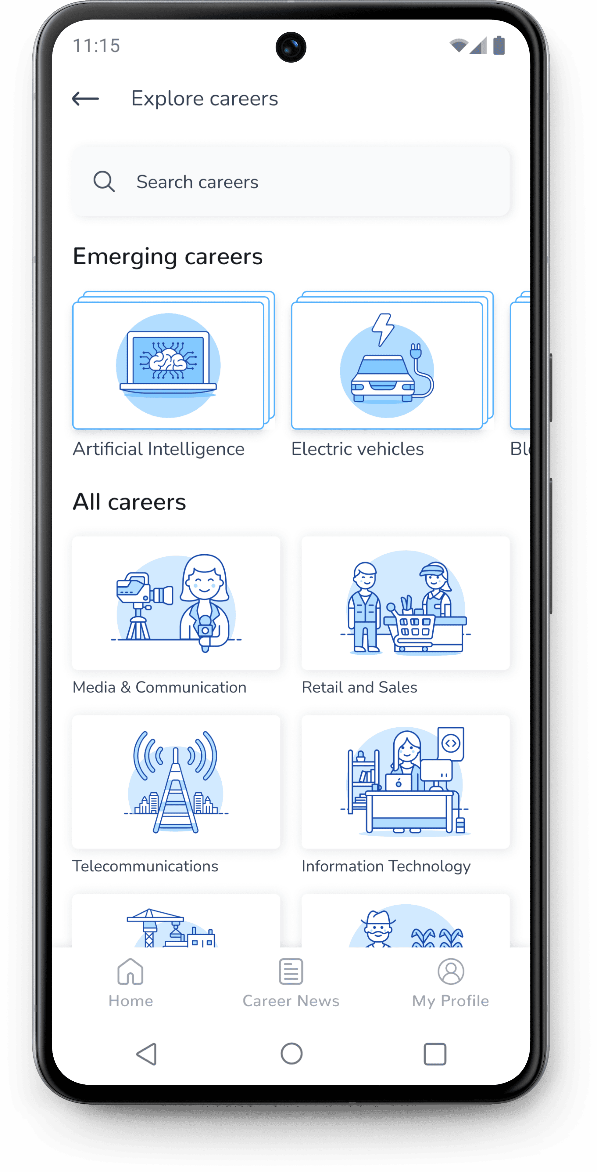
I optimized the Explore section by using smaller card sizes to provide more information to user in the first fold.

Similar illustrations were used to maintain visual balance.

All career section was optimized by listing all career options on the screen which were earlier provided in the horizontal carousal.

First draft

Latest design

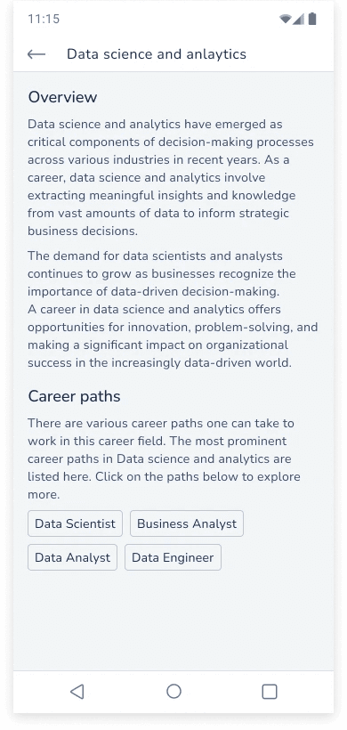
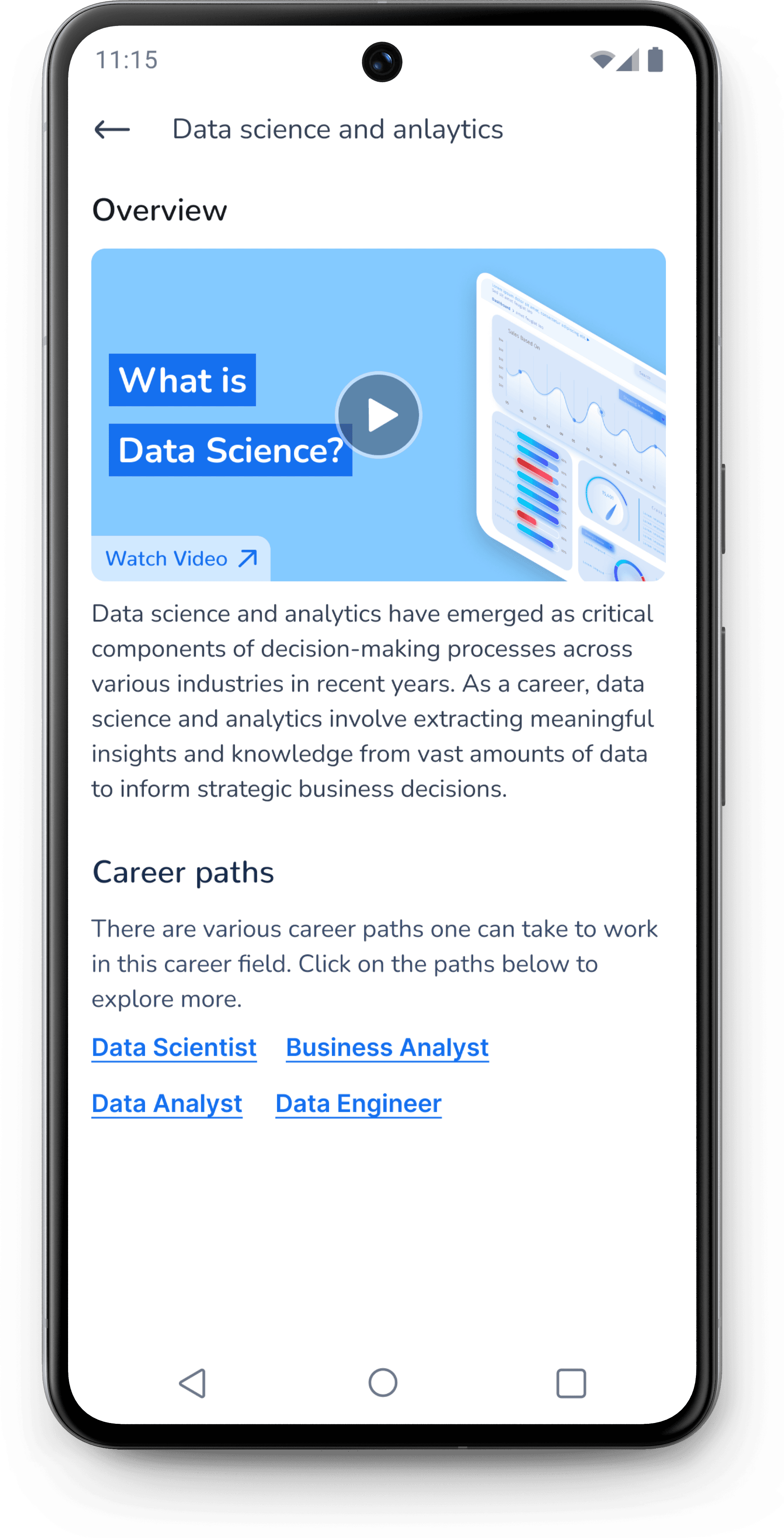
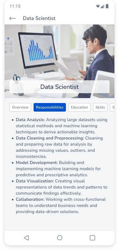
The individual career section had lot of text and the links to specific career paths had limited affordance.

The design was optimized by having a video in the overview and link style buttons were used for better affordance.

First draft

Latest design

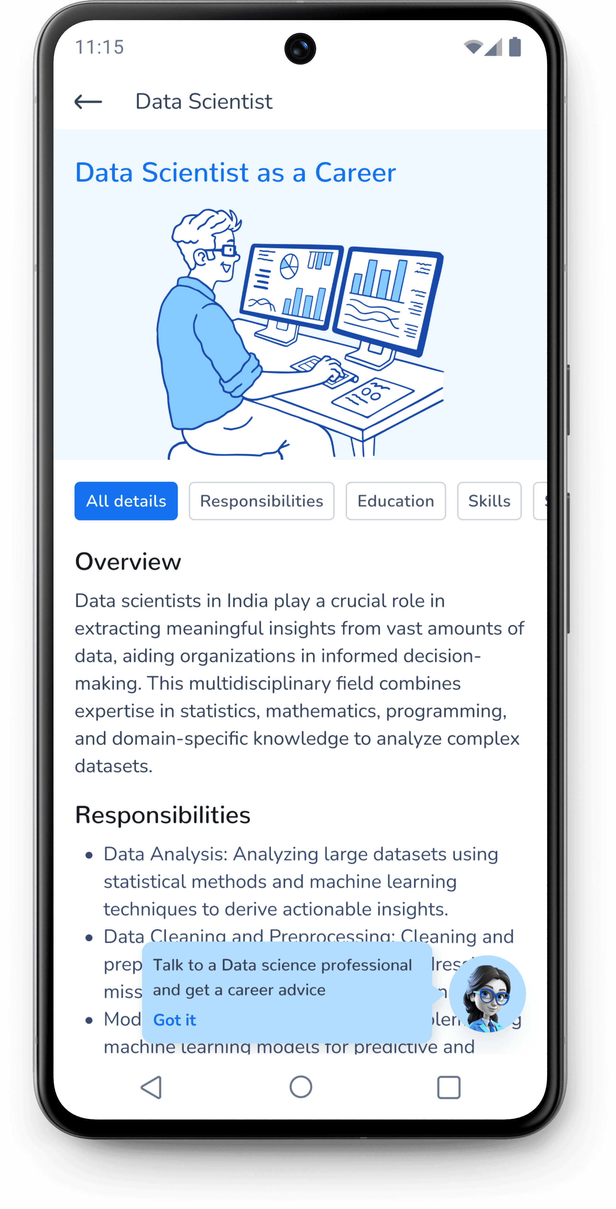
During usability study, one of participants expressed the need to view mentors related to a particular career path in the section itself.

The design was optimized by presenting all information on the same screen. The user could reach any section by scrolling or clicking on the tabs at the top.

A floating button along with a tool tip was introduced so that users can approach professionals related to any particular field and get some career advice.

First draft

Latest design

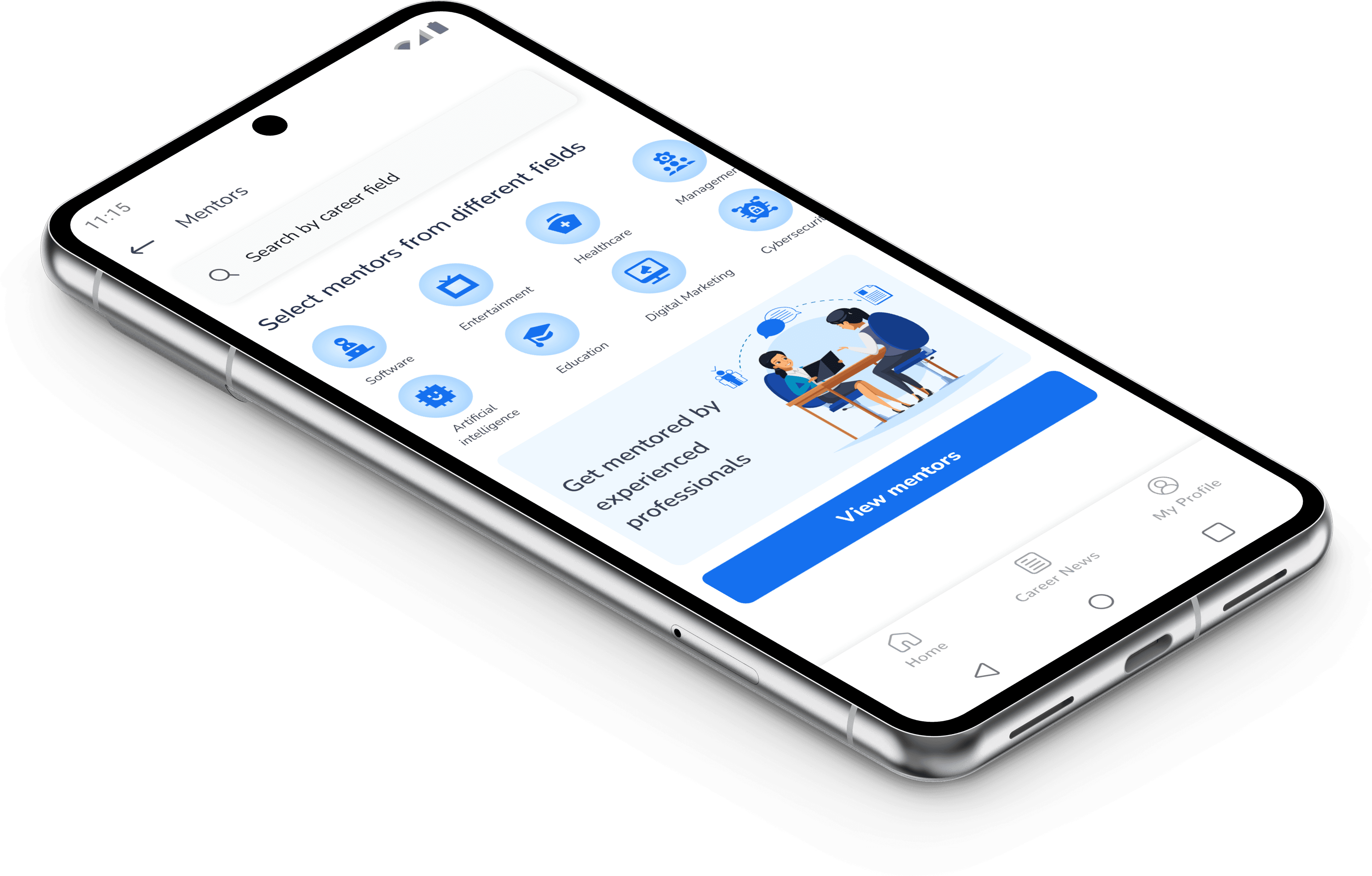
Mentors section

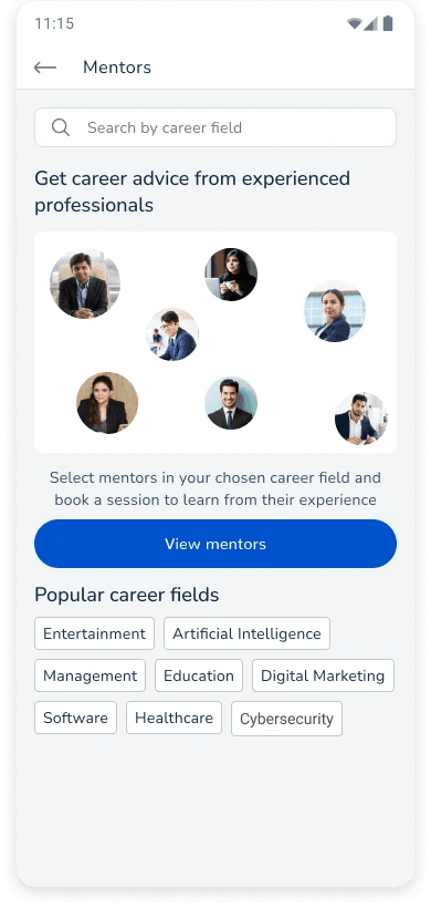
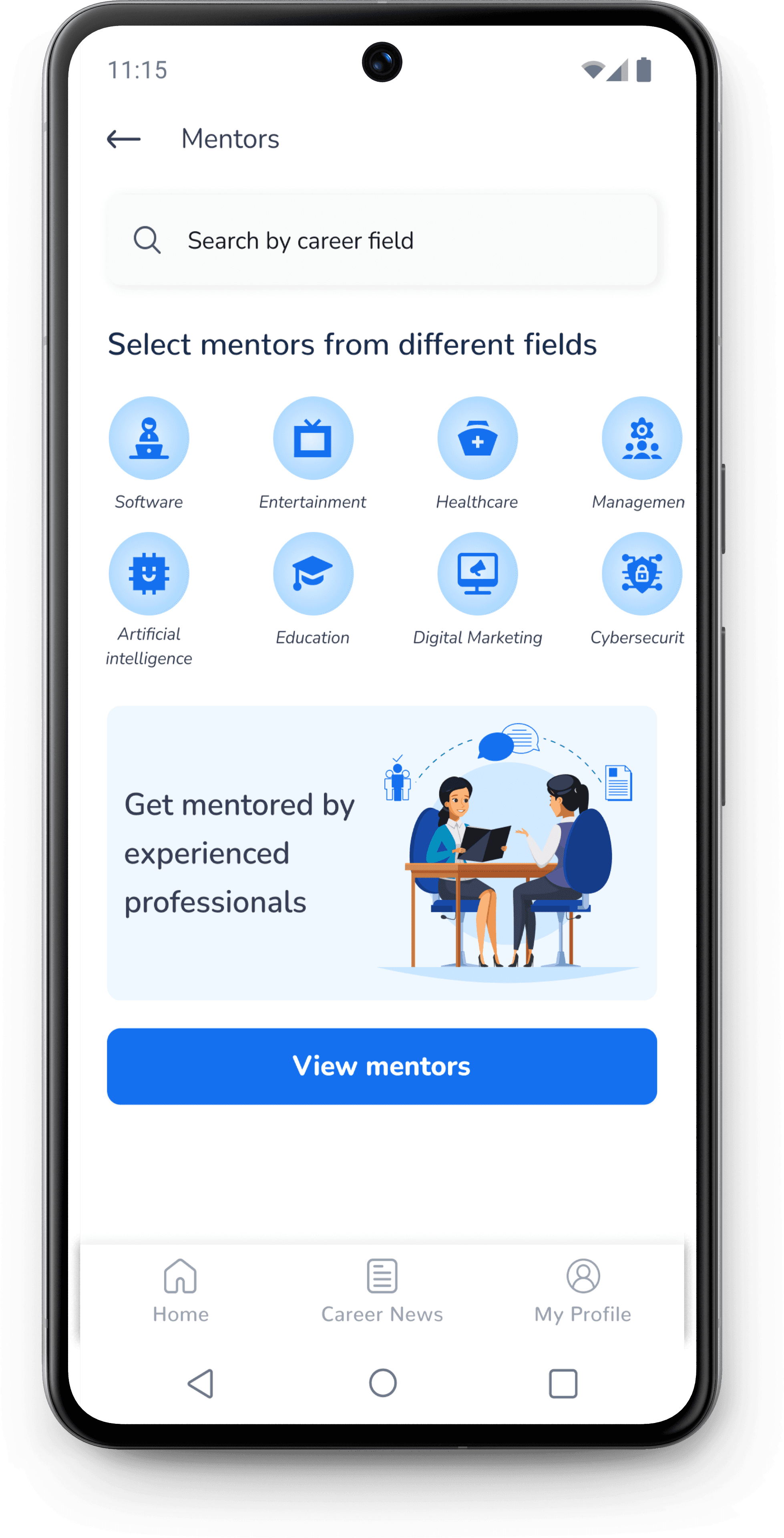
The first draft for mentor home screen included a CTA for viewing mentors along with links to popular career fields.

The design of mentor section was optimized by listing professional fields at the top. This was expected to improve experience for users who were searching mentors from a specific field.

First draft

Latest design

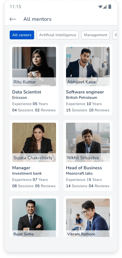
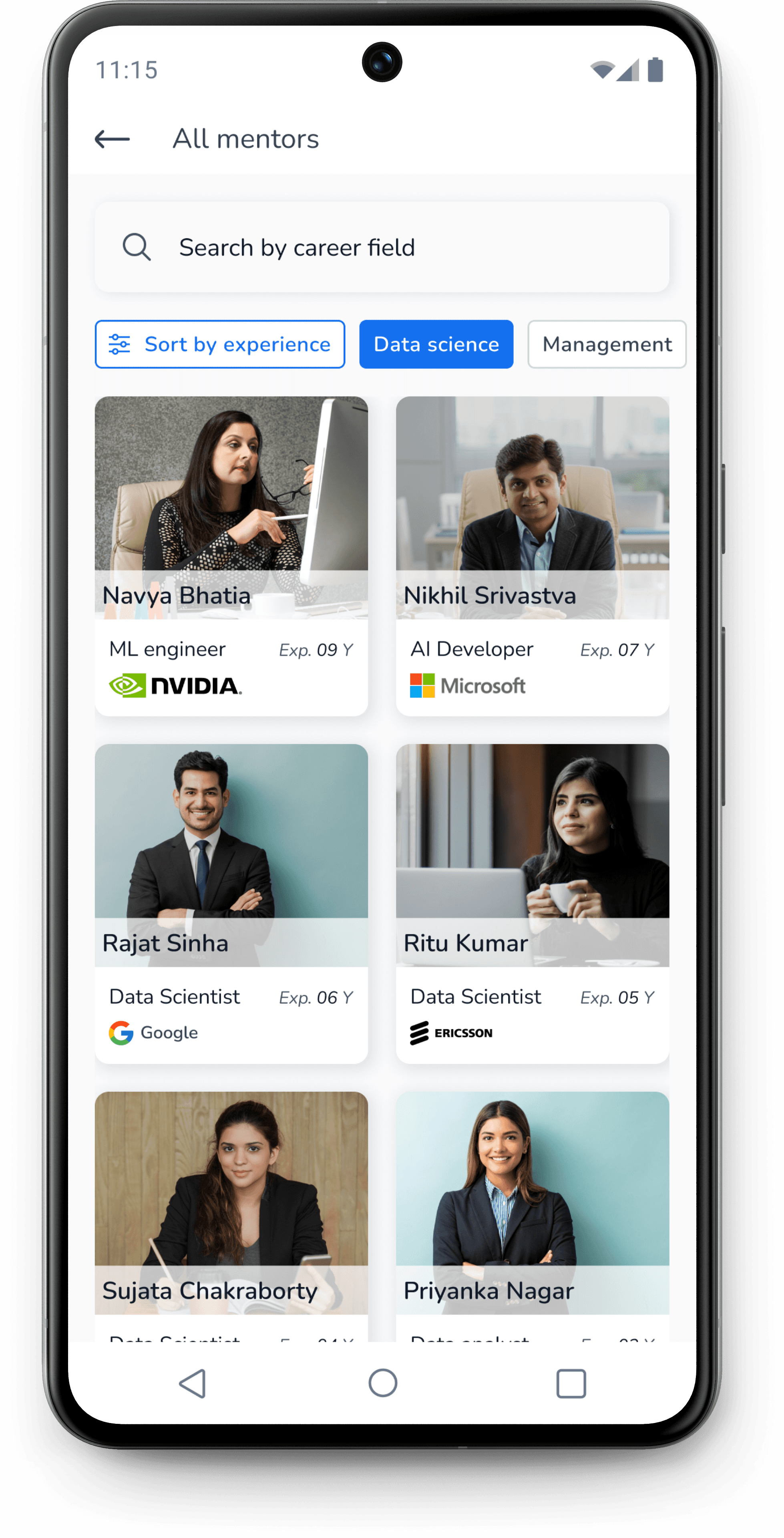
It was discovered during the usability study that users wanted to see mentors with different level of experience.

I introduced a new tab at the top to sort the mentors based on experience.

First draft

Latest design

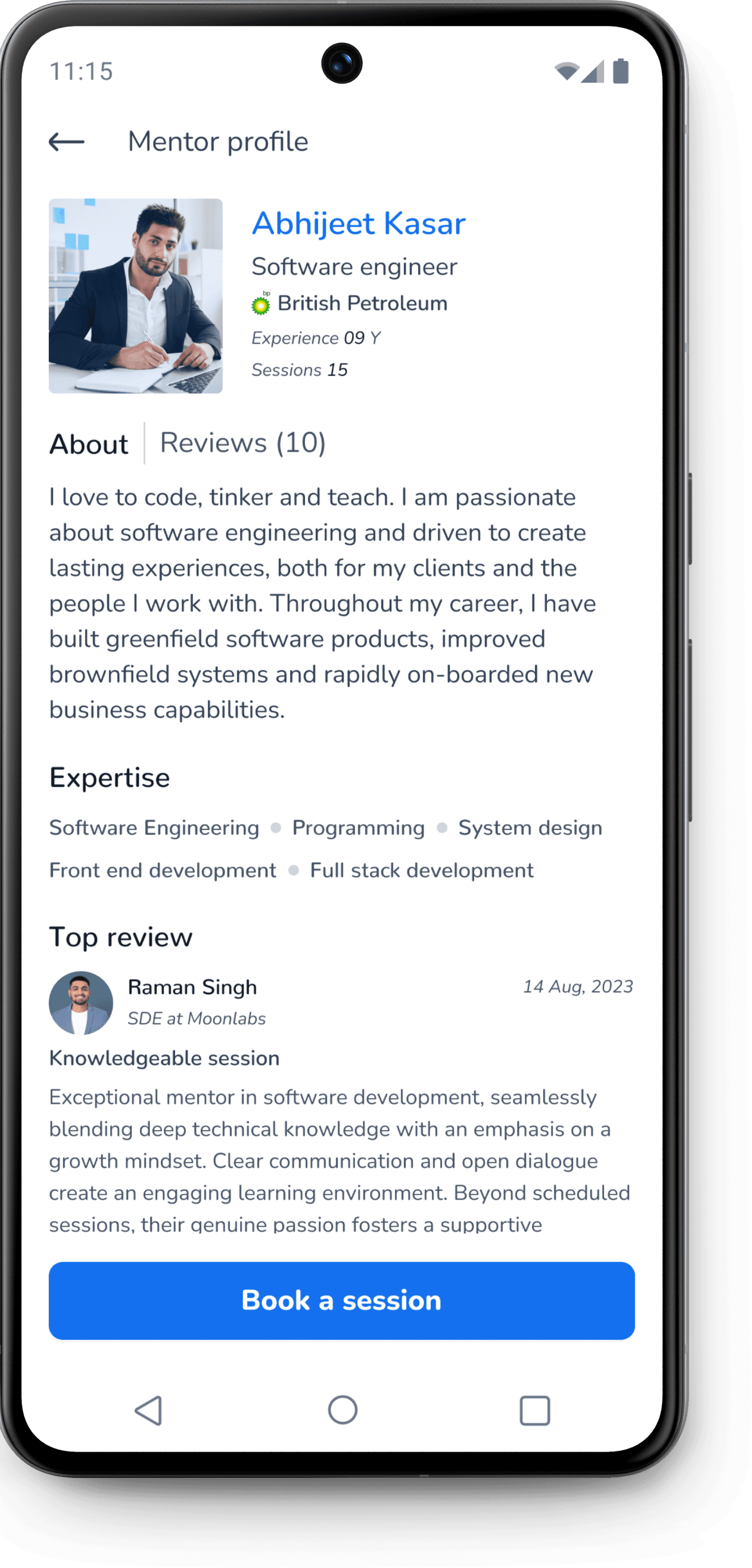
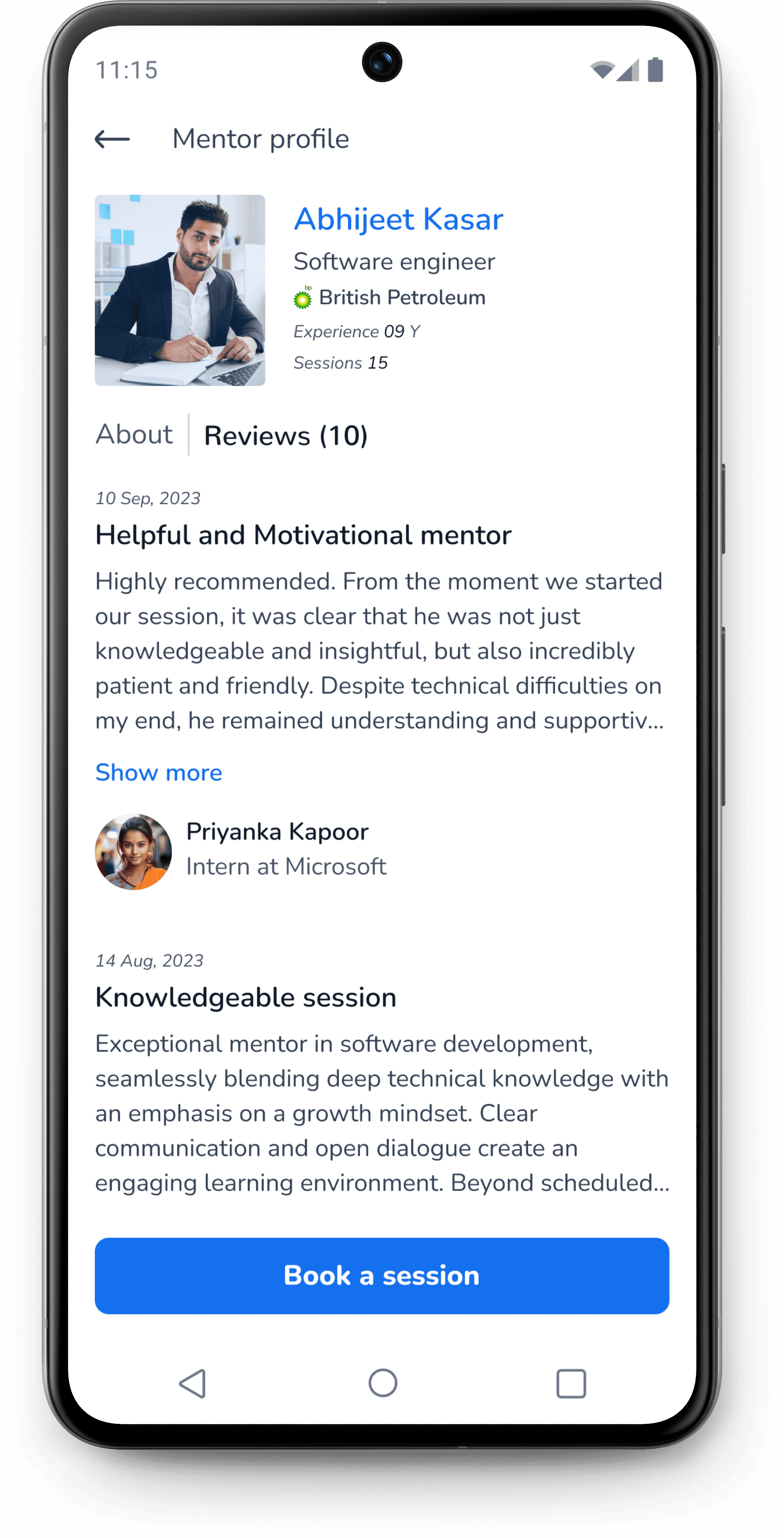
Mentor’s profile

About section

Review section

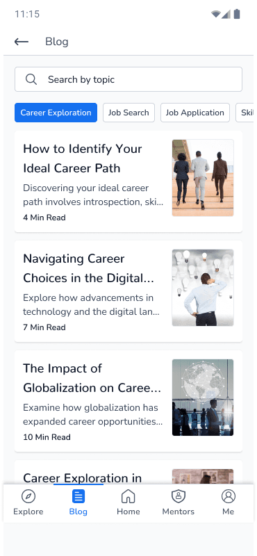
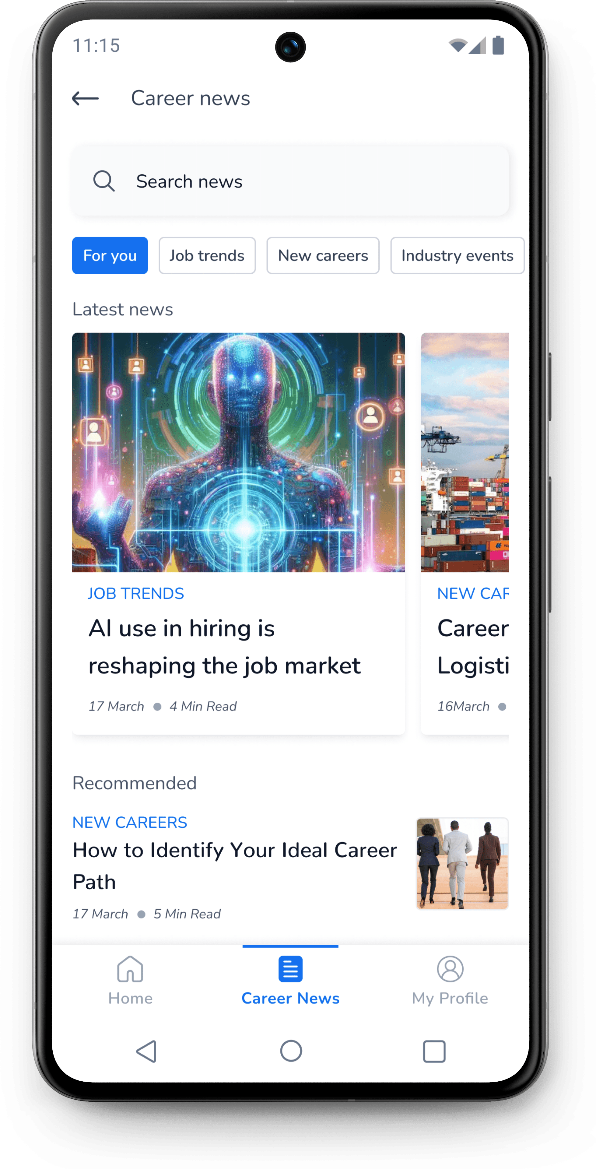
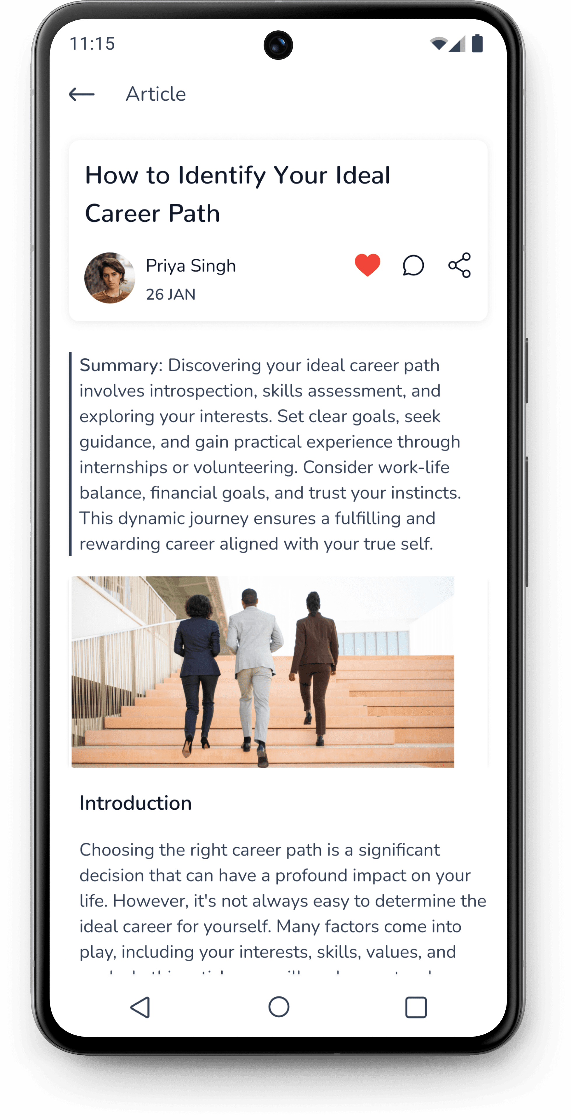
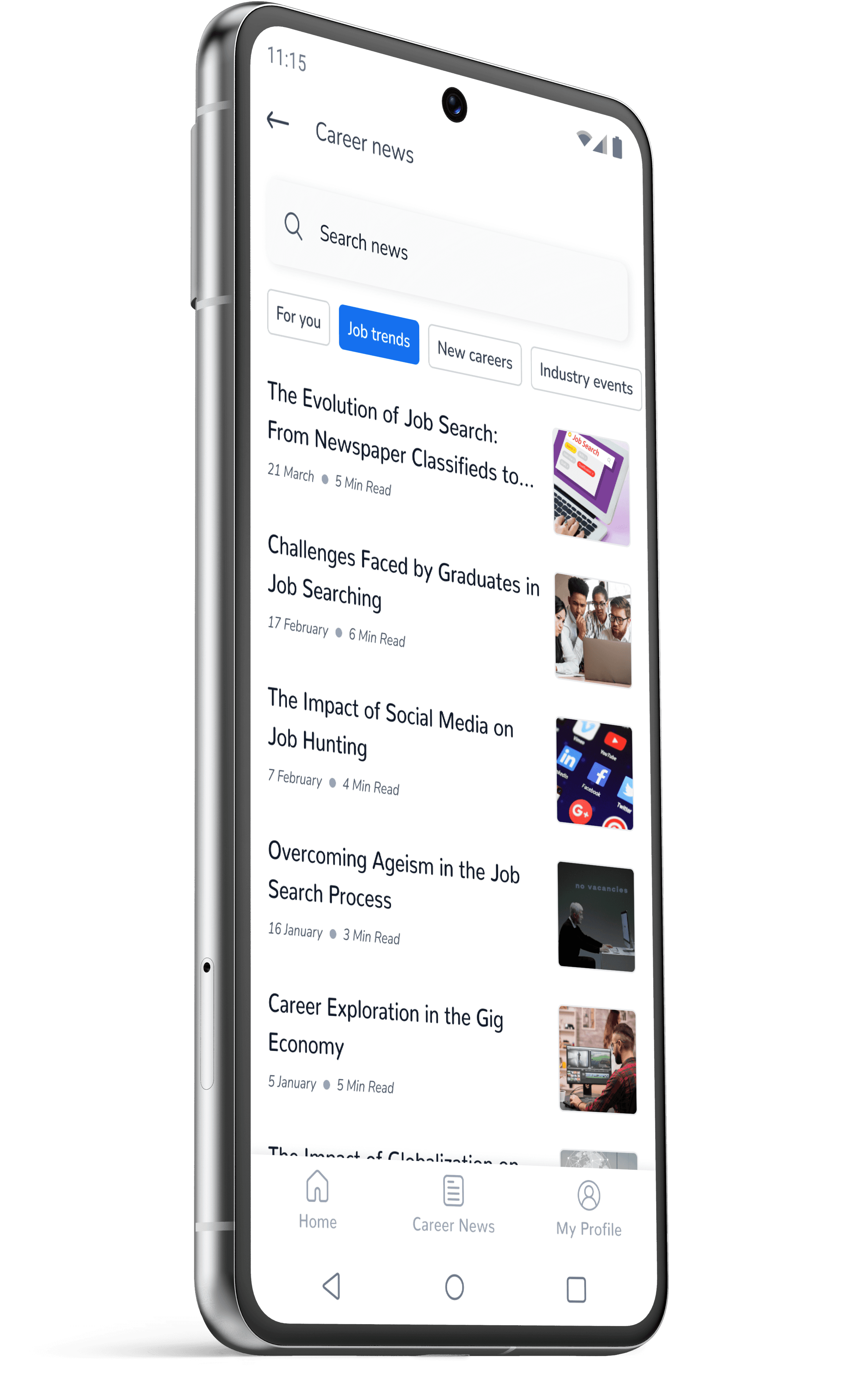
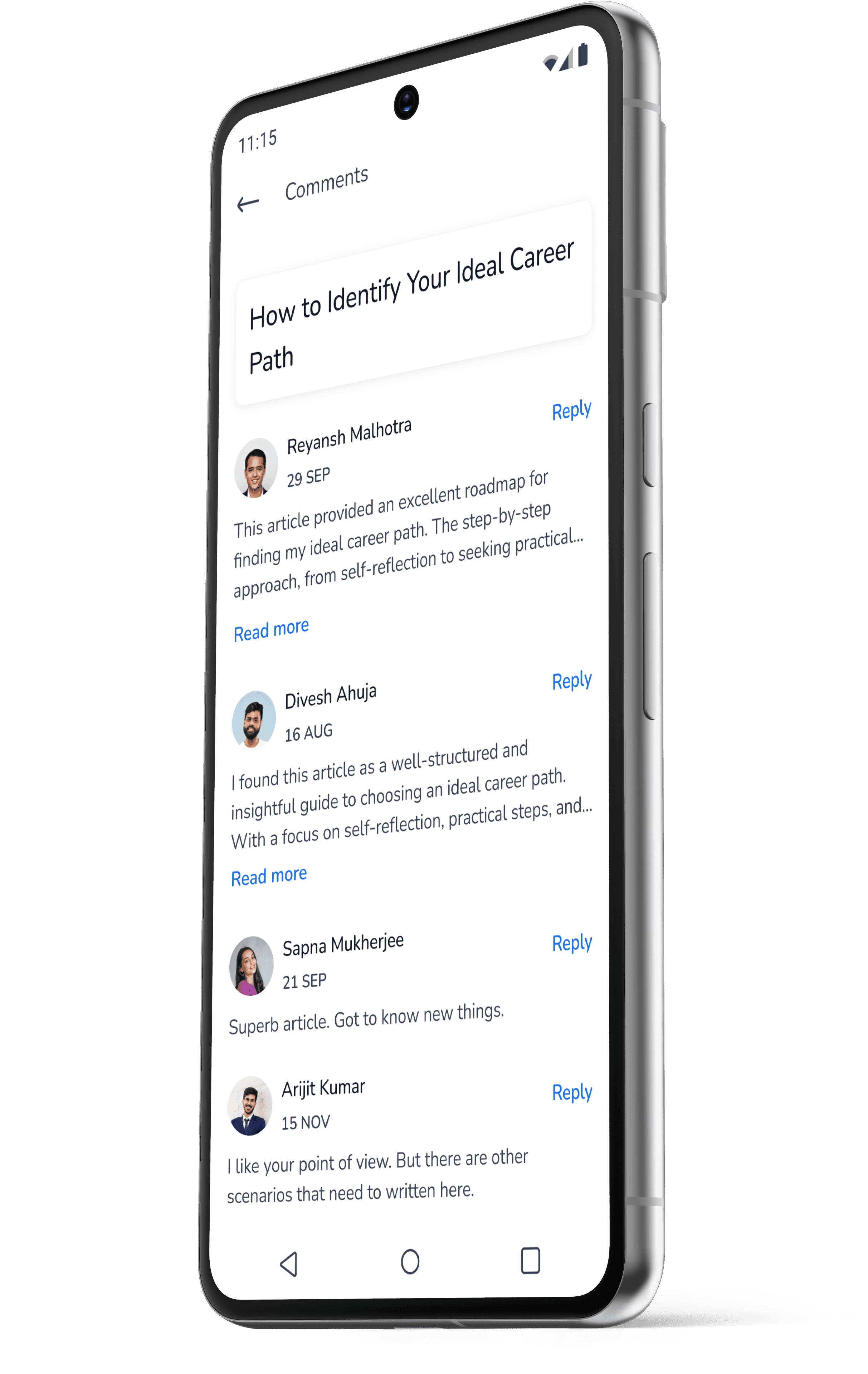
Career news

The first draft included a blog section where the user can read articles related to career on various topics.

After several iterations. I realised that a career news section is expected to be more engaging for the users as compared to a blog section.

A user is more likely to check recent updates about careers than checking on occasional articles on the blog.

First draft

Latest design

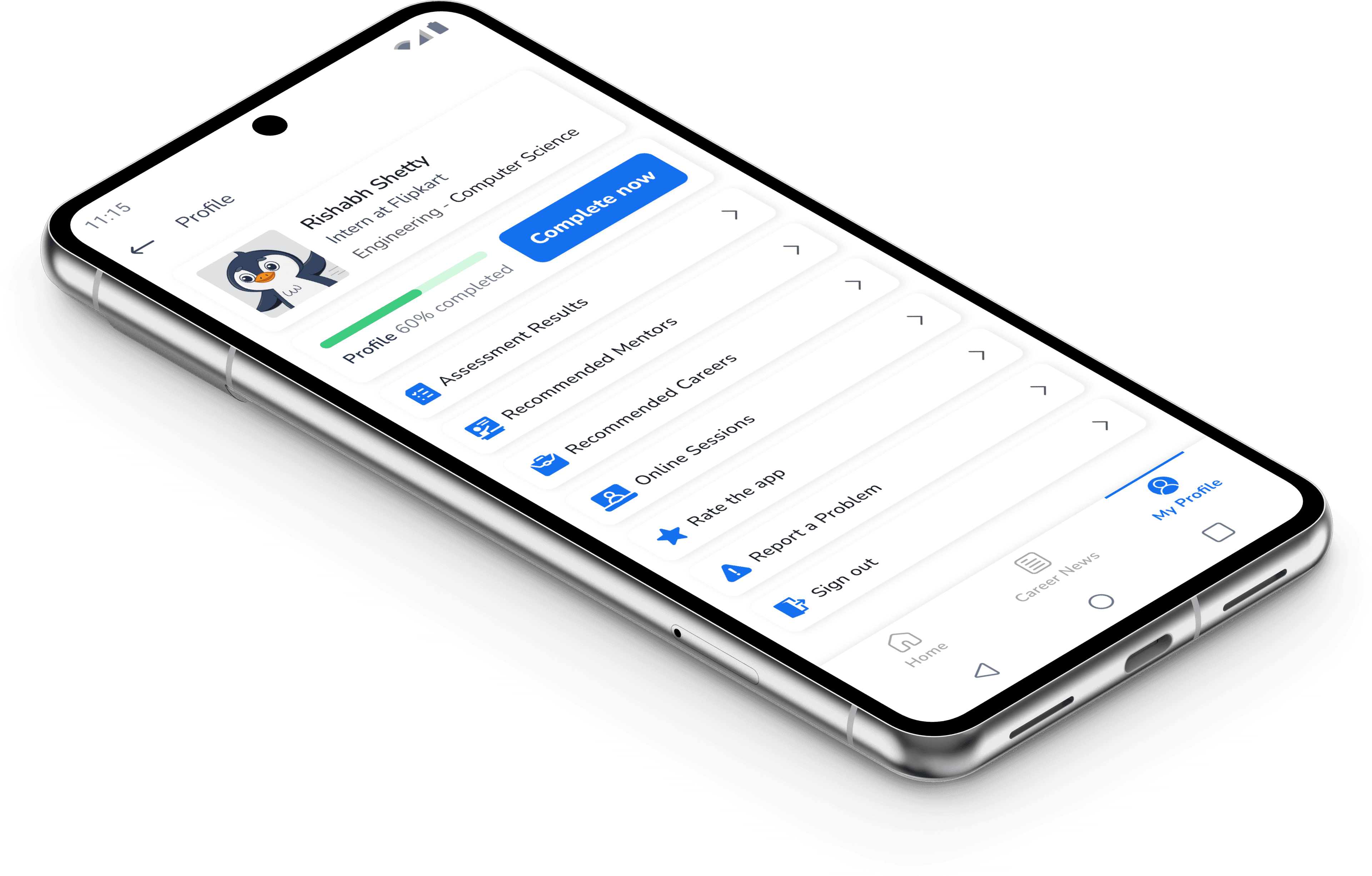
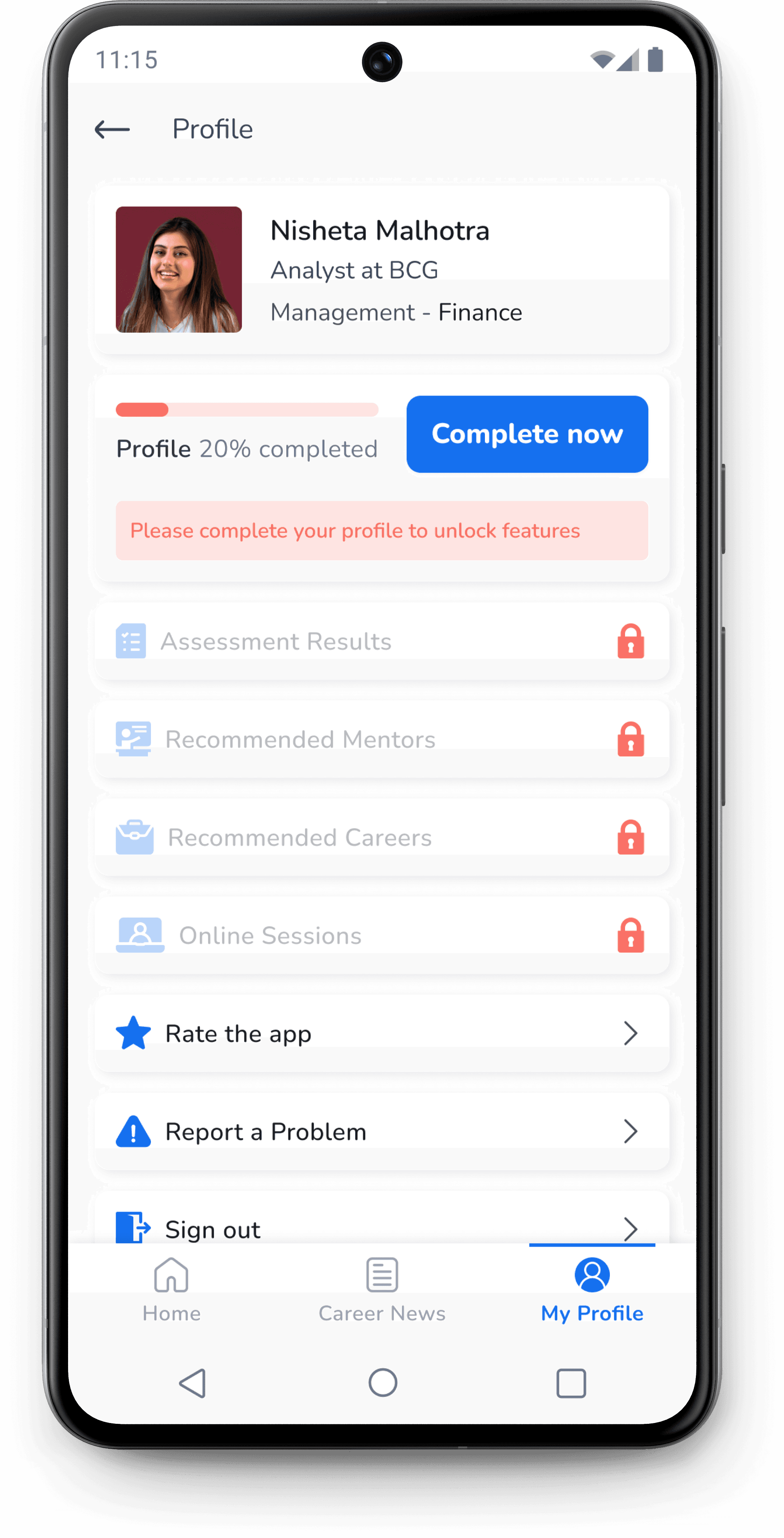
User profile

The other major purpose of providing a user profile section along with storing the user details was to offer personalization to the users by offering them different recommendations based on their assessment results, education and professional qualifications.

Feature lock was introduced to prompt the user to complete their profile.

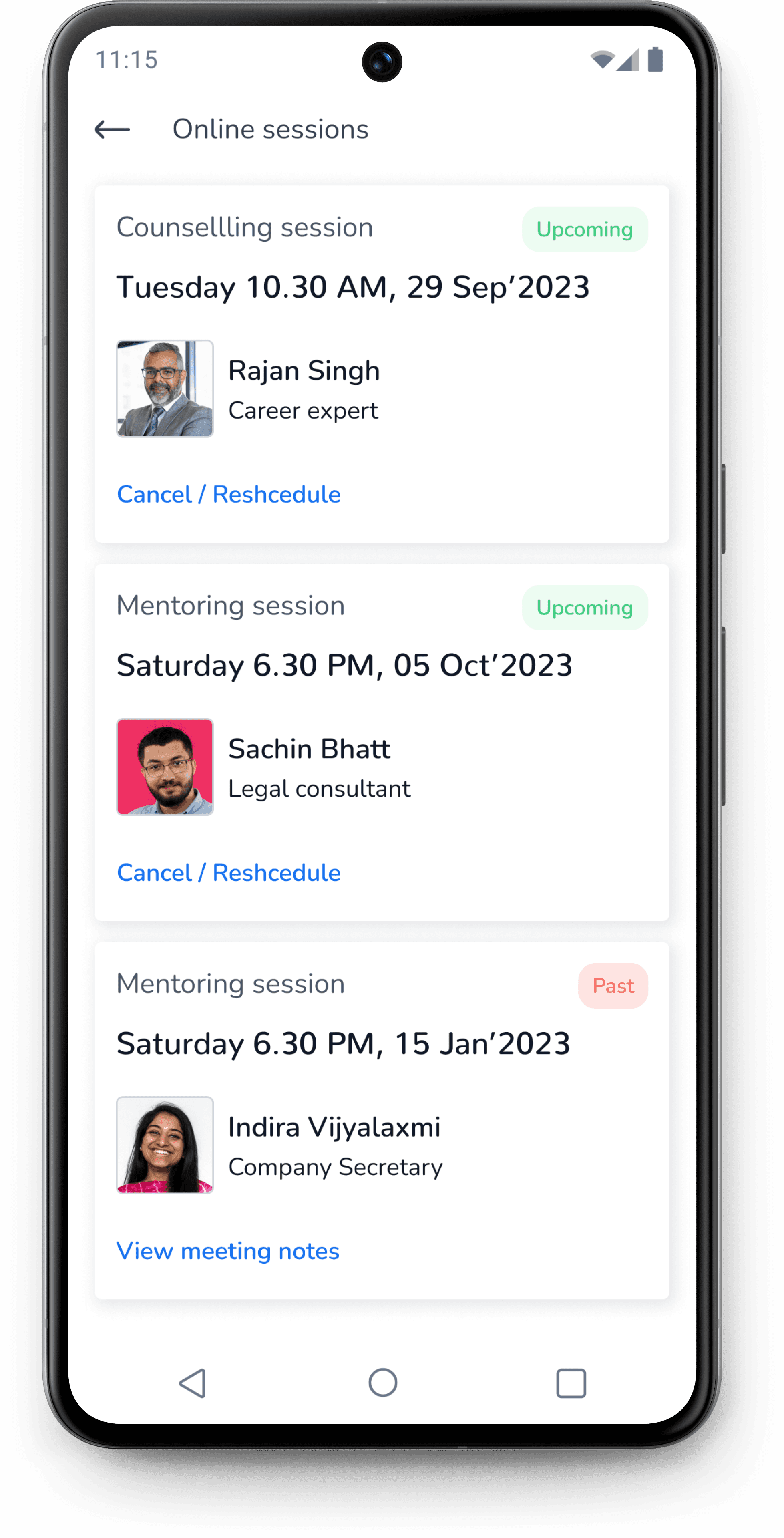
Users can access and modify the their online sessions from the profile section.

The Problem

More than 90% of Indian households have limited or no access to Career Guidance.

Let me illustrate the problem with a short story about Hrithik.

Hrithik Kapoor

Hrithik, a 12th class student is enrolled in engineering entrance coaching which he hates.

His father wants him to become a chemical engineer like him and do a government job. Hrithik thinks he does not belong to engineering field.


He is passionate about art, sketching things and building model aero planes. But he does not know what to do with his passion and choose a career that offers some interesting work for him.

Due to lack of guidance and influence of his parents, Hrithik had to study chemical engineering despite his lack of interest in the field.

Key learnings

Time management and Prioritization matters

The initial months of the project were challenging, as I had to balance a full-time job and family responsibilities alongside the project. Steady progress was elusive until I enhanced my time management skills and prioritized the project. By dedicating early mornings and weekends to the project, I was able to successfully complete it.

UX Research can be time-intensive

My UX research exceeded the planned timeframe due to reliance on generative methods like surveys and interviews. Surveys sometimes took over 15 days due to limited participant availability, and scheduling interviews was challenging, even on weekends, due to participants' personal commitments.

Side projects amplify skill development

Working on a side project can be highly rewarding, offering opportunities to learn diverse skills. I gained experience with tools ranging from interview transcribing to animation. Developing survey and interview questions honed my communication and writing abilities. Additionally, my networking and persuasion skills improved as I convinced participants to join the study.

Lets create excellent work!

CONTACT

vikassethi2007@gmail.com

91-96546 65889

vsdesigns.com

Lets create excellent work!

CONTACT

vikassethi2007@gmail.com

91-96546 65889

vsdesigns.com

Onboarding

The early versions of onboarding included 3 screens only that showcased the 3 major features of the application including career discovery, exploration and advice.

During usability test, 2 out of 5 users faced difficulty while deciding what section they wanted to explore when they did not had any idea about their careers.

So the onboarding screens were increased to 7 with a questionnaire to guide the user based on what the user had in mind while using the app the for the first time.

Latest Onboarding

After several iterations, it was realized based on feedback from design mentor that onboarding was quit long for the new user. So a new shorter onboarding was designed that included 3 screens showing the major offerings of the application.

Home screen

The home screen of first draft was designed to include all the different sections/features of the app.

Different CTA’s were provided for the users to navigate to various solutions that appealed to them.

The latest home screen design was arrived after several iterations and feedback from mentor.

I optimized the home screen so that user can view all features of the app in the first fold itself.

A new section that covered all the major offerings of the app was introduced in the first fold.

This section was expected to reduce confusion among user about the first steps to be taken when they arrive on the home screen for the first time.

JOB TRENDS

The Evolution of Job Search: From Newspaper Classifieds to Online

17 March

Pooja Sharma

NEW CAREERS

Future of engineering: Trends and opportunities for BTech students

19 March

Balaji Srinivas

INDUSTRY EVENTS

Tata Punch gets all the limelight in the recent EV expo

20 March

Ankita Tiwari

NEW CAREERS

The future of work: Advantages of pursuing a career in AI

21 March

Tarun Karthikeyan

Rajat Sinha

Software engineer

Google

Anika Banerjee

AI architect

Vikram Singh

Asst. Manager

Bhavna Sharma

Project manager

Reliance Jio

Improved the mentor section by showing the company name more prominently and improved the design of cards

Introduced the career news section instead of blogs to increase engagement with users.

When a user returns to home screen after completing assessment

When a user returns to home screen without completing the assessment

Career Assessment

The first draft for the career assessment home screen included brief description about the career assessment section.

It was discovered during the usability studies that participants found the assessment too long and they did not understand the need for every section.

I improved the introduction screen to educate the user better about how is the assessment section is structured and what each section will accomplish.

First draft

Discover yourself

Discover your interests, work values, personality and find a career that matches your unique capabilities

This assessment will help you finding career interests, personality type and work values

Lets begin

Career assessment

11:15

Career assessment

2

3

4

1

General inftormation

The career assessment is divided into four parts.

Each part will take around 20 minutes to complete.

There is time gap of 8 hrs between each part.

Start assessment part-1

11:15

Latest design

Different assessment sections

The complete career assessment was divided into four different sections.

Images and illustrations were used for providing clear context to the user.

Assessment Results

The initial design of results screen showed only a congratulatory message with different CTAs for viewing results and career recommendations.

I optimized the design by providing only 1 CTA. The copy was made more interesting by including the name public figure to create interest in user to click and check results.

3rd design iteration

Latest design

Explore careers

The first draft of the explore career section included two horizontal sliders for emerging and all careers. This design did not appealed visually and was following a similar pattern.

I optimized the Explore section by using smaller card sizes to provide more information to user in the first fold.

Similar illustrations were used to maintain visual balance.

All career section was optimized by listing all career options on the screen which were earlier provided in the horizontal carousal.

First draft

Latest design

The individual career section had lot of text and the links to specific career paths had limited affordance.

The design was optimized by having a video in the overview and link style buttons were used for better affordance.

First draft

Latest design

During usability study, one of participants expressed the need to view mentors related to a particular career path in the section itself.

The design was optimized by presenting all information on the same screen. The user could reach any section by scrolling or clicking on the tabs at the top.

A floating button along with a tool tip was introduced so that users can approach professionals related to any particular field and get some career advice.

First draft

Latest design

Mentors section

The first draft for mentor home screen included a CTA for viewing mentors along with links to popular career fields.

The design of mentor section was optimized by listing professional fields at the top. This was expected to improve experience for users who were searching mentors from a specific field.

First draft

Latest design

It was discovered during the usability study that users wanted to see mentors with different level of experience.

I introduced a new tab at the top to sort the mentors based on experience.

First draft

Latest design

Mentor’s profile

About section

Review section

Career news

The first draft included a blog section where the user can read articles related to career on various topics.

After several iterations. I realised that a career news section is expected to be more engaging for the users as compared to a blog section.

A user is more likely to check recent updates about careers than checking on occasional articles on the blog.

First draft

Latest design

User profile

The other major purpose of providing a user profile section along with storing the user details was to offer personalization to the users by offering them different recommendations based on their assessment results, education and professional qualifications.

Feature lock was introduced to prompt the user to complete their profile.

Users can access and modify the their online sessions from the profile section.

Key learnings

Time management and Prioritization matters

The initial months of the project were challenging, as I had to balance a full-time job and family responsibilities alongside the project. Steady progress was elusive until I enhanced my time management skills and prioritized the project. By dedicating early mornings and weekends to the project, I was able to successfully complete it.

Side projects amplify skill development

Working on a side project can be highly rewarding, offering opportunities to learn diverse skills. I gained experience with tools ranging from interview transcribing to animation. Developing survey and interview questions honed my communication and writing abilities. Additionally, my networking and persuasion skills improved as I convinced participants to join the study.

Lets create excellent work!

CONTACT

vikassethi2007@gmail.com

91-96546 65889

vsdesigns.com

Lets create excellent work!

CONTACT

vikassethi2007@gmail.com

91-96546 65889

vsdesigns.com

The prototype is fully clickable.
Try it!

Prototype

Not optimized for viewing on mobile devices

Please use a tablet or laptop to view content.